The Best Cartography and Map-Making Books
This curriculum takes a beginner from the wonder and history of maps all the way through the technical craft of projections, design, and data visualization. Each stage builds on the last: first developing a love and literacy for maps, then understanding their science and geometry, then mastering the design principles that make maps communicate powerfully, and finally engaging with cutting-edge practice and critical theory.
Foundations: Falling in Love with Maps
BeginnerBuild a rich intuitive understanding of what maps are, what they do, and why they matter — developing map literacy and historical context before any technical detail.
▸ Study plan for this stage
Pace: 4–5 weeks, ~40–50 pages/day. "On the Map" (~400 pages) takes 2 weeks; "How to Lie with Maps" (~200 pages) takes 1.5–2 weeks; final week for review, reflection, and exercises.
- Maps are not objective representations of reality but deliberate constructions shaped by the mapmaker's choices, values, and limitations
- Historical evolution of cartography reveals how maps have reflected and shaped human understanding of the world, from ancient times through the digital age
- Map literacy means understanding what a map shows, what it omits, and why those choices matter for how we interpret geography and society
- Projection systems, scale, symbolism, and color are technical choices that distort reality in specific ways—understanding these distortions is essential to reading maps critically
- Maps are powerful tools for communication, propaganda, and control; the same territory can be mapped in radically different ways to serve different agendas
- The relationship between map and territory: maps simplify, generalize, and abstract; no map can show everything, and what gets left out is often as important as what's included
- Maps have shaped exploration, colonialism, nationalism, and modern geopolitics; understanding cartographic history is understanding power
- Digital and interactive maps have changed how we engage with cartography, but the fundamental principle remains: all maps lie, and understanding how is the key to using them wisely
- What is the relationship between a map and the territory it represents? Why is it impossible for a map to show everything?
- How have maps been used throughout history to shape human exploration, territorial claims, and political power? Give at least two historical examples from 'On the Map'.
- What are the main ways maps can mislead or distort reality? Describe at least three specific techniques discussed in 'How to Lie with Maps'.
- How do projection systems, scale, color, and symbolism affect how we interpret a map? Why do these choices matter?
- Why does Monmonier argue that 'all maps lie'? What does he mean by this, and how does understanding this principle make you a better map reader?
- How has your understanding of maps changed after reading these books? What aspects of cartography do you now notice or question that you didn't before?
- Create a hand-drawn map of a familiar place (your home, neighborhood, or campus) from memory. Then compare it to a real map of the same area. What did you include, omit, exaggerate, or distort? Reflect on why.
- Find three different maps of the same geographic region (e.g., a city, country, or historical territory). Compare their projections, scales, colors, and what features they emphasize. Write a short analysis of how each map tells a different story about the same place.
- Select one historical map from 'On the Map' that fascinated you. Research the context: Who made it? When? For what purpose? What does it reveal about the mapmaker's worldview or the politics of the time?
- Analyze a modern map (from a news article, government agency, or app) using Monmonier's framework. Identify the projection, scale, color choices, and symbolism. What is this map trying to persuade you to believe? What might it be hiding?
- Create your own 'lying map' of a real place that deliberately distorts reality to tell a specific story (e.g., a map that exaggerates the size of areas you like, or emphasizes certain features). Write a brief explanation of your choices and what agenda your map serves.
- Interview someone about how they use maps (navigation, planning, understanding news, etc.). Ask them what they assume maps show accurately and what they've never questioned. Reflect on how the books have changed your own map literacy compared to theirs.
Next up: This stage establishes the critical, humanistic foundation for understanding maps as cultural and political artifacts; the next stage will build on this intuition by introducing the technical and mathematical principles that underlie cartographic practice.

A highly readable, story-driven history of cartography that introduces key concepts, famous maps, and the human drama behind map-making — the perfect first book to build enthusiasm and vocabulary.
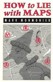
A concise, accessible classic that teaches critical map literacy by exposing how design choices shape meaning — essential early reading so the learner questions maps rather than just consuming them.
The Science of Maps: Projections and Geography
BeginnerUnderstand the mathematical and geographic foundations of cartography — especially map projections, coordinate systems, and how the round Earth is translated onto flat surfaces.
▸ Study plan for this stage
Pace: 4–5 weeks, ~25–30 pages/day. Start with "Flattening the Earth" (2 weeks) for conceptual foundations, then move to "Map Projections—A Working Manual" (2–3 weeks) for technical depth and hands-on application.
- Why map projections are necessary: the impossibility of representing a sphere on a flat surface without distortion
- The three main distortion types: area, angle, and distance, and the trade-offs between them
- Major projection families: conformal (preserves angles), equal-area (preserves area), equidistant (preserves distance), and azimuthal projections
- Coordinate systems: latitude/longitude, graticules, and how geographic coordinates translate to Cartesian plane coordinates
- The mathematics of projection: how equations transform spherical coordinates into flat map coordinates
- Historical development of projections: why different projections were invented for different purposes and eras
- Practical selection criteria: choosing the right projection for a given map's purpose, scale, and geographic region
- Why is it impossible to create a map that preserves all properties (area, angle, and distance) simultaneously, and what does Snyder explain about this fundamental constraint?
- What are the defining characteristics of conformal, equal-area, equidistant, and azimuthal projections, and when would you use each?
- How do latitude and longitude coordinates on a sphere get converted into x,y coordinates on a flat map, and what role do projection equations play?
- What distortions appear in Mercator, Lambert Conformal Conic, and Albers Equal-Area projections, and why were these projections historically important?
- Given a specific mapping task (e.g., mapping a continent, navigation chart, or thematic data), how would you select an appropriate projection and justify your choice?
- What is the graticule, and how does its appearance on a map reveal which projection was used?
- Work through Snyder's historical examples in 'Flattening the Earth': sketch or print out 3–4 different projections of the same region and annotate the distortions you observe (area stretching, angle bending, distance exaggeration).
- Using the equations and tables in 'Map Projections—A Working Manual', manually calculate the projected coordinates for 5–10 points on a simple projection (e.g., Mercator or Lambert Conformal Conic) to internalize how the math translates spherical to planar coordinates.
- Create a comparison chart of 6–8 major projections (Mercator, Lambert Conformal Conic, Albers Equal-Area, Azimuthal Equidistant, Stereographic, etc.) listing their properties, distortion patterns, and best-use cases based on Snyder's guidance.
- Select a real-world mapping problem (e.g., a navigation chart, a thematic map of climate zones, or a political map of your country) and justify which projection from 'Map Projections—A Working Manual' you would use and why.
- Plot the graticule (latitude/longitude grid) for two different projections on the same region and compare how the grid lines curve or remain straight—this visually demonstrates projection properties.
- Using GIS software (QGIS, ArcGIS, or similar) or online tools, reproject the same map data into 4–5 different projections and observe how the map's appearance, scale, and distortion change; correlate your observations to Snyder's mathematical descriptions.
Next up: This stage equips you with the theoretical and mathematical toolkit to understand *why* maps look the way they do; the next stage will apply these principles to practical cartographic design, data visualization, and the choices that turn raw geographic data into effective, purposeful maps.
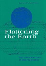
The definitive accessible history and explanation of map projections by the foremost authority on the subject — introduces every major projection family with clear diagrams before any heavy math.
Snyder's technical companion that goes deeper into the mathematics of projections; reading his accessible history first makes this more rigorous follow-up far easier to absorb.
Design Principles: Making Maps Communicate
IntermediateMaster the visual and design principles that separate a good map from a great one — typography, color, symbol, hierarchy, and the cognitive science behind effective cartographic communication.
▸ Study plan for this stage
Pace: 4–5 weeks, ~25–30 pages/day, with 2–3 days per week dedicated to design exercises and map critiques
- Color theory in cartography: sequential, diverging, and qualitative schemes; perceptual uniformity; accessibility for color-blind readers
- Typography on maps: font selection, hierarchy, placement, and legibility across scales and media
- Symbolization strategies: point, line, and area symbols; visual variables (size, value, hue, texture); matching symbols to data types
- Visual hierarchy and figure-ground relationships: directing viewer attention through contrast, size, and placement
- Cognitive load and information design: simplification, generalization, and the principle of visual economy
- Map design for different audiences and purposes: thematic vs. reference maps; print vs. digital contexts
- Perceptual principles: gestalt theory, pre-attentive processing, and how the eye reads maps
- Design iteration and critique: testing maps with users and refining based on feedback
- Why would you choose a sequential color scheme over a diverging one for a particular dataset, and what are the perceptual consequences of that choice?
- How do typography decisions (font family, size, weight, placement) affect a map's readability and the hierarchy of information?
- What is the relationship between visual variables (hue, value, size, texture) and the type of data being mapped (nominal, ordinal, interval)?
- How can you use contrast and visual hierarchy to guide a viewer's eye through a map and prevent cognitive overload?
- What design principles differ when creating a map for print versus digital display, and how do these constraints shape your design choices?
- How do principles of gestalt theory and pre-attentive processing inform effective symbol design and map layout?
- Analyze 3–5 published maps (from atlases, news media, or online sources): identify the color scheme, typography choices, and symbolization strategy; critique their effectiveness and suggest improvements
- Create a color palette for a thematic map using Brewer's principles; test it for perceptual uniformity and simulate color-blind vision using online tools (e.g., Color Brewer website or Coblis simulator)
- Redesign an existing poorly designed map by applying hierarchy, typography, and symbolization principles; document your decisions and rationale
- Design a simple thematic map (e.g., population density, climate zones, or disease prevalence) with intentional choices in color, symbols, and typography; create both a print and digital version and note the differences
- Conduct a small user test: show your map to 3–5 people and ask them to identify key patterns, read labels, and describe their visual experience; refine the design based on feedback
- Create a visual inventory of symbol types (points, lines, areas) and their perceptual properties; match each to a real-world dataset and justify your choices
Next up: This stage equips you with the visual language and cognitive principles to craft maps that communicate clearly; the next stage will build on these foundations by exploring how to apply these principles to specific cartographic problems—such as representing uncertainty, temporal change, or multivariate data—and how to leverage digital tools and interactivity to enhance communication.
A thorough, well-structured textbook covering the full cartographic design process — the ideal bridge from conceptual map literacy to systematic, principled map-making practice.

Brewer, creator of ColorBrewer, delivers practical, example-rich guidance on color, layout, and visual hierarchy specifically for map designers — directly actionable after the broader Kraak foundation.
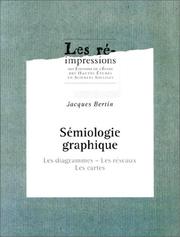
The foundational theoretical text on visual variables and graphic communication; challenging but transformative — reading it here, after design basics, unlocks a deep grammar for all cartographic and data visualization decisions.
Data Visualization and the Modern Map
IntermediateConnect cartographic design to the broader world of data visualization, thematic mapping, and statistical graphics — learning to represent quantitative and qualitative data spatially with clarity and honesty.
▸ Study plan for this stage
Pace: 8–10 weeks, ~25–30 pages/day (alternating between Tufte's dense visual analysis and Slocum's applied methodology)
- Data-ink ratio and the principle of eliminating chart junk to maximize clarity in visual communication
- Multivariate data representation: techniques for displaying multiple dimensions of information simultaneously on a map or graphic
- Thematic mapping fundamentals: choropleth, proportional symbol, dot density, and isopleth maps as tools for spatial data storytelling
- Color theory and perceptual effectiveness: selecting palettes and visual variables that encode data accurately without distortion
- Geovisualization as interactive and dynamic representation: moving beyond static maps to exploratory and confirmatory visualization
- Ethical data representation: recognizing how design choices (scale, classification, symbolization) can mislead or clarify
- Statistical graphics and cartographic design convergence: applying Tufte's principles of excellence to thematic and geographic visualization
- What is the data-ink ratio, and how does Tufte's concept apply to reducing visual clutter in thematic maps?
- Describe the strengths and limitations of at least three thematic mapping techniques (e.g., choropleth, proportional symbol, dot density) and when to use each.
- How do color choice and visual variables (hue, saturation, value, size, shape) affect the accuracy and perception of quantitative data on a map?
- What is the difference between exploratory and confirmatory geovisualization, and what role does interactivity play in each?
- How can a cartographer or data visualizer ethically represent statistical data spatially, and what are common pitfalls that lead to misrepresentation?
- How do Tufte's principles of excellence in statistical graphics translate to the design of thematic maps, and where do they diverge?
- Analyze a published thematic map or statistical graphic using Tufte's data-ink ratio framework: identify and list all non-data elements, then propose a redesign that increases the ratio.
- Create three different thematic maps of the same dataset (e.g., population density, income distribution, disease prevalence) using choropleth, proportional symbol, and dot density techniques; compare which method communicates the pattern most effectively.
- Design a color palette for a choropleth map representing a continuous variable (temperature, elevation, poverty rate) and justify your choices based on perceptual effectiveness and accessibility (colorblind-friendly testing).
- Sketch or prototype an interactive geovisualization that allows a user to toggle between exploratory (open-ended discovery) and confirmatory (hypothesis-testing) modes for a spatial dataset of your choice.
- Critique a real-world map or infographic that misrepresents data through misleading scale, classification, or symbolization; document the ethical issues and propose a corrected version.
- Combine quantitative and qualitative spatial data in a single visualization (e.g., overlay statistical regions with narrative annotations or symbols); reflect on how Tufte's principles of clarity and Slocum's multivariate techniques work together.
Next up: This stage equips you with the visual and statistical literacy to design honest, effective thematic maps and geovisualizations; the next stage will likely deepen your technical toolkit by exploring digital cartography platforms, GIS software, and the production workflows that bring these design principles into practice at scale.

The canonical text on data graphics and information design; its principles of data-ink ratio, chartjunk, and small multiples apply directly and powerfully to thematic cartography.
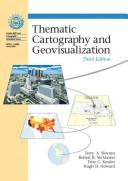
The most comprehensive academic treatment of thematic map types — choropleth, isopleth, proportional symbol, dot maps — building directly on Tufte's visualization principles in a spatial context.
Advanced Practice: Art, Craft, and Critical Cartography
ExpertEngage with cartography as both a critical discipline and a creative art — understanding power, subjectivity, and aesthetics in maps, and drawing inspiration from master practitioners.
▸ Study plan for this stage
Pace: 4–5 weeks, ~25–30 pages/day, with 2–3 days per week dedicated to atlas exploration and critical mapping exercises
- Maps are never neutral representations—they embed power, ideology, and subjective choices about what to include, exclude, and emphasize
- Cartographic design involves deliberate aesthetic and functional decisions (color, projection, scale, symbolism) that shape how viewers interpret information
- The relationship between map-maker, map, and map-reader is dynamic; understanding the cartographer's intent and perspective is essential to critical map literacy
- National Geographic's cartographic tradition represents a specific institutional voice and visual language that reflects particular values and editorial choices
- Subjectivity in cartography can be leveraged creatively and ethically to tell stories, challenge assumptions, and represent marginalized perspectives
- The history and politics of map projection, boundary-drawing, and territorial representation reveal how maps have been tools of colonialism, nationalism, and power
- How does Denis Wood argue that maps function as instruments of power, and what examples does he provide of how maps shape political and social reality?
- What are the key design choices a cartographer must make (projection, color, scale, symbolism), and how do these choices influence what a map communicates?
- How does the National Geographic Student Atlas exemplify a particular institutional perspective, and what values or biases might be embedded in its selection and presentation of geographic information?
- What is the difference between treating maps as objective documents versus understanding them as subjective, authored works?
- How can cartographers use subjectivity and creative design ethically to challenge dominant narratives or represent alternative perspectives?
- What role does aesthetics play in cartography, and how can visual beauty serve both functional and critical purposes in map-making?
- Read *The Power of Maps* with annotation: mark passages where Wood discusses how maps conceal or reveal power; note specific historical examples and reflect on how they apply to contemporary maps
- Conduct a critical analysis of 3–4 maps from the National Geographic Student Atlas: for each, identify the projection used, color palette, what regions receive emphasis, what is omitted, and what narrative or values this suggests
- Create a comparison chart: select one geographic region (e.g., the Middle East, Africa, or a contested border area) and find how it is represented in 2–3 different atlases or map sources; analyze how representation differs and why
- Design your own map of a familiar place (your neighborhood, city, or campus) that deliberately emphasizes something unconventional or marginalized (e.g., informal economies, environmental hazards, cultural landmarks ignored by official maps); write a brief statement explaining your cartographic choices
- Conduct an interview or written reflection: choose a map from the National Geographic Atlas that surprised or troubled you; research its historical context and the cartographer's/institution's reasoning; write a critical response
- Create a visual essay or presentation: select 2–3 maps from Wood's *The Power of Maps* and 2–3 from the National Geographic Atlas; arrange them to tell a story about how cartography shapes perception of a specific theme (e.g., development, borders, resources)
Next up: This stage equips you to read maps as texts authored by humans with particular interests and perspectives, preparing you to either specialize in critical cartography scholarship, pursue creative/activist map-making, or apply cartographic thinking to other visual and spatial media.
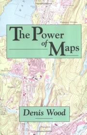
A landmark critical cartography text arguing that maps are never neutral — essential for any serious cartographer to understand the politics and rhetoric embedded in every design choice.
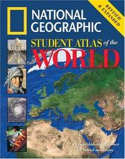
Studying a masterwork reference atlas at this advanced stage trains the eye to recognize professional-level decisions in projection choice, typography, color, and hierarchy across hundreds of map types.
Discussion
Keep reading
Paths that share books, cover the same subject, or open a related topic.