Data visualization: books to design charts that tell stories
This curriculum takes you from the perceptual and design foundations of data visualization all the way through storytelling, dashboard design, and hands-on coding with D3.js. Each stage builds on the last — you'll first learn *why* certain visuals work, then *how* to design them well, then *how to communicate* with them, and finally *how to build* them from scratch in code. Expect roughly 10 books across 4 tightly sequenced stages.
Foundations: Perception & Principles
BeginnerUnderstand how the human visual system processes information and what makes a chart honest, clear, and effective — the bedrock vocabulary every visualization practitioner needs.
▸ Study plan for this stage
Pace: 8–10 weeks, ~25–30 pages/day (with reflection breaks). Tufte (4–5 weeks), Munzner (2–3 weeks), Cairo (2 weeks).
- Data-ink ratio and the elimination of chartjunk: maximizing the proportion of ink used to represent data rather than decoration
- Pre-attentive processing: visual properties (color, position, size, shape) that the brain processes in under 500ms, before conscious thought
- The visualization design space: mapping data dimensions to visual encodings (channels) and choosing appropriate chart types for your data structure
- Honesty and integrity in visualization: avoiding distortion, manipulation, and misleading scales that betray the underlying data
- Visual perception principles: gestalt laws, color theory, and how humans compare magnitudes, detect patterns, and read hierarchies
- The functional purpose of visualization: clarifying what question your visualization answers and designing for your specific audience and context
- Interaction and layering: when and how to use interactivity, small multiples, and progressive disclosure to handle complexity without overwhelming the viewer
- What is the data-ink ratio and why does Tufte argue it should be maximized? Give an example of chartjunk and explain how you would remove it.
- Explain pre-attentive processing and list at least four visual channels (e.g., position, color, size). Which channels are most effective for encoding quantitative vs. categorical data?
- What is the visualization design space, and how do you map data dimensions to visual encodings? Why might a bar chart be better than a pie chart for comparing parts of a whole?
- How can a visualization be technically correct but still dishonest? Describe at least two techniques that distort data perception and how to avoid them.
- What does Munzner mean by 'expressiveness' and 'effectiveness' in visualization design? How do these principles help you choose between competing chart types?
- According to Cairo, what is the relationship between aesthetics and function in visualization? Why does a beautiful chart that misleads fail on both counts?
- Tufte audit: Find three examples of chartjunk in published articles, reports, or websites. Redesign each one to maximize data-ink ratio, and write a one-paragraph explanation of your changes.
- Pre-attentive processing experiment: Create two versions of the same dataset—one using color to encode a variable, one using size. Show both to a peer and measure how quickly they can answer a simple question (e.g., 'Which category is largest?'). Document which encoding was faster.
- Design space mapping: Take a dataset with 4–5 variables (e.g., sales by region, product, and quarter). Sketch at least three different visualization approaches and justify each choice using Munzner's expressiveness and effectiveness criteria.
- Deception detection: Collect five 'bad' visualizations (misleading axes, truncated scales, inappropriate chart types, or distorted proportions). For each, identify the deception technique and propose an honest redesign.
- Gestalt and hierarchy: Design a single-page infographic that uses gestalt principles (proximity, similarity, continuity, closure) to guide the viewer's eye through a narrative about a dataset. Annotate your choices.
- Functional brief: Write a one-page functional brief for a visualization you want to create: define your audience, the core question it answers, the data structure, and your choice of visual encoding. Justify why your chosen chart type is appropriate for both the data and the audience.
Next up: This stage establishes the perceptual and ethical foundations that underpin all visualization work; the next stage will build on these principles by exploring specific chart types, interaction patterns, and tools for implementing these ideas in practice.

The canonical starting point for the field. Tufte establishes core principles — data-ink ratio, chartjunk, small multiples — that every subsequent book builds on or reacts to.
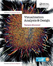
Provides a rigorous, systematic framework for *why* certain encodings work, grounded in perceptual science. Read after Tufte to give his intuitions a formal backbone.
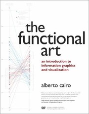
Bridges perception theory and practical chart design with real-world examples, making the abstract principles from the first two books immediately actionable.
Chart Design & Visual Best Practices
BeginnerBuild a working toolkit of chart types, design decisions, and common pitfalls so you can confidently choose and construct the right visual for any dataset.
▸ Study plan for this stage
Pace: 8–10 weeks, ~25–30 pages/day (approximately 2–3 weeks per book, with overlap for practice)
- The importance of context and audience in chart selection—understanding who needs to see what and why
- Core chart types and their appropriate use cases: bar charts, line charts, scatter plots, heat maps, and when to avoid pie charts
- Visual encoding principles: how position, color, size, and shape communicate data relationships more or less effectively
- The role of narrative and story structure in data visualization—moving beyond decoration to purposeful design
- Common design pitfalls: dual-axis charts, truncated axes, misleading color scales, and chart junk that obscures rather than clarifies
- Accessibility and clarity: designing for diverse viewers, avoiding color-only encoding, and ensuring legibility
- The distinction between exploratory and explanatory visualization—knowing when to show all data vs. guide the viewer to a specific insight
- How do you determine which chart type is most appropriate for a given dataset and audience?
- What are the key design principles from Knaflic's work that distinguish effective from ineffective visualizations?
- How can you use color, position, and other visual elements to encode data accurately without misleading your audience?
- What are the most common ways charts can lie or mislead, and how do you guard against them in your own work?
- How do narrative structure and context shape the way viewers interpret a visualization?
- What accessibility considerations should you keep in mind when designing charts for a broad audience?
- Recreate 3–4 charts from 'Storytelling with Data' by hand or in your preferred tool, then annotate what makes each one effective
- Collect 5 real-world charts (from news, reports, or dashboards) and critique each using Wong's and Cairo's frameworks—identify what works and what misleads
- Design a simple bar chart, then intentionally introduce 3 common pitfalls (e.g., truncated axis, excessive colors, chart junk), then redesign to fix them
- Take a messy dataset and create two versions: one exploratory (showing all patterns) and one explanatory (guiding the viewer to one key insight)
- Practice the 'pre-attentive processing' exercise: create a chart where the key insight is visible in under 1 second, then one where it takes 5+ seconds; compare
- Redesign a pie chart from a real source as a bar chart or small multiples, explaining why the new version is clearer
Next up: This stage equips you with the vocabulary, principles, and critical eye to evaluate and build sound visualizations; the next stage will deepen your technical execution by teaching you how to implement these principles in specific tools and at scale.
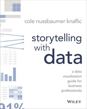
A highly practical, example-driven guide to decluttering charts and focusing attention — the best bridge between theory and everyday chart-making work.

A concise, authoritative style guide covering charts, maps, and tables with clear do/don't examples; reinforces good habits at the level of individual design choices.

Teaches you to read and critique misleading visuals critically — essential for designing honest charts and for developing a sharp editorial eye.
Storytelling, Narrative & Dashboards
IntermediateLearn to arrange visuals into coherent narratives and dashboards that guide an audience toward insight, moving beyond individual charts to communication systems.
▸ Study plan for this stage
Pace: 8–10 weeks, ~25–30 pages/day (mix of reading and reflection). Allocate roughly 3 weeks to "The Truthful Art," 3 weeks to "Information Dashboard Design," and 2–3 weeks to "Data Visualisation" with overlap for integration exercises.
- Narrative structure in data visualization: how to sequence visuals to build toward a conclusion (Cairo's emphasis on authorial intent and guided exploration)
- The five pillars of effective dashboards: clarity, consistency, responsiveness, and actionability as defined by Few's framework
- Visual encoding principles: how to match data types and relationships to appropriate chart types and interactive elements
- Audience-centered design: tailoring narrative complexity, interactivity, and visual hierarchy to specific user needs and contexts
- Dashboard architecture: organizing multiple visualizations into coherent systems that support both exploration and monitoring
- Truthfulness and integrity in narrative: maintaining ethical communication while guiding interpretation through visual arrangement
- Interaction design for dashboards: when to use filters, drill-downs, and linked views versus static narrative sequences
- Bridging individual charts to systems: moving from standalone visualizations to integrated information ecosystems that tell a story
- How does Cairo define the relationship between authorial intent and audience interpretation, and how should this shape the way you arrange visuals in a narrative?
- What are the key differences between exploratory dashboards and explanatory narratives, and when should you use each approach?
- According to Few's framework, what makes a dashboard 'effective,' and how do clarity and consistency contribute to actionability?
- How do you choose between interactive exploration and a guided narrative sequence when communicating data insights to different audiences?
- What visual encoding strategies does Kirk recommend for organizing complex multi-view dashboards, and how do they support cognitive load management?
- How can you maintain truthfulness and avoid manipulation while using narrative sequencing and visual hierarchy to guide an audience toward a specific insight?
- Read and annotate Cairo's chapters on narrative structure (particularly his discussion of authorial intent vs. reader freedom). Create a one-page summary of how he defines 'truthful' storytelling with data.
- Analyze 3–5 real-world dashboards (from business intelligence tools, news outlets, or public data sources). For each, identify which of Few's five pillars are present or missing, and document how this affects usability.
- Design a simple exploratory dashboard (5–7 visualizations) for a dataset of your choice. Document your decisions about layout, visual hierarchy, and interactivity using Kirk's principles.
- Create a narrative sequence (3–5 static slides or pages) that tells a data story from the same dataset. Compare it to your dashboard design: what changed, and why?
- Redesign an existing poorly-designed dashboard or report using lessons from all three books. Write a brief critique explaining what was wrong and how your changes improve narrative clarity and actionability.
- Practice 'visual encoding matching': take a complex dataset and sketch 3 different ways to visualize the same relationships. Justify each choice using principles from Cairo, Few, and Kirk.
Next up: This stage equips you to move from understanding individual visualization techniques to orchestrating them into persuasive, functional communication systems—preparing you to tackle advanced topics like real-time data monitoring, interactive storytelling at scale, and designing for diverse stakeholder needs in the next stage.
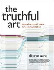
Deepens the storytelling angle with statistics and journalism context, teaching you how to build arguments with data — a natural next step after chart-level design.

The definitive book on dashboard design, covering layout, visual hierarchy, and choosing the right metrics — directly applicable after mastering individual chart design.

Provides a comprehensive design process framework — from brief to final output — that ties together storytelling, aesthetics, and audience thinking into a repeatable workflow.
Building Visuals in Code with D3
ExpertTranslate all design knowledge into working, interactive, browser-based visualizations using D3.js — the industry-standard JavaScript library for bespoke data graphics.
▸ Study plan for this stage
Pace: 8–10 weeks, ~40–50 pages/day with code practice sessions
- D3 selection and binding data to DOM elements using .data(), .enter(), .update(), and .exit()
- SVG fundamentals: how to construct and manipulate shapes (circles, rectangles, paths, lines) as the foundation for all D3 graphics
- Scales and axes: mapping data domains to visual ranges and creating readable, labeled coordinate systems
- Transitions and animations: smoothly updating visualizations in response to data changes or user interactions
- Event handling and interactivity: responding to user input (clicks, hovers, drags) to create responsive, exploratory graphics
- Layout generators: using D3's built-in tools (pie, stack, tree, force) to position data elements without manual calculation
- Hierarchical and network data structures: visualizing relationships, trees, and graphs beyond simple x-y plots
- Performance optimization: managing large datasets and complex interactions without degrading browser responsiveness
- How does D3's data binding model (.data(), .enter(), .update(), .exit()) differ from imperative DOM manipulation, and why is it powerful for dynamic visualizations?
- What is the relationship between data domains, ranges, and D3 scales, and how do you choose the appropriate scale type (linear, ordinal, log, etc.) for your data?
- How do you create smooth transitions between visualization states, and what are the performance trade-offs of different animation approaches?
- How can you layer interactivity (tooltips, filtering, brushing, dragging) into a D3 visualization without breaking the data-binding pattern?
- What are the key differences between using D3 layout generators (pie, tree, force) versus manually positioning elements, and when should you use each?
- How do you structure a D3 project to handle real-time or large datasets while maintaining responsive user interactions?
- Build a simple bar chart from scratch using D3 selections and data binding; then update it dynamically when data changes to internalize the .enter()/.update()/.exit() pattern
- Create a scatter plot with linear scales for both axes, add axes with labels, and experiment with different scale types (log, power) to see their visual effect
- Implement a line chart with a transition that animates when you click a button to swap datasets; measure and optimize the animation duration
- Build an interactive visualization that responds to mouse events: add tooltips on hover, highlight on click, and allow users to filter data by category
- Create a pie chart or donut chart using d3.pie() and d3.arc(), then add click handlers to explode slices or transition to a different layout
- Build a small force-directed graph (network diagram) with d3.forceSimulation() showing 10–20 nodes and links; experiment with force parameters to improve layout
- Refactor one of your earlier visualizations into a reusable function or module that accepts data and configuration as parameters
- Create a dashboard with 2–3 linked visualizations (e.g., a bar chart and a scatter plot) where selecting a bar filters the scatter plot in real time
Next up: This stage equips you with the technical skills to implement any visualization design in code; the next stage will focus on applying these tools to real-world datasets, optimizing for performance at scale, and mastering advanced patterns like responsive design and custom interactions that elevate a graphic from functional to exceptional.
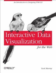
The most accessible and widely recommended introduction to D3.js, building up from HTML/SVG basics to fully interactive charts — the essential first coding step.

Goes beyond basics into advanced D3 patterns — networks, maps, dashboards — written by a practitioner at Netflix; read after Murray to tackle real-world complexity.
Discussion
Keep reading
Paths that share books, cover the same subject, or open a related topic.