The Best Books to Learn Adobe Illustrator, in Order
This curriculum takes a complete beginner from zero Illustrator experience to confident vector artist and logo/illustration designer. Each stage builds on the last: first mastering the interface and core tools, then conquering the pen tool and paths, then applying those skills to real-world logo and illustration projects, and finally developing a professional design sensibility that elevates the work.
Foundations: Interface, Tools & Thinking in Vectors
BeginnerUnderstand what vector art is, navigate the Illustrator workspace confidently, and use essential tools (shapes, color, type, basic transforms) without feeling lost.
▸ Study plan for this stage
Pace: 4–5 weeks, ~25–30 pages/day (Classroom in a Book: 2–3 weeks; Vector Basic Training: 1–2 weeks)
- Vector vs. raster: why vectors scale infinitely without quality loss, and when to use each
- The Illustrator workspace: panels, toolbars, artboards, and how to customize your view for efficiency
- Anchor points, paths, and the Pen tool: the foundation of drawing and editing shapes in vectors
- Shape tools (rectangle, circle, polygon) and how to combine them with Boolean operations (Unite, Minus Front, Intersect)
- Color, stroke, and fill: applying and managing color attributes to build visual hierarchy
- Type in Illustrator: creating point and area text, basic formatting, and converting text to outlines
- Transform tools and techniques: scale, rotate, reflect, and skew to manipulate objects with precision
- Thinking in vectors: breaking down complex designs into simple shapes and reusable components
- What is the fundamental difference between vector and raster graphics, and why does this matter for your design work?
- How do you navigate and customize the Illustrator workspace to match your workflow?
- Explain the relationship between anchor points, paths, and handles—how do they control the shape of a vector object?
- How would you use the Pen tool to draw a custom shape, and what are the key techniques for editing it afterward?
- Describe how to combine multiple shapes using Boolean operations to create a more complex form.
- What are the differences between point text and area text, and when would you use each in a design?
- How do you apply and modify color, stroke, and fill properties to create visual contrast?
- How would you approach breaking down a complex illustration into simple vector shapes before you start drawing?
- Complete the first 3–4 lessons in Classroom in a Book (workspace setup, basic shapes, color basics) and recreate the example files from scratch without looking at the solution.
- Draw a simple icon (e.g., a house, star, or coffee cup) using only the basic shape tools and Boolean operations; save it and compare it to reference icons.
- Use the Pen tool to trace a simple line drawing or photograph (a leaf, simple animal silhouette, or geometric logo) to practice anchor point placement and path editing.
- Create a business card or small poster layout combining shapes, text, and color—apply what you've learned about type, fills, and strokes to build visual hierarchy.
- Recreate one of Von Glitschka's vector exercises from Vector Basic Training that focuses on breaking down a design into component shapes.
- Experiment with the transform tools: take a single shape and create a pattern or composition by scaling, rotating, and reflecting it multiple times.
- Design a simple color palette (3–5 colors) and apply it to a multi-element composition to practice managing color and stroke attributes.
- Spend 30 minutes exploring the Illustrator workspace: customize your panels, create a workspace layout that feels natural, and document your setup for reference.
Next up: This stage equips you with the core vocabulary and muscle memory to navigate Illustrator and think in shapes, preparing you to tackle more advanced techniques like gradients, patterns, advanced path editing, and illustration workflows in the next stage.

The official Adobe Press hands-on course is the single best starting point — structured lessons cover every core tool in a logical order, giving beginners a complete map of the application before diving deeper.
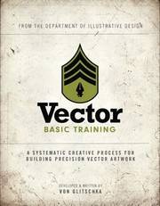
Read this immediately after getting comfortable with the interface; Glitschka reframes how to *think* in vectors — using grids, structured sketching, and clean geometry — building the mental model that separates tidy vector work from messy clicking.
The Pen Tool & Paths: Mastering Bézier Curves
BeginnerAchieve true fluency with the pen tool, anchor points, and path editing — the single most important skill gap for Illustrator beginners.
▸ Study plan for this stage
Pace: 4–5 weeks, ~25–30 pages/day, with daily practice sessions of 45–60 minutes on the pen tool
- Anchor points (corner, smooth, and combination points) and their role in defining path shape and direction
- Direction handles and how they control the curvature of Bézier curves between anchor points
- The pen tool workflow: clicking to create anchor points, dragging to set direction handles, and closing paths
- Path editing techniques: selecting, moving, and modifying anchor points and handles after initial creation
- Converting point types (corner to smooth and vice versa) to reshape paths without redrawing
- Combining the pen tool with selection tools to efficiently create and refine complex paths
- Practical strategies for drawing organic shapes, geometric forms, and tracing artwork with precision
- What is the difference between a corner point and a smooth point, and when would you use each one?
- How do direction handles control the shape of a Bézier curve, and what happens when you adjust them?
- Walk through the step-by-step process of drawing a closed path with the pen tool, from first click to completion.
- How do you convert an existing anchor point from one type to another, and why would you do this during path editing?
- What are the most efficient keyboard shortcuts and modifier keys when using the pen tool, and how do they speed up your workflow?
- How would you approach tracing a complex organic shape (like a leaf or face outline) using the pen tool, and what editing steps would follow?
- Draw 10 simple geometric shapes (squares, triangles, stars) using only the pen tool, focusing on precise anchor point placement and clean corners.
- Create a series of smooth, flowing curves by drawing S-curves, spirals, and wave patterns; adjust direction handles to refine smoothness.
- Trace a provided photograph or sketch of an organic shape (flower, animal silhouette, or face) using the pen tool, then edit the path to match the original as closely as possible.
- Practice converting anchor points: draw a path with all corner points, then convert specific points to smooth points and observe how the shape changes.
- Create a composite illustration combining geometric and organic shapes (e.g., a simple landscape with trees, hills, and a sun) using only the pen tool.
- Redraw a complex vector artwork from a reference image, focusing on minimizing anchor points while maintaining shape accuracy—this builds efficiency.
Next up: Mastery of the pen tool and path editing unlocks your ability to create any custom shape, which is essential before moving into stroke and fill styling, transformations, and building complex illustrations with multiple layered paths.

Project-driven exercises that force repeated, deliberate pen-tool and path practice in realistic design scenarios, cementing muscle memory for anchor-point manipulation.
Logo Design & Typography in Illustrator
IntermediateApply vector skills to real-world logo construction, understand type as a design element, and learn the professional workflow for delivering clean, scalable mark design.
▸ Study plan for this stage
Pace: 4–5 weeks, ~25–30 pages/day with 2–3 design projects interspersed
- Logo design principles: simplicity, memorability, timelessness, and versatility across scales and media
- The design process: research, concept development, sketching, refinement, and client feedback loops
- Typography as a core design element: font selection, kerning, and how letterforms contribute to brand identity
- Color theory and monochromatic logo design: creating marks that work in single-color and full-color applications
- Technical execution in Illustrator: building modular, scalable vector shapes and preparing files for production
- The psychology of marks: how visual metaphor, symbolism, and negative space communicate brand values
- Professional deliverables: file formats, guidelines documentation, and presenting logos to clients
- What are the core principles that make a logo timeless and effective across different contexts and sizes?
- How do you approach the research and concept phase before sketching a logo, and why is this critical?
- How can typography be used as a primary design element rather than just a supporting detail in a logo?
- What techniques ensure a logo works equally well in color, grayscale, and single-color applications?
- How do you organize and structure vector shapes in Illustrator to create a clean, scalable, production-ready logo file?
- What role does negative space and visual metaphor play in memorable logo design?
- Design a logo for a fictional brand using Airey's process: conduct research, create 10+ rough sketches, develop 3 refined concepts, and present them with a one-page rationale
- Recreate a classic logo (e.g., Apple, Nike, or FedEx) in Illustrator by analyzing its geometry, proportions, and construction; document how it achieves simplicity and scalability
- Create a typographic logo where the letterforms themselves are the primary mark; experiment with kerning, weight, and custom modifications to make it distinctive
- Build a logo system that works in full color, two-color, and single-color (black/white) versions; create a simple brand guidelines document showing proper usage
- Conduct a competitive analysis: collect 5–8 logos in your chosen industry, analyze their strengths and weaknesses using Airey's principles, and sketch how you'd differentiate a new mark
- Design a logo and prepare professional deliverables: export multiple file formats (AI, PDF, PNG, SVG), create a grid system showing clear space, and write a brief explaining design decisions
Next up: This stage equips you with the strategic thinking and technical precision needed to design cohesive brand systems—the next stage will expand these logo foundations into comprehensive visual identities including color palettes, iconography, and layout systems.
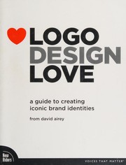
The most widely read primer on logo design thinking — teaches the *why* behind great marks (simplicity, scalability, meaning) before you build them, so your Illustrator work has strategic purpose.
A hands-on companion to Airey's theory; walks through the actual construction and refinement process of logos with exercises that map directly to Illustrator's vector tools.
Vector Illustration: Characters, Scenes & Style
IntermediateMove beyond logos into expressive vector illustration — building characters, scenes, and a personal visual style using Illustrator's full toolset.
▸ Study plan for this stage
Pace: 4–5 weeks, ~40–50 pages/day with daily practice projects
- Building expressive character anatomy and proportions in vector form
- Layering and composition techniques for complex scenes in Illustrator
- Color theory and palette development for cohesive visual style
- Advanced path editing and shape manipulation for organic, stylized forms
- Using Illustrator's brushes, effects, and blending modes for illustrative depth
- Developing a recognizable personal aesthetic through consistent design choices
- Balancing precision with expressiveness in vector illustration
- Translating reference materials and sketches into polished vector artwork
- How do you construct believable character proportions and anatomy within Illustrator's vector constraints?
- What techniques does Caplin recommend for organizing complex multi-element scenes in Illustrator?
- How can you use color harmony and palette selection to establish a cohesive visual style across multiple illustrations?
- What is the relationship between path control, anchor points, and achieving expressive, organic shapes?
- How do brushes, effects, and blending modes enhance the illustrative quality of vector work beyond flat design?
- What are the key differences between designing a logo and designing a full character or scene illustration?
- How do you develop and maintain a personal visual style while working in vector?
- Create 3–4 character designs from scratch: sketch, vectorize, and refine proportions using Illustrator's tools
- Build a complete scene composition (landscape, interior, or environment) using layering and depth techniques from the book
- Develop a personal color palette (5–8 colors) and apply it consistently across 2–3 different illustration projects
- Practice advanced path editing: take a rough sketch and refine it into smooth, expressive curves using the Pen tool and Smooth tool
- Experiment with Illustrator's brush library and custom brushes to add texture and character to vector strokes
- Create a character sheet showing your character in multiple poses and expressions to test consistency and style
- Recreate one of Caplin's example illustrations step-by-step, documenting your process and noting techniques used
- Design a small scene or diorama that combines multiple characters, props, and background elements with intentional depth and focus
Next up: This stage equips you with the foundational skills and personal aesthetic needed to tackle specialized illustration domains—whether that's animation preparation, commercial illustration, or stylized concept art—by proving you can execute complex, expressive vector work with intention and technical control.
Broadens the illustrator's toolkit with composition, color theory, and storytelling through imagery — essential context for making vector illustrations that communicate, not just display technical skill.
Advanced Craft & Professional Practice
ExpertDevelop a refined design eye, understand color systems and grids at a professional level, and produce portfolio-ready work with the confidence of a working designer.
▸ Study plan for this stage
Pace: 8–10 weeks, ~25–30 pages/day. "Thinking with Type" (3–4 weeks, ~20 pages/day), followed by "The Elements of Graphic Design" (4–5 weeks, ~25–30 pages/day). Allow 1 week for integration exercises and portfolio refinement.
- Typography as a primary design system: how typeface choice, scale, weight, and spacing communicate hierarchy and meaning in vector-based layouts
- Grid systems and modular composition: constructing proportional, repeatable structures that organize content and create visual coherence across multiple artboards
- Color as a relational system: understanding how hue, value, saturation, and contrast function together to establish mood, hierarchy, and professional polish
- Negative space and visual rhythm: using white space, alignment, and repetition to guide the eye and create intentional visual flow
- Contrast and emphasis: deploying size, color, weight, and position strategically to direct attention and establish focal points
- Design principles applied to real constraints: balancing aesthetic refinement with practical requirements (file organization, export settings, client deliverables)
- Critical analysis of existing design: developing the ability to deconstruct professional work and articulate why design decisions succeed or fail
- Iterative refinement: moving beyond initial concepts to polish, test, and evolve designs based on systematic principles rather than intuition alone
- How does typeface selection (serif vs. sans-serif, weight, width) establish hierarchy and tone in a vector composition, and how would you justify a specific choice to a client?
- Explain the relationship between a grid system and visual hierarchy. How would you construct a grid for a multi-page document or poster series in Illustrator?
- What is the difference between contrast and emphasis, and how do you use color, scale, and position together to create a clear focal point?
- How do you use negative space intentionally to improve readability and visual impact, rather than filling every area of a design?
- Analyze a professional design (poster, logo system, or publication layout). What color relationships, typographic choices, and spatial decisions make it effective?
- What are the key differences between designing for print vs. screen in Illustrator, and how do color systems and grids adapt between these contexts?
- Complete "Thinking with Type" exercises: create a typographic hierarchy study using a single typeface family (varying scale, weight, and spacing) to organize a multi-level text hierarchy; export as a clean Illustrator artboard.
- Design a modular grid system for a fictional publication (e.g., magazine spread, poster series, or branding guidelines). Document the grid proportions, margins, and column structure in Illustrator, then apply it to 3–4 layouts.
- Create a color palette study: select a professional design you admire, extract its color system using Illustrator's eyedropper, and document the hex values and color relationships (complementary, analogous, triadic). Explain why these colors work together.
- Redesign a piece of your own earlier work using the principles from both books: improve typography, introduce a grid, refine color relationships, and increase negative space. Document the before/after with annotations.
- Deconstruct a professional design (book cover, poster, or brand identity): create an annotated Illustrator file that identifies the grid structure, typographic hierarchy, color system, and focal points. Write a 200-word analysis of how these elements work together.
- Design a small poster or promotional graphic for a fictional client, applying all stage concepts: intentional typography, a visible grid structure, a cohesive color system, and strategic use of white space. Present 2–3 refined iterations showing refinement.
Next up: This stage equips you with the systematic design thinking and refined aesthetic judgment needed to move into specialized applications—whether that's designing complex interactive systems, building comprehensive brand identities, or mastering advanced Illustrator techniques for specific industries.
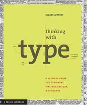
Typography is inseparable from professional vector design; Lupton's canonical text gives the deep typographic literacy needed to handle type in logos and illustrations at a professional standard.
Caps the curriculum with a rigorous study of space, unity, and visual hierarchy — the invisible principles that make polished Illustrator work look intentional and authoritative rather than merely competent.
Discussion
Keep reading
Paths that share books, cover the same subject, or open a related topic.