Logo and brand identity design: the best books to build brands, in order
This curriculum takes a beginner from the fundamental language of visual marks all the way through building full brand systems and presenting them confidently to clients. Each stage builds on the last: first you learn to see and think like a designer, then you master the craft of logo-making, then you expand into cohesive brand identity systems, and finally you learn how to sell and defend your work professionally.
Foundations: Learning to See & Think Like a Designer
BeginnerDevelop a designer's eye — understand visual principles, the purpose of marks, and how meaning is communicated through shape, color, and type before touching a logo project.
▸ Study plan for this stage
Pace: 4–5 weeks, ~25–30 pages/day. Start with "Thinking with Type" (Week 1–2.5), then move to "The Elements of Graphic Design" (Week 2.5–5). Allocate 2–3 days per week for exercises and reflection.
- Typography as a visual and communicative system: how letterforms, spacing, and hierarchy convey meaning beyond words
- The anatomy of type: understanding stroke, counter, x-height, baseline, and how these properties affect readability and expression
- Grid systems and spatial relationships: how designers organize information and create visual rhythm through alignment and proportion
- The five core elements of graphic design: line, shape, color, texture, and value, and how they work together to create visual impact
- Contrast and emphasis: using visual differences in scale, weight, color, and position to guide the viewer's eye and establish hierarchy
- The relationship between form and function: how design choices serve the message and audience, not decoration alone
- Visual perception and gestalt principles: how the eye groups, interprets, and completes visual information
- How does typography function as both a practical tool for communication and an expressive design element? Give examples from 'Thinking with Type.'
- What is the difference between serif and sans-serif typefaces, and when would you choose each based on context and audience?
- Explain how a grid system works and why designers use grids to organize space, even when the final design doesn't show the grid.
- Name and describe the five core elements of graphic design from 'The Elements of Graphic Design,' and give an example of how each can be used to create emphasis.
- How do contrast and hierarchy work together to guide a viewer through a visual composition? Provide a real-world example.
- What does it mean to design with intention, and how do you distinguish between decoration and purposeful design choices?
- Type specimen study: Select 3–4 typefaces from 'Thinking with Type' and create a one-page visual analysis showing their anatomy, personality, and best use cases.
- Grid exploration: Redesign a page of text (a poem, article excerpt, or advertisement) using three different grid systems. Observe how the grid changes the reading experience and emphasis.
- Visual hierarchy exercise: Take a piece of text with multiple levels of information (headline, subheading, body, caption) and use only typography (size, weight, color, spacing) to create clear hierarchy without adding images.
- Element isolation study: Find 5 real-world logos or brand marks and analyze each using the five core elements from 'The Elements of Graphic Design.' Identify which elements are dominant and why.
- Contrast and emphasis practice: Create a series of simple compositions (3–4 variations) using the same shapes or type, varying only one element at a time (scale, color, position, weight) to see how contrast directs attention.
- Designer's eye journal: Over 2 weeks, collect 10–15 examples of typography and graphic design in the wild (packaging, signage, websites, print). Annotate each with observations about hierarchy, contrast, and visual principles at work.
Next up: By developing a trained eye for visual principles, hierarchy, and the expressive power of type and shape, you'll be ready to apply these foundational skills to the specific challenge of logo design—where every mark must communicate meaning efficiently and memorably.
Typography is the backbone of most logos and brand identities; this accessible classic builds essential vocabulary around letterforms, hierarchy, and spacing that every brand designer must internalize first.
Introduces the core visual principles — space, unity, dominance, and hierarchy — giving beginners a structured grammar for why some marks feel right and others fall apart.
The Logo: Designing the Mark
BeginnerUnderstand what makes a great logo, learn the categories of marks (wordmarks, symbols, emblems), and develop a repeatable process for conceiving and refining logo forms.
▸ Study plan for this stage
Pace: 8–10 weeks, ~25–30 pages/day, with 2–3 days per week dedicated to design exercises and sketching
- The principles of effective logo design: simplicity, memorability, versatility, and timelessness (from Airey's core philosophy)
- The five logo categories and their strengths: wordmarks, lettermarks, pictorial marks, abstract marks, and emblems (from Thomas's taxonomy)
- The strategic design process: research, concept development, sketching, refinement, and testing across applications (from Airey and Thomas)
- How to evaluate and critique logos using objective criteria: legibility, scalability, color independence, and cultural appropriateness
- The role of constraint and simplification in creating iconic marks that work at any size (demonstrated throughout Logolounge 6)
- How to apply design fundamentals (typography, geometry, negative space) to logo conception and refinement
- The difference between trends and timeless design; how to avoid dated aesthetics while remaining contemporary (Airey's emphasis)
- What are the five main categories of logo marks, and what are the key advantages and limitations of each?
- According to Airey, what are the four essential qualities that distinguish a great logo from a mediocre one?
- Walk through the complete logo design process from brief to final delivery, as outlined in Thomas's methodology.
- How do you test whether a logo design is truly effective? What criteria should you evaluate?
- Why is simplicity critical in logo design, and how do you balance simplicity with distinctiveness?
- Analyze a logo from Logolounge 6: identify its category, explain why it works, and describe how it demonstrates timeless design principles.
- Complete Airey's 'logo love' analysis: select 5 logos you admire, identify their category, and write a one-paragraph critique explaining why each one works using Airey's principles
- Sketch 20+ logo concepts for a fictional brand (or a real brief) using Thomas's process: start with research and mood boards, then rapid ideation, then refinement of top 3 concepts
- Redraw 3 logos from Logolounge 6 by hand to understand their underlying geometry, proportions, and construction—then write notes on what makes each one effective
- Create a logo in one color only, then test it at multiple scales (business card, billboard, favicon) to verify legibility and impact without relying on color
- Design a wordmark and a pictorial mark for the same fictional brand, then compare them: which is more memorable? Which is more versatile? Why?
- Conduct a 'logo autopsy': take a poorly designed logo and redesign it using Thomas's framework and Airey's principles; document your process and reasoning
Next up: This stage equips you with a deep understanding of what makes a logo work in isolation; the next stage will expand this into full brand identity systems, teaching you how logos interact with typography, color palettes, imagery, and other brand elements to create cohesive visual languages.
The ideal first logo book — conversational, richly illustrated, and packed with real-world case studies that explain the principles of timeless, effective logo design in plain language.
Follows naturally from Airey by going deeper into the taxonomy of marks and the conceptual thinking behind iconic symbols, reinforcing the 'why' behind every design decision.
A curated visual library of professional logos organized by type and trend; reading it at this stage trains pattern recognition and expands the designer's visual reference bank.
Brand Identity Systems: Beyond the Logo
IntermediateExpand a single mark into a full, cohesive brand identity — mastering color palettes, typographic systems, imagery styles, and the rules that keep a brand consistent across every touchpoint.
▸ Study plan for this stage
Pace: 6–8 weeks, ~40–50 pages/day (alternating between both books; Wheeler first for foundational depth, then Budelmann for systematic reinforcement)
- Brand identity systems as coordinated visual and verbal elements that extend far beyond a logo mark
- Color psychology and palette development: selecting, justifying, and applying primary, secondary, and accent colors across contexts
- Typographic systems: choosing and pairing typefaces, establishing hierarchy, and creating type guidelines that work across digital and print
- Imagery style and visual language: photography direction, illustration approach, and graphic elements that reinforce brand personality
- Brand guidelines and standards manuals: documenting rules for consistent application across all touchpoints (web, print, packaging, signage, etc.)
- Cohesion and flexibility: balancing strict consistency with adaptive systems that work in constrained or unexpected contexts
- Touchpoint mapping: understanding how identity systems function across packaging, websites, social media, environmental design, and collateral
- How do you develop a cohesive color palette that reflects brand personality, and what role do primary, secondary, and accent colors play in a brand identity system?
- What are the key criteria for selecting and pairing typefaces in a brand identity system, and how do you establish typographic hierarchy across different media?
- How should a brand's imagery style (photography, illustration, graphic elements) be defined and documented to ensure consistency without sacrificing flexibility?
- What essential sections should a brand guidelines document include, and why is it critical to provide both rules and real-world application examples?
- How do you adapt a brand identity system to work across radically different touchpoints (e.g., a billboard vs. a social media icon) while maintaining cohesion?
- What is the relationship between a logo and the broader brand identity system, and why is the logo just one component rather than the entire identity?
- Conduct a competitive color audit: analyze 5–8 brands in a single category (e.g., luxury watches, fast-casual restaurants) and map their color palettes. Identify which colors are overused and which create differentiation.
- Create a typographic system for a fictional brand: select 2–3 typefaces (one for headlines, one for body, one for accents), establish size and weight hierarchy, and show how they work across a business card, website header, and packaging label.
- Develop an imagery style guide: collect 12–15 reference images (photography, illustration, or graphic treatments) that define a cohesive visual language for a brand, then write 3–4 sentences explaining the style's personality and rules.
- Map a brand identity system across 8–10 touchpoints: choose a real or fictional brand and document how its logo, colors, typography, and imagery appear on (e.g.) a website, Instagram post, product packaging, billboard, business card, and email template.
- Critique an existing brand guidelines document: select a published brand manual (many are available online), identify what works well and what's missing or unclear, and propose 2–3 improvements.
- Build a mini brand identity system from scratch: starting with a logo you've created or selected, develop a complete system including a 3–4 color palette with hex codes, a typographic pairing with size/weight rules, an imagery direction statement, and a 1-page guidelines sheet showing 4 key applications.
Next up: This stage equips you with the systems-thinking and documentation skills needed to move into advanced territory—whether that's designing for complex, multi-brand ecosystems, adapting identity systems to emerging media (AR, voice, metaverse), or leading brand strategy at the organizational level.

The definitive industry handbook for building complete brand systems; it walks through every phase from research to launch and is the single most-referenced book in professional brand practice.

Complements Wheeler with a concise, principle-by-principle breakdown of the elements that make up a brand system — ideal for solidifying the 'rules' before moving into advanced process work.
Process, Strategy & Concept
IntermediateDevelop a professional, strategic design process — from client discovery and brand strategy through ideation, iteration, and knowing when a concept is truly finished.
▸ Study plan for this stage
Pace: 4–5 weeks, ~25–30 pages/day (approximately 10–12 hours per week)
- The brand gap: bridging the disconnect between strategy and execution by aligning internal culture with external perception
- Brand strategy as the foundation for design decisions—defining purpose, audience, and differentiation before visual exploration
- The design process as iterative and collaborative: discovery → strategy → ideation → refinement → validation
- How constraints (budget, audience, medium) shape and improve design concepts rather than limit them
- The role of storytelling and narrative in making brand identity memorable and emotionally resonant
- Knowing when a concept is 'finished': criteria for evaluating whether a design solution solves the strategic brief
- Client communication and feedback loops as essential to the design process, not obstacles to it
- Visual identity systems (logo, typography, color, imagery) as expressions of brand strategy, not decorative choices
- What is the 'brand gap' and why do most companies fail to close it? How does design help bridge it?
- Walk through a complete brand strategy process: what questions must you answer before sketching a single logo?
- How do you move from a strategic brief to initial concepts? What ideation methods help generate diverse directions?
- What criteria determine whether a logo or identity system is 'finished'? When is iteration complete?
- How do you communicate design decisions to clients in a way that connects them back to strategy?
- Describe the relationship between constraints and creativity. How do limitations improve design outcomes?
- Conduct a full brand discovery interview with a real or fictional client: map their business, audience, competitors, and desired positioning. Document findings in a one-page strategy brief.
- Take a brand you know well (your own, a local business, or a case study from the books). Reverse-engineer its strategy: what audience, values, and positioning does the visual identity suggest?
- Generate 20+ logo concepts for a single brief in one sitting using rapid sketching (5–10 minutes per concept). Evaluate which directions best express the strategy, not which look 'coolest.'
- Redesign an existing logo or identity system by first articulating its current strategy, then proposing a new strategic direction and visual system to match.
- Create a visual identity system (logo, color palette, typography, imagery guidelines) for a fictional brand. Document how each element reinforces the brand strategy.
- Conduct a peer critique session: present a design concept with its strategic rationale. Have peers evaluate whether the visual identity actually solves the brief, not just whether they like it aesthetically.
Next up: This stage establishes the strategic thinking and process discipline that underpins professional design work; the next stage will deepen your execution skills by focusing on the specific craft elements (typography, color theory, composition, and technical production) that bring these strategies to visual life.
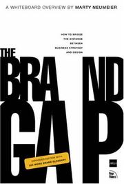
A short, punchy read that bridges business strategy and design thinking, teaching designers how to position a brand conceptually before a single mark is drawn.

A process-focused follow-up that documents real brand identity projects from brief to final delivery, showing how strategy, concept, and craft converge in professional practice.
Presenting, Defending & Delivering Brand Work
ExpertLearn how to package, present, and persuasively defend brand identity work to clients — and understand how to document a finished system in guidelines that outlast the project.
▸ Study plan for this stage
Pace: 6–8 weeks, ~25–30 pages/day, with 1–2 days per week for reflection and exercises
- Positioning strategy: how to identify and articulate what makes a brand unique in a crowded market (Zag's core thesis)
- The business case for design: translating design decisions into client value and ROI language
- Presentation frameworks: structuring narratives that move stakeholders from skepticism to buy-in
- Brand guidelines as a living system: documenting identity rules in ways that empower future users and prevent brand decay
- Defending creative choices: using research, strategy, and psychology to justify design decisions rather than relying on taste
- The designer's mindset: balancing commercial viability with creative integrity (Work for Money's central tension)
- Differentiation through constraint: how limiting a brand's visual and verbal toolkit creates memorability and consistency
- Stakeholder psychology: understanding client fears, ego, and decision-making to navigate feedback and revisions
- What is a 'zag' and why is differentiation through constraint more powerful than trying to appeal to everyone?
- How do you translate a brand identity system into a presentation that persuades a skeptical client or board?
- What should a comprehensive brand guidelines document include, and how do you structure it so non-designers can apply it correctly?
- How do you defend a design decision that a client dislikes using strategy and research rather than personal preference?
- What is the relationship between a designer's commercial success and creative fulfillment, and how do you navigate that tension?
- How do you position a brand in a way that makes it memorable and defensible against competitors?
- Analyze a real brand (e.g., Apple, Mailchimp, Patagonia) and identify its 'zag'—what it's *not* trying to be. Write a one-page positioning statement explaining its differentiation strategy.
- Take a rejected design concept from your own work (or a case study) and write a 2–3 page defense document that reframes the concept using research, psychology, and business logic instead of aesthetic arguments.
- Audit an existing brand guidelines document (find one online). Identify gaps, unclear instructions, and sections that would confuse a non-designer. Propose 3–5 improvements.
- Create a 10-slide presentation deck pitching a fictional brand identity system to a hypothetical client. Include positioning, visual rationale, and implementation guidelines. Practice delivering it and anticipating objections.
- Interview a designer or creative director about their most difficult client presentation. Document the strategies they used to handle pushback, and extract 3–5 principles you can apply to your own work.
- Design a one-page 'brand essence' document (positioning, personality, visual principles) for a real or fictional brand. Then create a corresponding guidelines excerpt showing how those principles translate to specific applications (logo, typography, color, imagery).
Next up: This stage equips you to deliver and defend brand work with confidence and clarity; the next stage will likely deepen your ability to evolve and adapt brand systems over time, or expand into specialized areas like digital brand application, brand extensions, or organizational change management.
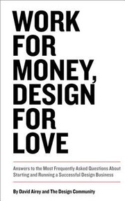
Tackles the business and communication side of design practice — how to handle clients, present concepts, manage feedback, and protect creative decisions with confidence.
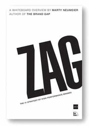
Closes the curriculum by teaching designers to think and argue at the brand-strategy level, giving them the language to justify bold identity decisions to even the most skeptical stakeholders.
Discussion
Keep reading
Paths that share books, cover the same subject, or open a related topic.