Learn typography: designing with type
This curriculum takes a beginner from the fundamental principles of how type works all the way to the nuanced craft of type design and advanced typographic judgment. Each stage builds on the last: you first develop vocabulary and visual awareness, then master the rules of spacing, pairing, and hierarchy, and finally study type as a designed artifact — understanding letterforms from the inside out so you can set type with genuine authority.
Foundations — Seeing & Reading Type
BeginnerBuild core vocabulary, understand why typography matters, and train the eye to notice what makes type work or fail on the page and screen.
▸ Study plan for this stage
Pace: 8–10 weeks total: Weeks 1–5 cover "The Elements of Typographic Style" (~20–25 pages/day, reading slowly and re-reading dense passages); Weeks 6–10 cover "Thinking with Type" (~15–20 pages/day, pausing to sketch and annotate examples). Budget extra time to revisit Bringhurst's glossary and specimen p
- The anatomy of type: understanding terms such as baseline, x-height, cap height, ascender, descender, stem, bowl, counter, serif, and aperture as introduced in Bringhurst and reinforced visually in Lupton
- Typeface classification: distinguishing Old Style, Transitional, Modern, Slab Serif, and Sans Serif families and understanding the historical forces that shaped each, per Bringhurst's historical narrative
- Rhythm and proportion: how Bringhurst's concept of the typographic page as a musical score connects line length, leading, and type size into a coherent reading experience
- The difference between a typeface and a font, and between type as image, text, and grid — the three lenses Lupton uses to structure 'Thinking with Type'
- Legibility vs. readability: Bringhurst's distinction between a letterform being recognizable in isolation (legibility) and a body of text being comfortable to read over time (readability)
- Hierarchy and contrast: how Lupton demonstrates that size, weight, style, spacing, and color work together to guide the reader's eye and signal importance
- Spacing at every scale: Bringhurst's detailed treatment of letterspacing, word spacing, and line spacing, and why each must be calibrated to the others
- Type on screen vs. type on the page: Lupton's contemporary examples that extend Bringhurst's print-centric principles into digital and interactive contexts
- After reading Bringhurst, can you label at least ten anatomical parts of a letterform from memory and explain how each part affects the overall texture of a block of text?
- How does Bringhurst argue that the best typography is invisible — and do you agree with his reasoning after seeing Lupton's more expressive counterexamples?
- Using Lupton's three-part framework (letter, text, grid), how would you diagnose a typographic problem you encounter in everyday life — a confusing menu, a cluttered poster, or a hard-to-read website?
- What is Bringhurst's guidance on choosing a type size and leading for continuous reading, and how does Lupton's discussion of columns and line length reinforce or complicate that guidance?
- Can you identify at least four typeface classifications by sight, name a historical period associated with each, and explain one formal characteristic that distinguishes them?
- How do both authors treat the relationship between white space and meaning — and where do their perspectives diverge?
- Anatomy labeling drill: Print or sketch five letters (e.g., 'a', 'g', 'R', 'Q', 'f') in a serif and a sans-serif face. Using Bringhurst's glossary as your reference, label every anatomical feature you can find. Repeat weekly until the vocabulary is automatic.
- Typeface classification walk: Collect 20 real-world type specimens (photographs of signage, book covers, packaging, websites). Sort them into Bringhurst's historical categories, write one sentence justifying each classification, and note one feature that made classification difficult.
- Spacing audit: Take a single paragraph of body text — printed or on screen — and evaluate its word spacing, letterspacing, and leading against Bringhurst's recommended ranges. Reformat it in a word processor or design tool to match his guidance, then compare the before and after.
- Hierarchy mapping (Lupton exercise): Choose any one-page document you use regularly (a receipt, a syllabus, a news article). Draw a rough wireframe of it and number every text element from 1 (most important) to N (least important). Then evaluate whether the typographic treatment — size, weight, position — actually matches that hierarchy.
- Legibility vs. readability test: Set the same 100-word passage in three different typefaces (one Old Style serif, one geometric sans, one display face) at the same size and leading. Read each aloud and time yourself. Write a short paragraph reflecting on what Bringhurst and Lupton would each say about the results.
- Visual journal: Keep a weekly two-page spread in a sketchbook or digital document. On the left, paste or screenshot one example of typography you admire and one you find problematic. On the right, annotate both using vocabulary from Bringhurst and at least one concept from Lupton's current chapter.
Next up: Mastering the vocabulary, historical classifications, and perceptual habits built here gives you the precise language and trained eye needed to engage critically with more advanced topics — such as type selection for specific contexts, grid systems, and typographic systems design — that form the core of the next stage.
The canonical starting point for any serious student of typography — it establishes the vocabulary, history, and guiding principles that every later book assumes you know. Read it slowly and return to it often.
A visually rich, accessible companion to Bringhurst that shows the same principles in action through hundreds of examples; its structure (Letter, Text, Grid) mirrors how a designer actually thinks about a typographic problem.
Rules in Practice — Spacing, Hierarchy & Pairing
BeginnerInternalize the practical rules good designers follow: how to set readable text, control spacing and hierarchy, and pair typefaces with confidence.
▸ Study plan for this stage
Pace: 8–10 weeks total, reading roughly 20–25 pages per session, 4–5 sessions per week. Week 1–2: "The Anatomy of Type" (Coles) — read one typeface spread per session, pausing to sketch details. Week 3–5: "Stop Stealing Sheep" (Spiekermann) — read one chapter per session, applying concepts to live text sa
- Typeface anatomy as a design vocabulary — understanding terminals, stems, bowls, counters, x-height, and contrast as described in Coles, so that visual decisions can be named and reasoned about
- How x-height and optical size affect readability at text sizes — a central thread running from Coles into Spiekermann's practical guidance
- Type as language: Spiekermann's argument that type carries tone, personality, and cultural meaning beyond the literal words it spells
- Spacing at every level — Hochuli's rigorous treatment of letter-spacing (tracking), word-spacing, and line-spacing (leading) as interdependent variables that together govern the 'color' and rhythm of a text block
- Hierarchy through contrast — using size, weight, style, and spacing (not decoration) to guide the reader's eye, as demonstrated throughout Spiekermann
- Typeface pairing logic — Spiekermann's principle of finding enough contrast between faces to create tension without conflict, grounded in the anatomical differences Coles names
- The micro-level of readability — Hochuli's focus on the paragraph as the fundamental unit: how line length, hyphenation, and justification interact to produce or destroy even texture
- Distinguishing display from text type — why a face that dazzles at 72 pt can fail at 10 pt, a distinction both Coles and Spiekermann address from different angles
- After working through Coles, can you look at an unfamiliar typeface and describe at least six anatomical features — and explain how those features influence its personality and appropriate use?
- Spiekermann argues that 'type is saying things in a certain way.' What does this mean in practice, and how would you choose a typeface to match the tone of a given piece of writing?
- What is the relationship between x-height, line-spacing, and line length, and why does changing one typically require adjusting the others? (Draw on Hochuli's analysis.)
- How does Hochuli define 'even type color,' and what are the three spacing variables a typographer must balance to achieve it?
- Using Spiekermann's pairing principles, how would you combine a serif and a sans-serif typeface for a book that has a long body text and frequent pull-quotes — and what anatomical features (from Coles) would you look for to ensure harmony?
- What distinguishes a typeface designed for continuous reading from one designed for headlines or display, and how do the books collectively explain this distinction?
- Anatomy labeling drill (Coles): Print or display 5–8 typefaces at large size (one serif, one sans, one slab, etc.). Without looking at the book, label every anatomical feature you can name. Check against Coles, then repeat weekly until all terms are automatic.
- Spacing comparison sheet (Hochuli): Set the same 100-word paragraph six times in your layout tool, varying only one variable each time — tracking, word-spacing, leading — in small increments. Print all six, pin them side by side, and write one sentence describing the texture change each adjustment produces.
- Tone-matching exercise (Spiekermann): Choose three short texts with very different tones (e.g., a legal notice, a children's story, a luxury brand tagline). Select a typeface for each using Spiekermann's personality framework, then write a one-paragraph justification citing specific anatomical traits from Coles.
- Pairing audit (Spiekermann + Coles): Find three real-world examples of typeface pairings you consider successful and three you consider unsuccessful (in books, posters, websites). For each, identify the anatomical features that create harmony or conflict, using Coles's vocabulary.
- Hierarchy reconstruction (Spiekermann): Take a plain, unformatted block of text (an article or recipe) and typeset it using only size, weight, and spacing — no color, no rules, no boxes — to create clear hierarchy. Repeat the exercise with a different typeface family to see how the face's own contrast affects your options.
- Hochuli close-reading log: After each reading session in 'Detail in Typography,' write a 3–5 sentence summary in your own words of the single most precise or surprising insight. At the end of the book, compile these into a one-page personal reference sheet of micro-typographic rules.
Next up: By internalizing the anatomical vocabulary of Coles, the cultural and functional reasoning of Spiekermann, and the micro-level precision of Hochuli, the reader has built the perceptual and technical foundation needed to move from following rules to understanding why those rules exist — setting up a deeper engagement with type history, type systems, and eventually type design itself.

A precise visual guide to 100 typefaces that teaches you to read the details of letterforms — stroke contrast, terminals, proportions — giving you the language to evaluate and pair type intelligently.

Written by one of the world's leading type designers, this book translates abstract principles into concrete, practical guidance on choosing and combining typefaces for real-world communication.
A short, dense masterclass on microtypography — the fine details of letterspacing, word spacing, line length, and leading that separate competent setting from truly beautiful type.
Developing an Eye — History, Culture & Judgment
IntermediateUnderstand how and why type styles evolved, develop historical context that sharpens aesthetic judgment, and learn to read the cultural meaning embedded in typeface choices.
▸ Study plan for this stage
Pace: 8–10 weeks total: Weeks 1–4 cover "Just My Type" by Simon Garfield (~20–25 pages/day, reading each chapter alongside a deliberate look at the typefaces discussed); Weeks 5–10 cover "Typography" by Paul Luna (~15–20 pages/day, slower pace to absorb technical and historical detail, with regular pauses
- The biographical and cultural stories behind iconic typefaces (Garfield) — type is never neutral; every face carries the fingerprints of its era and creator
- How typefaces acquire cultural connotations over time and why the same face can feel authoritative in one context and kitsch in another (e.g., Garfield's treatment of Comic Sans, Helvetica, Trajan)
- The major historical periods of type design — blackletter/gothic, humanist, old-style, transitional, modern/Didone, slab-serif, sans-serif — and the social or technological forces that drove each shift (Luna)
- The anatomy of type: understanding terms such as x-height, counter, aperture, stress, modulation, and how these micro-decisions shape macro-readability (Luna)
- The distinction between display and text typography and how historical context shaped which genres of typeface were considered appropriate for each (Luna)
- How printing technology — from Gutenberg's press to phototypesetting to digital fonts — repeatedly disrupted and reinvented type design conventions (both books)
- Developing a personal critical vocabulary: moving from 'I like it' to articulating why a typeface works or fails in a given cultural and functional context (both books)
- The ethics and politics of type: appropriation, legibility as a social good, and the power dynamics embedded in typographic choices (Garfield)
- After reading Garfield, can you tell the story of at least five typefaces — naming their designer, historical moment, cultural reception, and why they endure or fell out of favour?
- Can you place a typeface you encounter in the wild into its correct broad historical classification (humanist, transitional, modern, geometric sans, etc.) and justify that classification using Luna's anatomical vocabulary?
- How did shifts in printing and reproduction technology (identified across both books) force type designers to rethink letterform construction — and can you give a concrete example from each major technological era?
- Using Garfield's cultural case studies as a model, can you construct a short argument for why a specific typeface choice in a real-world artefact (a book cover, a logo, a newspaper) either succeeds or fails to communicate its intended meaning?
- What does Luna's analysis reveal about the relationship between x-height, line spacing, and reading comfort — and how did historical conventions around these variables differ between, say, a Renaissance humanist text face and a 20th-century newspaper face?
- How do both authors, in their different registers (Garfield's narrative journalism vs. Luna's scholarly analysis), agree or disagree on what makes a typeface 'timeless' — and what is your own synthesised position?
- Typeface timeline wall: As you read each book, build a physical or digital timeline pinning at least 15 typefaces to their historical moment. For each entry write one sentence on the technological context and one on the cultural meaning — drawing directly on Garfield's stories and Luna's historical framework.
- The 'cold read' log: Once a week, photograph five pieces of typography in your environment (packaging, signage, books, screens). Before consulting any reference, write a paragraph identifying what you see anatomically (using Luna's terms) and what cultural message the choice seems to send (using Garfield's lens). Review and revise after finishing that week's reading.
- Garfield character study: Choose one typeface Garfield profiles in depth (e.g., Helvetica, Gill Sans, or Times New Roman). Research its designer and era independently, then write a 300-word 'type biography' in your own words, ending with a verdict on whether its current cultural associations are deserved.
- Anatomical tracing exercise (Luna-driven): Print or display a paragraph set in one old-style face and one geometric sans. Using tracing paper or a drawing app, annotate every anatomical feature Luna names — stress axis, serifs, terminals, modulation, counters, ascenders/descenders. Write a comparison noting how the historical period of each face is 'written into' its structure.
- Period-matching challenge: Collect 10 unlabelled typeface specimens (from free font sites or printed books). Without looking at names, attempt to classify each by historical period and rationale using Luna's framework. Then reveal the answers and write a short reflection on where your eye was accurate and where it failed — and why.
- Cultural re-setting experiment: Take a single short text (a newspaper headline, a warning label, a wedding invitation) and re-set it in three typefaces from radically different historical periods. Write a paragraph for each version explaining — using both Garfield's cultural vocabulary and Luna's anatomical one — how the meaning and tone shift, and which choice is most appropriate and why.
Next up: By internalising the historical arc and cultural grammar of type through Garfield and Luna, the reader has built the critical eye and vocabulary needed to move from appreciating type to actively making and evaluating typographic decisions — the foundation for tackling hands-on practice in layout, hierarchy, and type selection in the next stage.
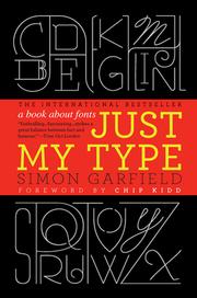
An engaging narrative history of typefaces and the designers behind them; it builds the cultural and historical intuition that helps you understand why certain typefaces feel the way they do.

A concise, scholarly overview of typography's history and theory that consolidates your growing knowledge into a coherent intellectual framework before moving into advanced design territory.
Advanced Craft — Type Design & the Letterform
ExpertUnderstand type from the inside out — how letterforms are constructed, what makes a typeface work as a system, and how professional type designers make decisions — so you can set type with deep, principled confidence.
▸ Study plan for this stage
Pace: 10–12 weeks total. Weeks 1–7: "Fonts & Encodings" by Haralambous (~40–50 pages/day, heavier technical chapters may need re-reading). Weeks 8–12: "The Stroke" by Noordzij (~15–20 pages/day, slow and deliberate — this is a dense philosophical text that rewards re-reading and sketching alongside).
- Font formats and encoding systems (Unicode, TrueType, OpenType, PostScript) and how they shape what a typeface can technically do — from Haralambous
- The distinction between a font (a software object) and a typeface (a design system), and how encoding decisions affect typographic behavior — from Haralambous
- Glyph tables, character mapping, and how OpenType features (ligatures, alternates, small caps) are structured and triggered — from Haralambous
- Hinting, rasterization, and the engineering trade-offs that affect how letterforms render on screen at different resolutions — from Haralambous
- Noordzij's foundational 'stroke theory': all letterforms derive from a single moving tool (the pen/brush), and the nature of that tool's translation or expansion defines the skeleton of every letter
- The two primary stroke models — translation (broad-nib pen, producing contrasting thick/thin strokes) and expansion (pointed pen/brush, producing swelling strokes) — and how they generate fundamentally different type genres
- The concept of the 'ductus': the sequence, direction, and speed of strokes that give a letter its structural logic, and how historical writing tools encode this logic into type design
- Letterform as a system: how consistency of stroke weight, contrast axis, spacing rhythm, and optical compensation across an entire typeface creates visual coherence
- After reading Haralambous, can you explain what Unicode is, why it matters for type design, and how a glyph in an OpenType font is mapped to a code point — and what breaks when that mapping is wrong?
- What is the difference between TrueType hinting and PostScript hinting, and why does it matter for a type designer choosing a font format for a text face intended for screen use?
- Using Noordzij's stroke theory, how would you classify the structural origin of a Venetian oldstyle typeface versus a Didone (modern) typeface — what tool model underlies each, and where is that visible in the letterforms?
- What does Noordzij mean by 'translation' versus 'expansion,' and can you sketch a lowercase 'o' that demonstrates each model clearly?
- How does Noordzij's concept of the ductus help explain why certain typefaces feel 'written' and others feel 'constructed' or 'drawn'?
- Synthesizing both books: if you were designing a new text typeface, how would your understanding of stroke theory (Noordzij) and OpenType feature architecture (Haralambous) together inform decisions about weight contrast, alternate glyphs, and rendering targets?
- Font dissection lab (Haralambous): Open a professional OpenType font (e.g., a well-made text face) in a font editor such as FontForge or Glyphs (trial). Locate the Unicode cmap table, identify at least three OpenType features (e.g., liga, smcp, onum), and document in writing what each feature does and how it is triggered. Cross-reference with Haralambous's technical descriptions.
- Encoding edge-case test (Haralambous): Choose a multilingual text (e.g., a paragraph mixing Latin, Greek, and Cyrillic). Set it in two different fonts — one with full Unicode coverage and one without. Document every rendering failure, missing glyph, or fallback substitution you observe, and explain each failure using Haralambous's encoding framework.
- Stroke-model sketching series (Noordzij): Using a broad-nib calligraphy pen held at a consistent 30–45° angle, write the lowercase alphabet. Then repeat with a pointed flexible nib (or simulate expansion strokes with a pencil). Photograph both sets and annotate where thick and thin strokes fall in each model, explicitly labeling each as 'translation' or 'expansion' in Noordzij's terms.
- Ductus analysis (Noordzij): Select five typefaces spanning different historical periods (e.g., Jenson, Garamond, Baskerville, Bodoni, a geometric sans). For each, draw the lowercase 'n' and 'o' from memory after studying them, then annotate the implied stroke direction, contrast axis angle, and tool model. Write a one-paragraph 'stroke biography' of each typeface.
- Synthesis design brief: Write a one-page type design specification for a hypothetical text typeface. Using Noordzij, define the stroke model, contrast level, and ductus. Using Haralambous, specify the encoding target (Unicode blocks), minimum glyph set, and at least four OpenType features the face will support. Justify every decision in writing.
- Hinting & rendering audit (Haralambous): Set the same word in the same typeface at 9pt, 12pt, 18pt, and 72pt on screen (use a browser or design app). Take screenshots and zoom in to examine rasterization. Write a short analysis of where hinting is visibly active, where it breaks down, and what Haralambous's explanation of the hinting process predicts about what you see.
Next up: Mastering the internal architecture of fonts (Haralambous) and the generative logic of the letterform (Noordzij) gives the reader the principled foundation needed to move into advanced typographic practice — evaluating, selecting, and deploying typefaces not by instinct alone, but with a deep understanding of why a typeface behaves the way it does in composition.
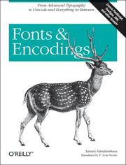
A thorough technical grounding in how fonts actually work as software and data, bridging the gap between visual design and the underlying systems — essential for anyone who wants to move beyond surface-level typesetting.

A foundational and challenging text by one of the great type-design theorists, explaining how all Latin letterforms derive from the stroke of a pen — reading this permanently changes how you see and evaluate type.
Discussion
Keep reading
Paths that share books, cover the same subject, or open a related topic.