Learn UX writing: words that make products work
This curriculum takes a beginner from the core principles of clear, human writing all the way to the strategic and systems-level craft of professional UX writing and content design. Each stage builds on the last: you first develop a writer's instinct for clarity, then learn the specific rules and patterns of UX microcopy, and finally zoom out to think about content as a product design discipline and career.
Foundations: Writing with Clarity & Empathy
BeginnerBuild the core writing instincts — plain language, concision, and reader-first thinking — that underpin all great UX copy before touching product-specific rules.
▸ Study plan for this stage
Pace: 6–7 weeks total: Weeks 1–4 cover "On Writing Well" (~20–25 pages/day, reading key chapters on clarity, clutter, and nonfiction craft); Weeks 5–7 cover "Nicely Said" (~15–20 pages/day, with slower reading to complete the exercises embedded in the book itself).
- Plain language: Zinsser's core argument that clear writing reflects clear thinking — strip every sentence to its cleanest components and remove anything that does not earn its place.
- Clutter as the enemy: Recognizing and cutting the 'official style' — unnecessary jargon, passive voice, redundant phrases, and pompous word choices — as taught throughout 'On Writing Well'.
- The humanity of the writer: Zinsser's insistence that personality and warmth belong in nonfiction writing, and that readers connect with a human voice, not an institutional one.
- Reader-first thinking: 'Nicely Said' frames every writing decision around the reader's needs, context, and emotional state — always asking 'what does this person need right now?'
- Voice and tone as distinct tools: 'Nicely Said' distinguishes a brand's consistent voice (who you are) from tone (how you adapt to a situation), and shows how both serve the reader.
- Concision as respect: Both books converge on the idea that brevity is an act of empathy — respecting the reader's time and cognitive load.
- Inclusive and honest language: 'Nicely Said' introduces the practice of writing for diverse audiences, avoiding assumptions, and choosing words that welcome rather than exclude.
- Editing as the real craft: Both books position rewriting and editing — not first-draft inspiration — as the true discipline that produces great writing.
- After reading 'On Writing Well,' can you identify at least five specific types of clutter Zinsser names, and find an example of each in a piece of writing you encounter this week?
- How does Zinsser define 'the transaction' between writer and reader, and why does he argue that a writer's personality is not optional but essential?
- How do 'Nicely Said' authors Fenton and Kiefer Lee define the difference between voice and tone, and can you describe a real product scenario where the tone would need to shift while the voice stays constant?
- What does 'Nicely Said' mean by 'writing for people first,' and how does that principle change the way you would write an error message or an onboarding screen?
- Both books emphasize editing over first-draft perfection. What is the editing process each book recommends, and where do their approaches overlap?
- How would you apply the plain-language principles from 'On Writing Well' to a piece of UI copy — for example, a button label or a confirmation dialog — that currently uses corporate or technical language?
- Clutter audit: Find a real piece of writing (a company's 'About' page, an app's onboarding flow, or a terms-of-service summary). Rewrite it applying Zinsser's clutter-cutting rules — eliminate every word that does not add meaning. Compare the word counts and read both versions aloud.
- Voice vs. tone matrix: Using the framework from 'Nicely Said,' choose a fictional or real product and write three versions of the same notification message (e.g., 'Your payment failed') — one for a moment of user frustration, one for a celebratory milestone, one for a neutral status update — keeping the voice identical but shifting the tone appropriately.
- The 'So what?' test: Write a short paragraph explaining a feature or product you use daily. After every sentence, ask 'So what does this mean for the reader?' Revise until every sentence answers that question before you have to ask it.
- Read-aloud edit: Write a 150-word piece of UX copy (a welcome email, an empty-state message, or a tooltip). Read it aloud and mark every place you stumble, sound robotic, or feel the urge to skip a word. Revise until it sounds like a knowledgeable, warm human speaking directly to one person.
- Inclusive language pass: Take any three screens of copy from an app you use. Review them through the lens of 'Nicely Said's' inclusive language guidance — flag assumptions about the user's identity, ability, or context, and rewrite the flagged phrases.
- Before-and-after portfolio entry: Combine the skills from both books by taking one complete user flow (sign-up, checkout, or error recovery) from a real product, rewriting every string for clarity, concision, empathy, and consistent voice, and documenting your reasoning for each change in a short annotation.
Next up: Mastering plain language and reader-first empathy through these two books gives you the instinctive writing foundation you need to apply product-specific UX writing rules — such as microcopy patterns, content hierarchies, and interface grammar — without losing the human clarity that makes those rules matter.

The definitive guide to clear, uncluttered nonfiction prose. It trains the beginner's eye to strip out jargon and write with humanity — the single most important habit a UX writer needs.
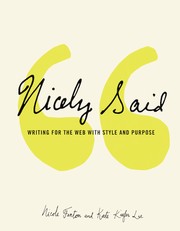
A gentle, practical bridge between general writing craft and writing for the web and products. It introduces voice, tone, and audience-first thinking in an accessible, encouraging way — perfect as a first UX-flavored read.
Core UX Writing: Microcopy & Interface Language
BeginnerLearn the specific vocabulary, patterns, and techniques of UX writing: buttons, error messages, onboarding flows, empty states, and the microcopy that guides users through a product.
▸ Study plan for this stage
Pace: 6–8 weeks total: Weeks 1–4 for "Microcopy" by Kinneret Yifrah (~20–25 pages/day, reading each chapter alongside a live app or website for real-world comparison); Weeks 5–8 for "Writing Is Designing" by Michael J. Metts (~15–20 pages/day, slower pace to absorb the design-systems and collaboration fra
- Microcopy as a functional UX tool — Yifrah's core argument that every word in an interface is a design decision that affects behavior, trust, and conversion
- The anatomy of microcopy touchpoints: buttons/CTAs, error messages, placeholder text, tooltips, confirmation dialogs, and empty states — and the distinct job each one does
- Voice & tone calibration — how Yifrah distinguishes a product's fixed 'voice' from the situational 'tone' that must shift (e.g., celebratory onboarding vs. empathetic error states)
- Error message best practices — Yifrah's framework: acknowledge the problem, explain it in plain language, and give the user a clear next action (no blame, no jargon)
- Onboarding microcopy — writing copy that reduces friction, sets expectations, and delivers the product's value proposition within the first few screens
- Words as interface elements — Metts's argument that writers are designers: labels, headings, and link text are not decoration but navigation and wayfinding tools
- Content-first design and the writer's role in the design process — Metts's case for embedding writing into wireframing and prototyping, not bolting it on at the end
- Empty states as opportunity — treating zero-data screens not as failures but as moments to educate, motivate, or delight the user (covered across both books)
- According to Yifrah, what are the three components a well-written error message must always include, and why does assigning blame to the user undermine trust?
- How does Yifrah define the difference between 'voice' and 'tone,' and can you give a concrete example of the same product voice expressed in two different tones?
- What does Metts mean when he says 'writing is designing,' and how does that reframe the UX writer's seat at the table during product development?
- Using principles from both books, how would you rewrite a generic 'Something went wrong. Please try again.' error message for a mobile banking app?
- What makes an empty state a missed opportunity, and what elements — drawn from Yifrah's microcopy patterns — should a well-crafted empty state include?
- How do button labels and CTAs function as wayfinding tools according to Metts, and what distinguishes a weak CTA (e.g., 'Submit') from a strong one?
- **Microcopy Audit (Yifrah):** Choose any app you use daily. Screenshot 10 microcopy moments (buttons, errors, empty states, tooltips). Score each one against Yifrah's criteria — clarity, tone, actionability — and rewrite any that fall short.
- **Error Message Rewrite Sprint (Yifrah):** Collect 5 real error messages from apps or websites. Apply Yifrah's three-part framework (acknowledge → explain → direct) to rewrite each one, then read them aloud to check for human-sounding language.
- **Onboarding Flow Teardown (Yifrah):** Sign up for a free product you haven't used before (e.g., a productivity or finance app). Document every piece of copy in the onboarding flow. Annotate what each line is doing (setting expectations, reducing anxiety, celebrating progress) and identify one moment where the copy fails the user.
- **Content-First Wireframe (Metts):** Pick a simple feature (e.g., a password-reset flow). Before touching any visual tool, write all the copy first — headings, body text, button labels, error states — in a plain text document. Then sketch a rough wireframe around your words, not the other way around.
- **Empty State Design (Both books):** Design the copy for three empty states for a fictional recipe-saving app: (1) brand-new user, no saved recipes; (2) user's search returns no results; (3) user deleted all recipes. Write headline, body, and CTA for each, applying Yifrah's tone guidance and Metts's principle that words are wayfinding.
- **Voice & Tone Card (Yifrah + Metts):** Create a one-page 'voice and tone' reference card for a fictional product of your choice. Define 3–4 voice attributes, show a 'we are / we are not' contrast for each, and write sample microcopy for a success state, an error state, and an empty state that demonstrates the voice in action.
Next up: Mastering the patterns and vocabulary of individual microcopy moments — buttons, errors, onboarding, empty states — builds the sentence-level fluency needed to tackle the next stage, where those moments must be orchestrated into coherent content systems, style guides, and cross-functional design workflows at scale.

The most thorough and practical handbook on interface microcopy. It covers every UI element — from CTAs to error messages — with real examples, making it the essential reference for this stage.

Argues convincingly that words are a design material, not an afterthought. Reading this after Yifrah deepens your understanding of how copy and UI design decisions are inseparable.
Voice, Tone & Content Strategy
IntermediateMove beyond individual UI strings to think systematically about brand voice, tone of voice across contexts, and how content decisions are made at a product or organization level.
▸ Study plan for this stage
Pace: 8–10 weeks total, reading ~25–35 pages per day on weekdays with weekends reserved for exercises and reflection. Week 1–3: "Letting Go of the Words" (Redish) — focus on web writing principles and reader-centered content. Week 4–6: "Strategic Writing for UX" (Podmajersky) — focus on voice, tone, and t
- Reader-centered writing: Redish's core argument that every content decision should start with who the reader is, what they need, and what they will do with the information — not what the organization wants to say.
- Conversation as metaphor: Redish's framing of web content as a conversation between site and visitor, which directly seeds the idea that brand voice is a consistent 'personality' in that conversation.
- Voice vs. Tone distinction: Podmajersky's precise separation of voice (the stable character of the brand) from tone (the contextual modulation of that character depending on user emotion, task urgency, and channel).
- The UX writing system: Podmajersky's framework for creating reusable, scalable content — voice charts, tone maps, and product-level content principles that govern individual string decisions.
- Strategic content decisions: Kissane's argument that content strategy is the practice of deciding what content to create, for whom, why, and how it will be maintained — not just how it is written.
- Content as a product: Kissane's concept that content has a lifecycle (creation, publication, governance, removal) and must be treated with the same rigor as any product feature.
- Appropriate content: Kissane's four-part test — content should be right for the user, right for the context, right for the business, and right for the medium.
- Governance and editorial thinking: Kissane's emphasis that sustainable content quality requires defined ownership, editorial standards, and ongoing stewardship — connecting individual UX writing decisions to organizational systems.
- After reading Redish, can you articulate the difference between writing 'for' users and writing 'with' users in mind — and give a concrete example from a product you use daily?
- Using Podmajersky's framework, how would you write a voice chart for a hypothetical fintech app? What three to five adjectives define its voice, and how does the tone shift between an error state and a celebratory onboarding moment?
- Podmajersky introduces the idea of 'strategic writing' as distinct from tactical copywriting. In your own words, what makes a content decision 'strategic,' and what organizational conditions make that possible?
- Kissane argues that content strategy is not the same as content marketing or UX writing. Where do the boundaries lie, and how do all three disciplines need to collaborate on a single product?
- How do Redish's reader-centered principles and Kissane's 'appropriate content' framework reinforce each other — and where, if anywhere, do they create tension?
- If you were onboarding a new UX writer onto a product team, which specific tools or artifacts from these three books (e.g., voice charts, tone maps, content principles, editorial standards) would you prioritize, and why?
- Voice chart workshop (Podmajersky): Choose a real or fictional product. Draft a one-page voice chart with 3–5 voice attributes, a 'we are / we are not' column for each, and two example UI strings that demonstrate each attribute — one in a neutral task flow and one in a high-stakes error or failure state.
- Tone mapping (Podmajersky + Redish): Map five distinct in-product moments (e.g., empty state, first-time onboarding, destructive action confirmation, success, system error) on a 2×2 grid of user emotional state vs. task urgency. Write a short string for each cell, then annotate how the tone shifts while the voice stays constant.
- Content audit with Kissane's 'appropriate content' lens: Take 10–15 screens from a real app (screenshots work). For each screen, score the content against Kissane's four criteria (right user, right context, right business goal, right medium). Write a one-paragraph recommendation for the two lowest-scoring screens.
- Reader persona + conversation script (Redish): Write a 'conversation script' as Redish describes — a back-and-forth dialogue between a user persona and a product's content — for a three-step checkout flow. Then rewrite the actual UI copy to match the natural language revealed in the script.
- Content principles document: Draft a one-page set of 4–6 content principles for a product of your choice, modeled on Podmajersky's structure. Each principle should have a name, a one-sentence definition, a 'do' example, and a 'don't' example drawn from real or plausible UI copy.
- Editorial standards mini-brief (Kissane): Write a one-page editorial brief for a hypothetical product blog or in-app notification system. Include: intended audience, voice and tone guidelines (referencing your voice chart), content lifecycle (who creates, reviews, publishes, and retires content), and one governance rule for when content must be reviewed.
Next up: By the end of this stage the reader can articulate brand voice, modulate tone systematically, and situate individual writing decisions within an organizational content strategy — which creates the foundation needed to study UX research methods, usability testing of content, and data-informed iteration in the next stage.
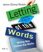
A landmark book on writing for the web with deep attention to how users actually read (they don't). It builds the research-backed mental model of user behavior that informs every content decision.

Introduces the concept of voice charts, UX writing patterns, and how to make content decisions strategically within a product team — a natural next step once you can write good microcopy.
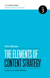
A concise, canonical primer on content strategy that gives UX writers the broader vocabulary and frameworks needed to advocate for content at a systems level.
Design Thinking & Collaboration
IntermediateUnderstand the UX design process holistically so you can collaborate effectively with designers, researchers, and product managers — and embed writing into the design workflow from day one.
▸ Study plan for this stage
Pace: 4–5 weeks total: Week 1–2 — "The Psychology of Everyday Things" (~25–30 pages/day, including reflection time); Week 3–4 — "Don't Make Me Think" (~40–50 pages/day, it's a faster read); Week 5 — integration week: revisit highlights, complete exercises, and synthesize cross-book insights.
- Affordances & Signifiers (Norman): Objects and interfaces must signal how they are meant to be used — UX writers create verbal signifiers (labels, CTAs, tooltips) that guide action just as physical design does.
- Conceptual Models (Norman): Users build mental models of how a system works; writing must align with and reinforce the user's model, not the engineer's implementation model.
- Feedback & Mapping (Norman): Every user action deserves a clear system response; microcopy (error messages, confirmations, status updates) is the primary vehicle for feedback in digital products.
- Human Error as Design Failure (Norman): When users make mistakes, the design — including the words — is usually at fault; this reframes copy critique as a systemic, not personal, issue.
- Satisficing & Scanning (Krug): Users don't read — they scan and grab the first reasonable option; UX writing must be ruthlessly prioritized, chunked, and front-loaded with meaning.
- The Billboard Test (Krug): Every page/screen should communicate its purpose in a glance; headlines, labels, and hierarchy do the heavy lifting before a user reads a single sentence.
- Eliminating Question Marks (Krug): Good UX writing removes cognitive friction — every word that makes a user pause to think is a word that should be rewritten or cut.
- Collaboration Touchpoints: Both books implicitly map to design-process stages (research → ideation → prototyping → testing); understanding this lets writers insert copy at the right moment rather than at the end.
- After reading Norman, can you explain in plain language what an 'affordance' is — and give three examples of how UX copy acts as a verbal affordance in a digital product?
- Norman argues that most human error is design error. How does this principle change the way you would write and advocate for error messages in a product team meeting?
- Krug says users satisfice rather than optimize. What are the concrete implications for how long your button labels, navigation items, and onboarding instructions should be?
- How do Norman's concept of 'feedback' and Krug's 'billboard test' complement each other when you are writing a loading state or an empty-state screen?
- Both authors address the gap between how designers/writers think a product works and how users actually experience it. What collaborative practices would you put in place — drawing from both books — to close that gap?
- Krug recommends 'getting rid of half the words on every page, then getting rid of half of what's left.' Pick a real UI screen you use daily: which words survive that test, and which don't?
- Affordance Audit: Choose three apps you use daily. Screenshot five screens each and annotate every piece of copy that acts as a signifier or affordance (buttons, labels, placeholders, tooltips). Note where the copy clarifies or contradicts the visual design — bring findings to a peer or mentor for discussion.
- Mental Model Mapping: Pick one product flow (e.g., checkout, sign-up, file upload). Write out the conceptual model a first-time user likely has, then map each piece of existing copy to either 'supports the model' or 'breaks the model.' Rewrite the breaking instances.
- Error Message Rewrite Sprint: Collect 10 real error messages from apps or websites. Apply Norman's 'design failure' lens: rewrite each one to (a) explain what happened, (b) tell the user what to do next, and (c) avoid blame. Compare before/after with a colleague.
- Krug's Halving Exercise: Take a real or sample onboarding screen with at least 100 words of copy. Apply Krug's rule — cut 50%, then cut 50% again. Read both versions aloud. Document what was lost (if anything) and what improved.
- Billboard Test Role-Play: Pair with a designer or fellow learner. Show each other a new screen for exactly 5 seconds, then hide it. Each person writes down: what the screen is for, what the main action is, and one thing that confused them. Use the gaps to rewrite headlines and primary CTAs.
- Design-Process Integration Map: Draw a simple double-diamond or agile sprint diagram. For each phase (Discover, Define, Develop, Deliver), list at least two specific writing contributions you could make — grounded in concepts from Norman and Krug — and one question you would ask the designer or PM at that stage.
Next up: Mastering how users think and how design teams work gives you the foundation to move into voice, tone, and content strategy — the next stage where you'll learn to translate these cognitive and collaborative principles into a consistent, scalable writing system for real products.

The foundational text of UX design thinking. Reading it gives UX writers a shared language with designers and a deep intuition for affordances, feedback, and mental models that directly shape copy decisions.

A fast, practical read on web usability that reinforces why clarity and brevity in copy are non-negotiable, and introduces lightweight usability testing methods UX writers can use themselves.
Advanced Craft & Professional Practice
ExpertDevelop a sophisticated, systems-level perspective on content design — including accessibility, inclusive language, style guides, and how to build and lead a UX writing practice.
▸ Study plan for this stage
Pace: 6–8 weeks total: Weeks 1–4 on "Content Design" by Sarah Richards (~20–25 pages/day, including reflection time); Weeks 5–8 on "Conversational Design" by Erika Hall (~15–20 pages/day, given its denser conceptual density). Reserve the final 3–4 days of each book for review, synthesis, and completing ex
- Content design as a discipline distinct from copywriting or UX writing alone — Richards' argument that content should be shaped by user needs and evidence, not organizational preference
- The 'content design process': research, discovery, and iterative content development rooted in data (search terms, analytics, user research) rather than assumptions
- Plain language and readability as strategic tools, not stylistic preferences — including how cognitive load, reading age, and sentence structure affect comprehension and trust
- Style guides and content standards as living systems — how to build, maintain, and socialize them across an organization to ensure consistency at scale
- Inclusive and accessible language: designing content that works for users with disabilities, varied literacy levels, and diverse cultural backgrounds
- Erika Hall's framing of conversation as the foundational model for all human-computer interaction — and why designing dialogue requires understanding turn-taking, intent, and context
- The anatomy of conversational interfaces: prompts, responses, error handling, and how voice/chatbot design demands the same rigor as visual UX writing
- Building and leading a UX writing or content design practice: advocating for the discipline, defining roles, embedding content strategy into product teams, and measuring content quality
- According to Sarah Richards, what is the core difference between content design and traditional copywriting, and why does that distinction matter for product teams?
- How does Richards recommend using data (e.g., search queries, call center logs, analytics) to inform content decisions, and what does this process look like in practice?
- What are the key principles Richards outlines for building an organizational style guide, and how should it evolve over time?
- In Erika Hall's framework, why is conversation the right mental model for designing digital interactions — and what are the risks of applying it poorly?
- What does Hall identify as the critical differences between designing for voice interfaces versus text-based conversational UI, and how should those differences shape your writing decisions?
- How do the two books together inform what it means to lead a content design practice — what responsibilities, skills, and organizational strategies do Richards and Hall each emphasize?
- Conduct a content audit of a real or sample product (app, website, or government service): evaluate 10–15 screens or pages against Richards' content design principles — flag jargon, passive constructions, content that serves the org rather than the user, and accessibility gaps. Write a one-page findings report.
- Using Richards' data-driven approach, gather three real signals (e.g., Google Autocomplete queries, Reddit threads, or app store reviews) for a product of your choice. Draft or rewrite a key piece of content (onboarding copy, error message, FAQ) based solely on the language and intent patterns you find.
- Draft a one-page content style guide for a fictional or real product, including: voice and tone guidelines, plain language rules, inclusive language standards, and at least one 'do/don't' example per rule. Then write a short 'how to use this guide' intro aimed at engineers and designers who are not writers.
- Using Hall's conversational design framework, map out a complete dialogue flow for a simple task (e.g., resetting a password via a chatbot, or a voice assistant booking a reminder). Write every turn: the system prompt, the ideal user response, two edge-case responses, and the error/recovery messages. Annotate each turn with your design rationale.
- Write a 1–2 page 'content design practice pitch' as if you are presenting to a VP of Product at a mid-size tech company. Draw on both Richards (why content design is a discipline) and Hall (why conversational and systems thinking matters) to make the case for hiring or expanding a content design team. Include proposed success metrics.
- Perform an accessibility review of a piece of conversational UI (a chatbot transcript, a voice assistant interaction, or a form flow). Evaluate it against at least four criteria: reading level, error message clarity, inclusive language, and screen-reader/voice compatibility. Rewrite the most problematic sections and explain your changes.
Next up: Mastering systems-level content design and conversational principles here equips the reader with the professional and strategic fluency needed to tackle portfolio development, cross-functional leadership, and specialized domains (such as AI content, localization, or content ops) in any subsequent advanced stage.

Written by the creator of the GOV.UK content design methodology, this book defines the discipline at its most rigorous — evidence-based, user-research-driven, and deeply practical for senior practitioners.

Expands the UX writer's toolkit into voice interfaces and conversational UI, and reframes all interface writing as a form of conversation — a perspective that sharpens craft at the highest level.
Discussion
Keep reading
Paths that share books, cover the same subject, or open a related topic.