Interior design: rooms you'll love
This curriculum takes you from the universal grammar of good design — space, light, color, proportion — through developing a personal style, and finally into the professional-level thinking that makes rooms both beautiful and truly livable. Each stage builds the vocabulary and eye needed for the next, so that by the end you are designing with intention rather than guessing.
Foundations: The Language of Space
BeginnerUnderstand the core principles — proportion, scale, light, color, and flow — that underpin every well-designed room, and build the vocabulary to talk and think about design clearly.
▸ Study plan for this stage
Pace: 8–10 weeks total, reading roughly 20–25 pages per day. Week 1–3: "The Decoration of Houses" (read slowly; it's dense and architectural — take notes on every principle Wharton names). Week 4–6: "Elements of Style" (faster, more visual — read alongside a sketchbook and flag every room example). Week 7
- Proportion and scale as the skeleton of a room — Wharton's argument that architecture and decoration are inseparable, and that getting the bones right (ceiling height, doorway width, room volume) determines everything else
- The hierarchy of elements: Wharton's insistence that walls, floors, and ceilings must be resolved before furniture or ornament is introduced — decoration serves architecture, never the other way around
- Restraint and 'suitability' — Wharton's three governing tests (fitness, proportion, harmony) as a timeless editing framework for any design decision
- Personal narrative in design — Gates's principle that a well-designed home tells the story of the people who live in it, making authenticity and curation more important than trend-following
- The design vocabulary toolkit — color, pattern, texture, light, and layering as the practical tools Gates uses to translate Wharton's classical principles into livable, modern rooms
- The psychology of space — Gallagher's evidence-based argument in 'House Thinking' that rooms shape mood, behavior, and identity, grounding aesthetic choices in human neuroscience and anthropology
- Flow and threshold — how the sequence of rooms (entry → living → private spaces) creates an emotional journey, explored by both Wharton (in terms of enfilade and proportion) and Gallagher (in terms of psychological transition)
- Light as a living material — treated by all three authors as the single most transformative element, from Wharton's classical window placement to Gates's layered artificial lighting to Gallagher's research on how natural light affects well-being
- According to Wharton in 'The Decoration of Houses,' why must architectural decisions always precede decorative ones, and can you give two specific examples she uses to illustrate this hierarchy?
- Gates organizes 'Elements of Style' around the idea that design should reflect personal identity. How does she reconcile this with objective principles like scale and proportion — where does personal taste end and universal principle begin?
- Gallagher argues in 'House Thinking' that each room in a home serves a distinct psychological function. Choose two rooms she analyzes and explain how their design features either support or undermine that function.
- How do all three authors treat natural light differently — what does each one emphasize, and taken together, what complete picture of light's role in interior design do they form?
- Wharton writes for a formal, early-20th-century context; Gates writes for a contemporary audience. Identify one principle from Wharton that Gates explicitly modernizes or reinterprets, and evaluate whether the core idea survives the translation.
- After reading all three books, how would you define 'flow' in an interior space? Draw on at least two of the books to support your definition.
- 'Bones audit': Choose one room in your home or a room from a magazine. Apply Wharton's three tests — fitness, proportion, and harmony — in writing. Identify what passes, what fails, and what single architectural change would have the greatest impact.
- Vocabulary flashcard deck: As you read Gates's 'Elements of Style,' write down every design term she uses (e.g., layering, grounding, negative space, vignette). Create a flashcard for each with her definition on one side and a hand-drawn or clipped visual example on the other. Aim for at least 30 cards.
- Light diary: For one full week, photograph the same room or corner of a room at four different times of day (morning, noon, late afternoon, evening). Write two sentences per photo describing how the light changes the mood and apparent scale of the space, connecting your observations to Gallagher's findings in 'House Thinking.'
- Room psychology map: After finishing 'House Thinking,' draw a simple floor plan of a home (yours, a friend's, or an imagined one). Annotate each room with: (a) its intended psychological function per Gallagher, (b) one design feature that supports that function, and (c) one change — drawn from Wharton's or Gates's principles — that would strengthen it.
- Curated mood board with a thesis: Create a mood board (physical or digital) for a single room. Then write a one-paragraph 'design statement' that explains every choice using the vocabulary from all three books — at least one concept from Wharton, one from Gates, and one from Gallagher must be explicitly named and applied.
- Comparative close-reading: Find one full-page room photograph in 'Elements of Style' and write a 300-word analysis of it using Wharton's classical principles as your critical lens. Then add a final paragraph asking: what does Gallagher's psychology of space add to your reading of this room that neither Wharton nor Gates explicitly addresses?
Next up: Mastering the foundational language of space — its principles, vocabulary, and psychological underpinnings — equips the reader to move from understanding what makes a room work in the abstract to studying how specific styles, historical periods, and material choices have applied (and broken) those principles across time and culture.

The foundational text of modern interior design, it establishes the primacy of architecture, proportion, and purpose over mere decoration — essential first principles every beginner needs before touching a paint chip.

A warm, accessible modern guide that translates classic principles into practical room-by-room advice, bridging Wharton's theory to real-life decision-making for today's homes.
Explores the psychology of how rooms affect mood and behavior, giving you the 'why' behind design choices and building intuition for livability alongside beauty.
Color, Light & Material: Training Your Eye
BeginnerDevelop a confident, working understanding of color theory, natural and artificial light, texture, and pattern so you can make deliberate, cohesive choices rather than reactive ones.
▸ Study plan for this stage
Pace: 6–8 weeks total. Week 1–4: "Interaction of Color" by Josef Albers — read slowly, ~10–15 pages/day, pausing frequently to do the color exercises Albers prescribes directly in the text. Week 5–8: "The Secret Lives of Colour" by Kassia St. Clair — read at a more relaxed pace, ~20–25 pages/day, treating
- Color relativity: how any color is transformed by the colors surrounding it (the core lesson of Albers — no color exists in isolation)
- Simultaneous and successive contrast: why adjacent colors appear to shift in hue, value, and saturation depending on their neighbors
- Value and saturation as design levers: understanding lightness/darkness and intensity as tools separate from hue itself
- Color temperature and its spatial effects: warm colors advance, cool colors recede — a foundational principle for manipulating perceived room size and depth
- The cultural, historical, and psychological 'life' of individual colors: how pigment availability, trade, class, and symbolism shaped the meaning of colors we use today (St. Clair)
- Natural vs. artificial light interaction with color: how the same paint chip reads differently under incandescent, fluorescent, and daylight — implied throughout Albers and made vivid through St. Clair's historical dye and pigment stories
- Texture and surface finish as color modifiers: matte vs. gloss, rough vs. smooth surfaces absorb and reflect light differently, altering perceived color
- Building a deliberate color palette: moving from reactive 'I like that' choices to intentional, relationship-based selections grounded in contrast, harmony, and context
- After reading Albers, can you explain why the same gray square looks like two different colors when placed on a white background versus a black background — and what this means when choosing a wall color for a room with dark furniture?
- What does Albers mean when he says 'color deceives continuously,' and how should this change the way you evaluate paint swatches or fabric samples in a store versus in your actual space?
- Using St. Clair's historical lens, why did certain colors (e.g., Tyrian purple, Prussian blue, or lead white) carry such strong social and emotional weight — and how does that inherited symbolism still influence interior design trends today?
- How do simultaneous contrast and color temperature together explain why a 'neutral' beige can feel pink in one room and yellow in another?
- What is the difference between a color harmony built on contrast (complementary) versus one built on proximity (analogous), and when would you deliberately choose each in an interior scheme?
- How does St. Clair's account of pigment scarcity and material origin deepen your appreciation for the role of texture and material finish alongside pure hue in a designed space?
- The Albers 'one color looks like two' exercise: Cut two identical 2-inch squares from a single paint chip or colored paper. Place one on a white sheet and one on a dark sheet. Observe and write down exactly how they differ — this trains your eye to see color relationally, not absolutely.
- Room audit under different light: Pick one room in your home. Observe a single colored surface (wall, cushion, rug) at three times of day (morning, midday, evening) and under artificial light at night. Photograph each and write a one-paragraph description of how the color shifts — connecting this to Albers' relativity principle.
- St. Clair color biography: Choose five colors from 'The Secret Lives of Colour' that surprise or move you. For each, write two sentences: (1) what you learned about its history/origin, and (2) how that knowledge would influence your decision to use it in a specific room type (bedroom, kitchen, hallway, etc.).
- Build a contrast study board: Using paint chips, magazine clippings, or digital swatches, create three small collages — one demonstrating simultaneous contrast (a color that looks different on two backgrounds), one showing a complementary palette, and one showing an analogous palette. Label each with the Albers concept it illustrates.
- Material + color interaction test: Gather three swatches of the same or very similar color in different finishes or textures (e.g., matte paint chip, glossy paper, rough fabric). Place them side by side in natural light and again under a lamp. Write observations on how finish and texture alter perceived color — bridging Albers' theory to real material choices.
- Deliberate palette proposal: Using everything from both books, propose a three-color palette for a real or imagined living room. Write a one-page rationale explaining: the dominant/secondary/accent color relationships (Albers), the cultural or emotional resonance of each color (St. Clair), and how the palette will behave under the room's primary light source.
Next up: Mastering how color, light, and material interact at the perceptual and cultural level gives you the critical eye needed to move into space planning and furniture arrangement — where those same colors, textures, and light sources must now be orchestrated across three-dimensional volume, scale, and proportion.
The definitive training tool for seeing color relationally rather than in isolation — doing the exercises here permanently sharpens your eye for how colors behave in a room.
Builds rich cultural and historical context around individual colors, making your palette choices more intentional and meaningful after Albers has trained your perception.
Style & Composition: Finding Your Voice
IntermediateLearn how to identify, articulate, and develop a personal design style, and understand how furniture arrangement, layering, and curation create rooms with character and coherence.
▸ Study plan for this stage
Pace: 8–10 weeks total, reading roughly 20–25 pages per day. Week 1–3: "Homebody" by Joanna Gaines (use the style quizzes and room walkthroughs slowly — journal alongside each chapter). Week 4–6: "The Perfectly Imperfect Home" by Deborah Needleman (read one object/concept entry per sitting, pausing to obs
- Personal style archaeology: Using Gaines' guided self-reflection process in 'Homebody' to excavate influences, memories, and instincts that form the foundation of an authentic design voice
- Style vocabulary and typology: Learning to name and distinguish design styles (farmhouse, collected, modern, etc.) as frameworks for communication, not rigid boxes, as modeled throughout 'Homebody'
- The beauty of imperfection and 'enoughness': Needleman's philosophy in 'The Perfectly Imperfect Home' that character comes from patina, quirk, and restraint — not perfection or completeness
- Object curation and meaning-making: How Needleman frames individual objects (a lamp, a chair, a rug) as carriers of story and personality, and how selective editing defines a room's soul
- The principles of styling as a skill: Henderson's systematic breakdown in 'Styled' of how vignettes, tablescapes, and shelves are composed using balance, height variation, texture, and color
- Layering as a compositional strategy: Building a room in layers — architecture, large furniture, rugs, lighting, soft goods, and objects — as taught through Henderson's step-by-step styling sequences
- Cohesion vs. matchy-matchy: The distinction between rooms that feel intentionally unified and those that feel sterile or over-coordinated, a tension explored across all three books
- Editing and restraint: The discipline of removing rather than adding — a recurring lesson from Needleman's object essays and Henderson's 'before and after' styling transformations
- After working through Gaines' style-discovery process in 'Homebody,' can you write a clear, specific paragraph describing your own design style — including at least three concrete influences or reference points that shaped it?
- How does Needleman's concept of the 'perfectly imperfect' challenge conventional ideas of a 'finished' room, and can you identify two or three objects in your own home that carry the kind of personal meaning she describes?
- Using Henderson's framework from 'Styled,' can you name and apply at least four compositional principles (e.g., the rule of odds, height variation, texture contrast, anchoring) to critique or improve a real vignette or shelf in your space?
- How do all three authors approach the tension between personal authenticity and design rules — where do Gaines, Needleman, and Henderson agree, and where do their philosophies diverge?
- What is the difference between a room that is 'layered' and one that is merely 'cluttered,' and how do Henderson's styling sequences help you understand where that line is?
- How does curation — the act of choosing what to leave out — function as a design tool across 'The Perfectly Imperfect Home' and 'Styled,' and what criteria can you now use to make editing decisions in your own space?
- Style Mood Board Sprint (tied to 'Homebody'): Complete Gaines' style-discovery prompts, then build a physical or digital mood board of 15–20 images that feel instinctively 'right' to you. Write a 200-word style statement beneath it — no design jargon allowed, only personal language.
- Object Biography Exercise (tied to 'The Perfectly Imperfect Home'): Choose 5 objects currently in your home. For each, write 3–4 sentences in Needleman's spirit: where it came from, what it means, and why it earns its place. Then identify 3 objects that fail this test and remove them.
- Vignette Lab (tied to 'Styled'): Select one surface in your home (a shelf, coffee table, or console). Using Henderson's layering and compositional principles, style it three different ways, photographing each attempt. Compare the photos and write one sentence identifying what works and what doesn't in each version.
- Room Layer Audit: Draw a simple floor plan of one room and annotate it by layer (architecture → large furniture → rug → lighting → soft goods → objects). Identify which layers feel strong and which feel underdeveloped, using vocabulary from all three books.
- Style Comparison Analysis: Find photos of three real rooms online that represent three different named styles. Write a one-paragraph analysis of each using concepts from 'Homebody' (style identity), 'The Perfectly Imperfect Home' (character and curation), and 'Styled' (composition and layering).
- Before-and-After Styling Challenge (tied to 'Styled'): Pick one 'problem' corner or surface in your home. Photograph it as-is, then apply Henderson's editing and styling process. Photograph the result. Reflect in writing on which specific techniques created the biggest improvement.
Next up: Mastering personal style and compositional layering creates the discerning eye and confident vocabulary needed to tackle the next stage's focus on color, pattern, and material selection — where the 'what feels right' instinct developed here must be translated into deliberate, technical choices.

A practical style-discovery guide that walks you through identifying what you love and translating it into a cohesive home — ideal for moving from principles to personal expression.

Teaches the art of layering objects, furniture, and art with personality and ease, showing how 'collected' rooms are composed rather than simply purchased.

A highly visual, step-by-step guide to styling and arranging objects and furniture within a room — the practical complement to Needleman's more philosophical approach.
Space Planning & Proportion: Designing Like a Pro
IntermediateMaster the spatial and architectural thinking professionals use — floor plans, furniture scale, traffic flow, and the relationship between rooms — so every design decision is grounded in how the space actually works.
▸ Study plan for this stage
Pace: 8–10 weeks total. Weeks 1–6: "Interior Design Illustrated" by Ching (~20–25 pages/day, 4–5 days/week), paying close attention to all diagrams and redrawing key figures by hand. Weeks 7–10: "The Interior Design Reference + Specification Book" by Grimley (~15–20 pages/day, 4–5 days/week), using it as
- Architectural drawing conventions — plans, sections, elevations, and axonometric views — as taught through Ching's visual language, and how to read and sketch them accurately
- The three-dimensional relationship between floor, wall, and ceiling planes and how their proportions shape perceived space (Ching's 'Primary Elements' and 'Form' chapters)
- Human scale and anthropometrics: using the body as the fundamental unit of measure for furniture sizing, clearance distances, and room dimensioning
- Traffic flow and circulation hierarchy — primary vs. secondary paths, door swing radii, and how movement patterns dictate furniture placement
- Furniture scale and grouping: understanding scale relationships between pieces, negative space, and how arrangements define activity zones within a room
- The principle of proportion systems (golden section, modular grids, regulating lines) and how Ching applies them to interior composition
- Room-to-room relationships: adjacency planning, spatial sequence, borrowed light, and how individual rooms function as part of a whole floor plan
- Specification and code literacy from Grimley: standard dimensions, clearances, accessibility requirements (ADA), and how professional specs translate design intent into buildable reality
- After studying Ching, can you read a floor plan and immediately identify primary circulation paths, furniture zones, and potential pinch points — and explain your reasoning using the spatial principles he illustrates?
- How do the proportions of a room (ceiling height relative to floor area) psychologically and functionally affect the design choices you make inside it, according to Ching's treatment of form and space?
- Using the anthropometric and clearance standards presented in Grimley's reference book, how would you evaluate whether a given furniture layout meets minimum functional and accessibility requirements?
- What is the difference between a section drawing and an elevation, and why does Ching argue that designers must think in both simultaneously rather than treating the floor plan as the sole design document?
- How do adjacency and spatial sequence — the order in which a person moves through rooms — influence design decisions such as sight lines, threshold treatments, and lighting, as discussed across both books?
- How does Grimley's specification framework translate the proportional and spatial ideas from Ching's illustrated principles into the measurable, codified language that contractors and clients actually use?
- Floor Plan Audit: Obtain or sketch the floor plan of your own home or a publicly available residential plan. Using Ching's circulation principles, draw overlay arrows showing primary and secondary traffic flow, then identify at least three layout problems and propose furniture rearrangements that solve them.
- Proportion Redraw: Select any three room diagrams from 'Interior Design Illustrated' and redraw them freehand at a different scale, then annotate each with the proportion relationships Ching highlights — practice until your eye can spot a 'correct' vs. 'off' proportion without measuring.
- Scale Furniture Cut-Outs: At 1/4" = 1'-0" scale, draw and cut out paper templates of your key furniture pieces (sofa, bed, dining table, chairs). Arrange them on a scaled floor plan of a real or invented room, testing at least four different layouts and evaluating each against Grimley's clearance minimums.
- Section Drawing Exercise: Pick one room from your floor plan audit and draw a full section cut through it (as Ching demonstrates), showing ceiling height, window head heights, and furniture silhouettes in true scale. Annotate it with the Grimley-sourced dimensions that govern each element.
- Adjacency Matrix: For a hypothetical 3-bedroom apartment, create a bubble diagram and then a formal adjacency matrix (a tool Grimley references) ranking how strongly each room needs to connect to every other. Use it to generate two alternative floor plan sketches and compare them.
- Specification Checklist: Using Grimley's reference tables, build a one-page 'Space Planning Checklist' for a living room — listing every critical dimension (seating clearance, TV distance, pathway width, ADA turning radius) — then apply it to audit a layout found in a design magazine, noting every violation or success.
Next up: Mastering how space is planned, proportioned, and specified creates the neutral, functional canvas that the next stage will bring to life — because once you know a room works, you are ready to learn how light, color, material, and atmosphere transform it from correct to compelling.
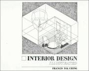
The most rigorous and widely used visual reference for spatial thinking, proportion, and the architectural elements of interiors — this is where design intuition becomes structured knowledge.

A comprehensive professional reference covering dimensions, materials, lighting standards, and specifications — read after Ching to ground your spatial ideas in real-world constraints.
Mastery: Synthesis, Livability & Lasting Beauty
ExpertSynthesize everything into a holistic design philosophy — understanding how great designers think, how timelessness is achieved, and how to make rooms that are genuinely, deeply livable for the people in them.
▸ Study plan for this stage
Pace: 3–4 weeks, ~20–25 pages/day — De Botton's essays are philosophically dense and reward slow, reflective reading; plan for re-reading key chapters and journaling between sessions
- The psychological relationship between architecture/interiors and human happiness — how spaces shape mood, identity, and sense of self
- The idea that buildings and rooms 'speak' a visual language: proportion, material, ornament, and color as moral and emotional vocabulary
- Timelessness vs. fashion: De Botton's argument that enduring design reflects deep human needs rather than fleeting cultural trends
- The tension between the ideal and the real — why we project our longing for virtue, order, and beauty onto physical spaces
- Functionalism vs. beauty: why utility alone is insufficient and how aesthetic experience is itself a human need
- The concept of 'self-expression through space' — how a room can be an honest or dishonest portrait of its inhabitant
- Humility in design: the danger of ego-driven spaces and the value of designing for genuine human livability over spectacle
- Synthesis thinking — how a master designer holds structure, beauty, comfort, identity, and emotion in balance simultaneously
- According to De Botton, in what specific ways do the spaces we inhabit influence our psychological states, self-perception, and even our aspirations — and what does this mean for how you approach a design brief?
- What does De Botton mean when he says architecture 'speaks,' and how can you apply that idea of visual language to decisions about furniture scale, material texture, and color palette in a real room?
- How does De Botton distinguish between timeless design and merely fashionable design, and what criteria would you use to evaluate whether a design choice you are making is one or the other?
- De Botton argues that we project idealized virtues onto spaces we admire. How should an interior designer use this insight to create rooms that feel genuinely meaningful to their specific inhabitants rather than generically aspirational?
- How has reading The Architecture of Happiness changed or deepened your personal design philosophy, and can you articulate that philosophy in a coherent written statement?
- What is the relationship between livability and beauty in De Botton's framework, and how do you resolve moments when they appear to be in conflict in a real project?
- Write a 500–800 word personal design manifesto: synthesizing everything you have learned across the full curriculum, use De Botton's philosophical framework as the backbone. State what you believe great interior design is for, how it should be evaluated, and what your non-negotiables are.
- Conduct a 'happiness audit' of a room you know well (your own home or a client's space). Walk through it slowly and, using De Botton's lens, write a paragraph for each major element — lighting, proportion, material, color, objects — describing what emotional or psychological message it currently sends and what it could send instead.
- Select three interiors from different eras (e.g., a Georgian drawing room, a mid-century modern living room, a contemporary minimalist space) and write a comparative essay arguing, with reference to De Botton's ideas, which elements of each are 'timeless' and which are 'of their moment' — and why.
- Choose one room in a real or hypothetical project and redesign it twice on paper: once optimizing purely for function, once optimizing purely for beauty. Then produce a third version that synthesizes both, annotating every decision with a sentence explaining how it serves the inhabitant's psychological and practical needs simultaneously.
- Find a space that is widely considered beautiful but that you personally find cold or unlivable (a famous museum interior, a celebrated minimalist home, etc.). Write a critique using De Botton's vocabulary — what virtue is it trying to express, where does it succeed, and where does it fail the people inside it?
- Create a 'design language card' for a specific real or imagined client: a one-page visual and written document that translates their personality, values, and aspirations into concrete design decisions — proportions, palette, materials, object types — grounded in De Botton's idea that spaces should be honest portraits of their inhabitants.
Next up: Completing this stage equips the reader with a coherent personal design philosophy and the critical vocabulary to evaluate any space against deep human needs — the essential foundation for moving into professional practice, client work, or advanced specialization, where these synthesized principles must be applied under real-world constraints.
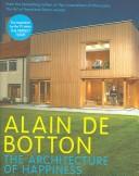
A philosophical capstone that asks why certain spaces make us feel whole and others do not — reading this last transforms you from someone who decorates rooms into someone who designs for human flourishing.
Discussion
Keep reading
Paths that share books, cover the same subject, or open a related topic.