The Best Books on Letterpress Printing, in Order
This curriculum starts from a solid intermediate footing and moves through the full arc of letterpress mastery: understanding type and typographic history, operating and caring for a press, and finally refining technique for the crisp, tactile output prized in fine cards and posters. Each stage builds the vocabulary and hands-on intuition needed for the next, so no step feels like a leap.
Type & Typographic Foundations
IntermediateUnderstand how type is designed, measured, and composed — the essential vocabulary and visual grammar that underpins every letterpress decision.
▸ Study plan for this stage
Pace: 6–8 weeks, ~25–30 pages/day (alternating between Bringhurst's visual/conceptual chapters and Haralambous's technical sections)
- The anatomy of type: serifs, x-height, cap height, ascenders, descenders, and how these proportions affect readability and character
- Typographic measurement systems: points, picas, ems, and how Bringhurst's proportional scales create visual harmony
- Font encoding and character sets: understanding how Haralambous explains the relationship between glyphs, Unicode, and historical encoding schemes
- Kerning, tracking, and leading: the spatial relationships that control how type breathes on the page
- The distinction between typeface and font: design intent versus technical implementation
- Historical context of type design: how serif, sans-serif, and specialty typefaces evolved and why their forms matter
- Typographic color and texture: how letterforms create visual rhythm and density on the page
- Practical composition principles: hierarchy, alignment, and whitespace as tools for guiding the reader's eye
- What are the key anatomical features of a letterform, and how do variations in x-height or serif style affect the personality and readability of a typeface?
- Explain the relationship between points, picas, and ems. How do these measurements translate to proportional design decisions in Bringhurst's system?
- What is the difference between a typeface and a font, and why does this distinction matter for letterpress printing?
- How do kerning, tracking, and leading work together to create typographic color and texture on the page?
- Describe how character encoding (as explained by Haralambous) impacts which glyphs are available in a digital font file, and what this means for historical or specialty typefaces.
- Why did certain typeface categories (serif, sans-serif, display) develop historically, and what visual or functional purposes do they serve?
- Anatomy study: Print out or photograph 5–6 different typefaces (serif, sans-serif, slab serif, script). Label the anatomical parts (serifs, x-height, ascenders, descenders, bowls, counters, terminals) on each. Note how these features differ and affect the typeface's character.
- Measurement conversion practice: Using Bringhurst's proportional scales, set a baseline grid for a hypothetical letterpress page. Calculate point sizes, leading, and line length using his recommended ratios. Verify your math by hand.
- Kerning observation exercise: Find 3–4 examples of poorly kerned type (in print or online). Identify which letter pairs are problematic and sketch how you would adjust the spacing. Then find well-kerned examples and analyze why they work.
- Encoding exploration: Using Haralambous's framework, examine the character map of 2–3 fonts you have access to (modern and historical if possible). Note which glyphs are present/absent and consider why certain characters might be missing from specialty typefaces.
- Typographic color study: Set the same text block in three different typefaces (e.g., Garamond, Helvetica, a display face). Compare the visual density and rhythm on the page. Write a short paragraph describing the typographic color of each.
- Hands-on composition: Using actual metal type (if available) or a detailed simulator, compose a small poem or quotation. Practice adjusting leading, spacing, and alignment to create visual hierarchy and guide the reader's eye. Photograph or print the result and annotate your decisions.
Next up: This stage equips you with the visual and technical language to recognize and manipulate type intentionally; the next stage will apply these principles to the specific constraints and possibilities of the letterpress machine itself.
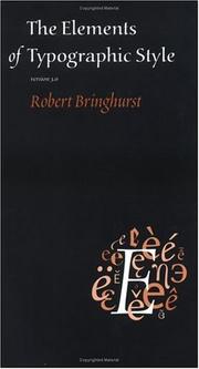
The canonical reference for type proportion, spacing, and nomenclature. Reading it first gives you the precise language — leading, kerning, measure, optical size — that every subsequent letterpress book assumes you already know.
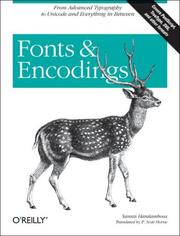
Bridges the gap between metal and digital type systems, explaining how letterforms are encoded and reproduced — critical context for a modern letterpress printer who works with both photopolymer plates and physical type.
History, Culture & the Press Itself
IntermediatePlace letterpress in its historical and cultural context, and learn how different press designs — platen, cylinder, Vandercook — actually work mechanically.
▸ Study plan for this stage
Pace: 8–10 weeks, ~25–30 pages/day (accounting for dense historical analysis and technical diagrams)
- The printing press as a transformative technology: how movable type disrupted manuscript culture, enabled mass production, and accelerated knowledge dissemination across Europe
- The shift from scribal to print culture: standardization of texts, reduction of copying errors, and the emergence of the author as a distinct role
- Typographic classification and evolution: understanding serif vs. sans-serif, the development of typefaces from Gutenberg through the modern era, and how type design reflects historical periods
- Mechanical principles of different press designs: the distinction between platen presses (flat bed), cylinder presses (rotating drum), and the Vandercook proof press, and how each affects impression quality and production speed
- The relationship between type design and printing technology: how the constraints and capabilities of different presses shaped the typefaces that were created for them
- Cultural and intellectual consequences of print: the role of the printing press in the Reformation, Scientific Revolution, and the formation of national identities through standardized languages
- How did the shift from manuscript to print culture change the way knowledge was preserved, standardized, and disseminated in early modern Europe?
- What are the key mechanical differences between platen, cylinder, and Vandercook presses, and how do these differences affect the quality and speed of printing?
- How did the development of printing types reflect the historical periods in which they were created, and what can typeface choices tell us about a document's era?
- What role did the printing press play in major historical movements such as the Reformation and the Scientific Revolution?
- How did the technical constraints of early printing presses influence the design of typefaces, and vice versa?
- Why is standardization of texts considered one of the most significant cultural consequences of the printing press?
- Create a timeline mapping the evolution of typefaces from Gutenberg to the 20th century using Dowding's classifications; annotate each with the historical context and press technology available at that time
- Sketch or diagram the mechanical operation of a platen press, cylinder press, and Vandercook press; label key components and explain how each produces an impression
- Select a printed book from three different centuries (e.g., 16th, 18th, 20th); analyze the typeface, layout, and paper quality, then write a short essay connecting these choices to the press technology and cultural moment of its production
- Read a primary source document from the pre-print era (e.g., a manuscript excerpt) and a printed version of similar content; compare them for consistency, legibility, and errors to understand Eisenstein's argument about standardization
- Visit a letterpress studio or museum with a working press (or watch a detailed video demonstration); operate or observe a platen or cylinder press in action and note how impression, speed, and paper feed work in practice
- Create a visual comparison chart showing how different typeface families (serif, sans-serif, slab serif, etc.) emerged in response to specific printing technologies and cultural needs, using examples from Dowding
Next up: This stage grounds you in the historical forces and mechanical realities that shaped letterpress, preparing you to move into hands-on technical practice—understanding *why* certain techniques matter and *how* historical constraints still influence modern letterpress work.
Understanding why the press matters culturally sharpens your intentionality as a printer. This foundational history explains what letterpress changed about the world, motivating every technical choice that follows.
A focused, practical survey of typeface history that connects historical punch-cutting and casting directly to the metal and wood type you will handle at the press.
Hands-On Letterpress Technique
IntermediateOperate a platen or proof press confidently — setting type, locking up a form, mixing ink, and achieving consistent impression across a print run.
▸ Study plan for this stage
Pace: 4–5 weeks, ~25–30 pages/day, with 2–3 dedicated press days per week for hands-on practice
- Type assembly and composition: selecting, arranging, and spacing type correctly to prepare for locking up
- Locking up a form: using quoins, furniture, and chase systems to secure type and ensure it remains rigid under pressure
- Platen and impression adjustment: understanding how to set proper impression depth to achieve consistent, even ink transfer without damaging type
- Ink mixing and consistency: preparing ink to the correct viscosity and tack for clean, uniform prints across multiple impressions
- Press mechanics and operation: understanding the iron handpress structure, lever mechanics, and proper feeding technique to maintain control and safety
- Troubleshooting common printing faults: diagnosing and correcting uneven inking, slur, set-off, and impression problems during a print run
- Achieving consistent registration and pull: developing muscle memory and technique to produce repeatable, professional results across a full run
- What are the key steps in locking up a form, and why is rigidity critical before printing?
- How do you adjust platen impression on an iron handpress, and what visual or tactile signs indicate proper impression depth?
- Describe the process of mixing letterpress ink to the correct consistency, and what problems arise if ink is too stiff or too loose.
- What is the relationship between type selection, spacing, and furniture choice when preparing a form for the press?
- How do you diagnose and correct common faults such as uneven inking, slur, or set-off during a print run?
- What safety and maintenance practices are essential when operating an iron handpress over extended print runs?
- Compose and lock up a simple single-line form (e.g., a business card or small broadside), then print 20–30 impressions while monitoring impression consistency and making micro-adjustments to the platen.
- Mix ink to three different viscosities (stiff, medium, loose) and print test pulls with each to observe how ink consistency affects transfer, coverage, and ink-off on the paper.
- Print a multi-line form (poem, short paragraph, or advertisement) and deliberately introduce one fault at a time (over-impression, under-impression, uneven inking) to learn how to recognize and correct each problem.
- Conduct a full print run of 50–100 impressions on a locked-up form, tracking impression quality and consistency across the run; document any drift or degradation and adjust technique or press settings accordingly.
- Disassemble and reassemble the quoins and furniture on a locked form, then reprint to verify that the form remains locked and prints identically—building confidence in form security.
- Practice feeding and pulling technique on a press with a partner or mentor, focusing on smooth, consistent lever pressure and hand placement to eliminate slur and achieve uniform impression.
Next up: Mastery of these hands-on techniques—confident form locking, impression control, and ink management—prepares you to tackle more complex multi-color work, larger forms, and specialized presses, where precision and consistency become even more critical.
Rummonds documents every variable — paper dampening, ink viscosity, impression depth — with the rigor of a master printer. Even if you never use an iron handpress, this book teaches you to think systematically about makeready and pressure.
Design for Print: Cards, Posters & Fine Work
ExpertDesign and produce finished, gallery-quality letterpress pieces — understanding layout, color, paper selection, and the interplay of deep impression and ink film for tactile results.
▸ Study plan for this stage
Pace: 8–10 weeks, ~40–50 pages/day (with 2–3 days/week dedicated to hands-on design and production work)
- Paper selection and its role in letterpress: weight, finish, texture, and how substrate interacts with impression and ink
- Layout and composition principles specific to print: grid systems, hierarchy, white space, and visual balance in constrained formats
- Typography as a design element: font selection, sizing, leading, and tracking in the context of handmade and fine letterpress work
- The tactile and visual interplay of deep impression, ink film thickness, and embossing effects on finished pieces
- Design workflow from concept to production: translating design intent into technical specifications for the press
- Color theory and ink mixing for letterpress: achieving consistent, gallery-quality results across cards, posters, and fine art pieces
- Binding and finishing techniques that elevate handmade books and multi-piece projects to professional standards
- Constraint-driven design: using the limitations of letterpress (type availability, press bed size, registration) as creative opportunities
- How do different paper weights, finishes, and textures affect the visual and tactile outcome of a letterpress impression, and how would you select paper for a specific design goal?
- What is the relationship between ink film thickness, impression depth, and the final aesthetic of a letterpress print, and how do you balance these variables for gallery-quality results?
- How do typographic principles (leading, tracking, font pairing) differ when designing for letterpress versus digital media, and why does this matter for fine work?
- Describe a complete design-to-print workflow for a letterpress poster or card: from concept and layout through paper selection, type specification, and final production decisions.
- How can you use color, embossing, and multi-pass printing to create visual hierarchy and depth in a constrained letterpress format?
- What binding and finishing techniques would elevate a set of handmade letterpress cards or a small book edition to gallery-quality presentation?
- Design and print 3–5 finished greeting cards or postcards: experiment with different paper stocks, ink colors, and impression depths; document how each variable affects the final tactile and visual result.
- Create a poster design (8.5×11 or larger) that uses typography as the primary visual element; print multiple versions with different ink densities and impression settings, then evaluate which best serves your design intent.
- Conduct a paper-selection study: gather 8–10 samples of different weights and finishes; print the same design on each and write brief notes on how the substrate changes the perception of the piece.
- Design and produce a small handmade book (8–16 pages) using letterpress for cover and/or interior pages; practice binding, paper selection, and layout to create a cohesive, finished object.
- Develop a color palette for a multi-color letterpress print; mix custom inks and test them on your chosen paper; print a final piece that demonstrates intentional color choice and registration.
- Reverse-engineer a gallery-quality letterpress piece (from a museum, artist portfolio, or fine press): analyze its paper, typography, layout, impression, and binding; write a one-page technical and aesthetic breakdown.
Next up: This stage equips you with the design sensibility and technical mastery to produce exhibition-ready letterpress work, positioning you to explore advanced topics such as historical printing techniques, experimental processes, or the business and curation of fine printing editions.

Expands your output repertoire from single sheets to folded and bound pieces, teaching paper grain, folding, and structure — all directly applicable to card and booklet production on the press.
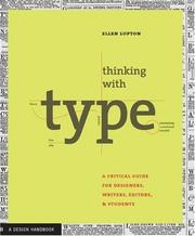
Closes the loop between design intent and press output: fine-tuning spacing, color, and hierarchy so that what you design translates faithfully to the crisp, tactile printed surface letterpress demands.
Discussion
Keep reading
Paths that share books, cover the same subject, or open a related topic.