Letterpress is often taught backward, starting at the press and ending in frustration. The press is only the last step; a beautiful print begins with type, spacing, and an understanding of what you are actually setting. Beginners who skip the typographic foundation end up with crooked, poorly spaced work no amount of presswork can save.
A good reading order builds that foundation first, then the historical context, then the hands-on craft. Read in sequence and the press becomes the satisfying finish to a well-understood process rather than a confusing machine.
Ground yourself in type
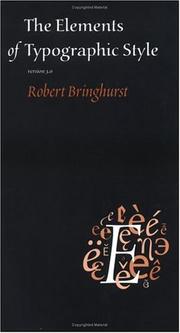
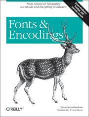
Start with The Elements of Typographic Style by Robert Bringhurst, the modern bible of typography that trains your eye for spacing, proportion, and the details that make text read well. Then add The complete manual of typography by James Felici for practical typesetting knowledge, and Fonts & Encodings by Yannis Haralambous to understand how type is organized and structured. This is the literacy every good print rests on.
Learn where type comes from
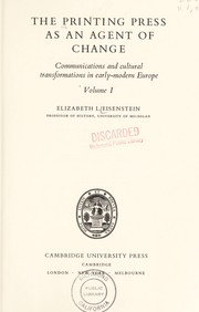
With an eye for type, learn its history. An introduction to the history of printing types by Geoffrey Dowding teaches you to recognize and choose typefaces with understanding, and The printing press as an agent of change by Elizabeth L. Eisenstein reveals how printing reshaped the world. This context deepens every choice you make at the case.
Get on the press
Now put ink to paper. Letterpress Now by Jessica C. White is a friendly, contemporary guide to actually printing, and The Vandercook Press by Harold Kyle covers the proof press most modern letterpress studios use. Printing on the iron handpress by Richard-Gabriel Rummonds brings the traditional craft to life, and Making Handmade Books by Alisa J. Golden extends your work from single sheets into finished, bound objects.
Read in this order and letterpress becomes typography you can hold. Follow the full path to go from setting your first line of type to pulling prints you are proud of.
Follow the full reading path →
Ready to learn something deeply?
Build a reading path — free