Colored Pencil Drawing: Best Books to Learn Layering and Realism
This curriculum takes a beginner from the very basics of colored pencil handling all the way to advanced photorealistic rendering. Each stage builds directly on the last — first establishing core vocabulary and mark-making, then introducing layering and blending discipline, then tackling complex subjects and photorealistic color, and finally mastering the burnishing and finishing techniques used by professional illustrators.
Foundations: Tools, Mark-Making & Color Basics
BeginnerUnderstand how colored pencils behave, set up a proper workspace, learn basic mark-making, and grasp fundamental color theory as it applies to colored pencil work.
▸ Study plan for this stage
Pace: 4–5 weeks, ~25–30 pages/day, with 2–3 dedicated practice days per week for mark-making and color exercises
- Colored pencil core properties: pigment load, layering capacity, burnishing, and how different brands/types (wax-based vs. oil-based) behave differently
- Essential workspace setup: proper lighting, ventilation, ergonomic seating, and organizing tools for efficiency and safety
- Mark-making fundamentals: pressure control, stroke direction, layering techniques, and how to achieve varied texture and value through hand technique alone
- Color theory applied to colored pencils: understanding hue, saturation, value, and how to mix colors through layering rather than physical blending
- Selecting and testing materials: choosing appropriate paper surfaces, pencil grades, and understanding how substrate affects final results
- Underpainting and value studies: establishing tonal foundation before adding color to create depth and visual impact
- Blending and burnishing techniques: using colorless blenders, solvents, and pressure to unify layers and create smooth transitions
- Color harmony and temperature: applying warm/cool relationships and complementary color principles to create cohesive, vibrant work
- What are the key differences between wax-based and oil-based colored pencils, and how do these differences affect your layering and blending approach?
- How should you set up your workspace to ensure proper lighting, ventilation, and ergonomics, and why does each element matter for both safety and quality work?
- Describe three distinct mark-making techniques and explain how pressure control and stroke direction influence the visual outcome in each
- How do you mix colors using colored pencils through layering, and what role does the order of application play in achieving desired hues and saturation?
- What is the purpose of an underpainting or value study, and how does establishing values early improve the final colored pencil piece?
- How do burnishing and blending differ, and when should you use each technique to achieve different effects in your work?
- Create a comprehensive pencil swatch chart testing at least 12 colored pencils from your collection, noting brand, core type, pigment load, and layering behavior on your chosen paper
- Conduct a mark-making study: fill one page with at least 6 different stroke techniques (hatching, stippling, circular motions, directional strokes, burnishing, blending) to internalize pressure and control
- Complete a value study using only grayscale or neutral pencils, focusing on establishing a clear range from light to dark without relying on color
- Execute a color-mixing exercise: select 3 complementary color pairs and layer them to explore how order of application and pressure affect the resulting hue and vibrancy
- Design and sketch your ideal colored pencil workspace, then physically organize your actual workspace according to ergonomic and efficiency principles outlined in the books
- Create a small still-life drawing (4×6 inches) using the complete workflow: underpainting, value study, color layering, and selective burnishing to practice integrating all foundational skills
Next up: Mastering these foundational tools, mark-making precision, and color-mixing principles equips you with the technical control and material knowledge necessary to move into the next stage, where you'll apply these skills to develop realistic form, depth, and subject-specific rendering techniques.

A perfect entry point that covers pencil types, paper selection, and essential techniques like layering and blending in plain language — gives beginners a complete vocabulary before anything else.
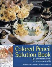
Structured as a problem-and-answer guide, it directly addresses the most common beginner frustrations (wax bloom, color mixing, pressure control), reinforcing the foundations just established.
Core Techniques: Layering, Blending & Value
BeginnerBuild confident, systematic layering habits, understand how to blend colors optically and with solvents, and develop strong value control across a range of subjects.
▸ Study plan for this stage
Pace: 4–5 weeks, ~20–25 pages/day with daily practice sessions (30–45 minutes)
- Systematic layering: building color depth through multiple transparent layers while preserving paper tooth and luminosity
- Optical color mixing: understanding how layered transparent colors interact visually rather than physically blending on a palette
- Solvent blending techniques: using colorless blenders, mineral spirits, or turpentine to fuse layers and create smooth transitions
- Value control and tonal range: managing light, mid, and dark values independently to create dimension and focal emphasis
- Pressure and burnishing: controlling pencil pressure to achieve different effects from light glazes to full saturation
- Paper selection and tooth preservation: choosing appropriate papers and techniques that maintain surface texture for continued layering
- Color theory applied to colored pencils: complementary colors, temperature shifts, and atmospheric perspective through layering
- What is the difference between optical color mixing and physical color mixing, and why does it matter for colored pencil work?
- How do you preserve paper tooth while building multiple layers, and why is this important for continued layering?
- Describe the step-by-step process for using a solvent to blend colored pencil layers—what precautions should you take?
- How can you use value control (light, mid, and dark tones) to create depth and direct the viewer's eye in a composition?
- What is burnishing, and when should you use it versus when should you avoid it in a layered drawing?
- How do complementary colors interact when layered optically, and how can you use this to enhance color vibrancy?
- Complete Averill's foundational layering exercises: build a 5-layer color study using transparent colors, documenting how each layer shifts the visual result
- Create a value scale (light to dark) using a single color family, practicing pressure control to achieve smooth transitions without burnishing
- Execute Poulin's solvent blending study: layer two complementary colors, then blend with a solvent, comparing results to dry blending
- Paint a simple still life (apple, sphere, or cylinder) focusing solely on value control—use only one or two colors to master tonal range
- Conduct a paper tooth preservation test: layer 8–10 colors on the same area using light pressure, then attempt to add more layers to verify surface quality
- Create an optical color mixing chart: layer primary and secondary colors in different sequences and observe how order affects the final appearance
- Draw a small landscape or portrait study (4×6 inches) applying all three techniques: systematic layering, optical mixing, and selective solvent blending in different areas
Next up: Mastering these foundational techniques—layering, blending, and value control—equips you with the systematic skills needed to tackle complex subjects like portraiture, realistic textures, and advanced color harmony in the next stage.
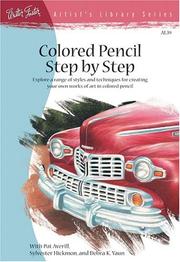
Walks through layering and blending step-by-step on real subjects, making the transition from isolated exercises to finished drawings feel achievable and logical.
A thorough, methodical guide to building up color through multiple layers; Poulin's emphasis on patience and process directly prepares the reader for the more demanding blending and burnishing stages ahead.
Intermediate Mastery: Texture, Light & Complex Subjects
IntermediateRender convincing textures (skin, fur, fabric, glass), understand how light and shadow interact with color, and tackle more complex multi-element compositions.
Though pencil-focused, Hillberry's obsessive attention to surface texture and light logic directly translates to colored pencil work and sharpens the observational skills needed for photorealism.
Advanced Color: Burnishing & Photorealistic Technique
ExpertMaster burnishing to achieve a luminous, paint-like finish; understand color temperature and chromatic layering at a professional level; and produce photorealistic colored pencil artwork.
▸ Study plan for this stage
Pace: 8–10 weeks, ~25–30 pages/day with daily practice sessions (2–3 hours minimum). Allocate 2–3 weeks per book with overlapping technique practice.
- Burnishing techniques: layering, pressure control, and blending with colorless blenders, light colors, and solvent-based methods to achieve luminous, paint-like finishes
- Color temperature theory: warm vs. cool undertones, temperature shifts in shadows and highlights, and strategic use of complementary colors to enhance realism
- Chromatic layering: building depth through transparent glazes, color mixing on paper, and understanding pigment interaction across multiple pencil applications
- Photorealistic rendering: translating photographic references into colored pencil with accurate value structure, edge control, and surface texture differentiation
- Skin tone modeling: mixing and layering flesh tones with temperature variation, undertone awareness, and subtle color shifts for dimensional portraiture
- Pressure modulation and paper selection: matching pencil pressure to paper tooth, understanding when to preserve tooth vs. burnish smooth, and choosing surfaces for specific effects
- Light and shadow as color: using color theory to model form rather than relying on black/gray, creating atmospheric perspective through color temperature
- Finishing strategies: protecting work, varnishing considerations, and achieving professional-quality results that withstand scrutiny
- What is burnishing, and how do colorless blenders, light colors, and solvents each produce different luminous effects in colored pencil painting?
- How do you use color temperature (warm vs. cool) strategically in shadows, highlights, and mid-tones to enhance photorealism and avoid flat, muddy results?
- Describe the chromatic layering process: how do you build transparent glazes and mix colors on paper to create depth without overworking the surface?
- What are the key differences in rendering skin tones for portraiture, and how do you incorporate undertone variation and temperature shifts to achieve dimensional realism?
- How do you translate a photographic reference into colored pencil while maintaining accurate value structure, edge control, and surface texture?
- When and why would you preserve paper tooth versus burnish smooth, and how does this choice affect the final appearance of your work?
- Complete Nickelsen's burnishing exercises from 'Colored Pencil Painting Bible': practice colorless blender burnishing, light-color layering, and solvent-based blending on scrap paper to internalize pressure and effect variations.
- Create a color temperature study (8×10 minimum): render a simple form (sphere or cube) using only warm colors in highlights and cool colors in shadows, then reverse it, comparing results to understand temperature's role in dimension.
- Execute a chromatic layering study from Hammond's 'Lifelike Drawing': select a simple object (fruit, flower) and layer 5–7 transparent glazes, documenting each layer and final result to see how color builds without muddying.
- Paint a monochromatic underpainting study: choose a photorealistic reference and block in values using a single color, then glaze complementary and analogous colors over it to understand value independence from hue.
- Render a skin tone sample sheet (Kullberg method): mix and layer at least 6 different flesh tone combinations on one page, showing undertone variation (yellow, red, olive) and temperature shifts from highlight to shadow.
- Complete a photorealistic portrait study (8×10 or larger): use a clear reference photo and apply all techniques—burnishing, temperature shifts, chromatic layering, and edge control—to produce a finished piece suitable for portfolio review.
Next up: Mastery of burnishing, color temperature, and chromatic layering at this advanced level equips you to tackle specialized subjects (wildlife, landscapes, complex textures) and develop a distinctive personal style in your next stage.

The single most comprehensive advanced resource on the subject — Nickelsen's 'painting' approach to colored pencil, including her detailed burnishing and glazing methods, is the gold standard for photorealistic results.
Hammond's grid-based, photo-reference method and her detailed breakdowns of skin, eyes, and hair provide concrete photorealistic workflows that consolidate everything learned in prior stages.
Kullberg is one of the foremost authorities on photorealistic portrait work in colored pencil; this book applies burnishing and advanced color layering to the most demanding subject — the human face — as a capstone challenge.
Discussion
Keep reading
Paths that share books, cover the same subject, or open a related topic.