Color theory for artists: an ordered reading path to using color well
This curriculum takes an artist from zero color knowledge to confident, palette-driven painting through four carefully sequenced stages. Each stage builds on the last — first establishing perceptual and conceptual foundations, then exploring color relationships and harmony, then diving into paint-mixing practice, and finally mastering the professional palettes and color strategies used by working painters.
Foundations: Seeing & Understanding Color
BeginnerBuild a reliable vocabulary for color (hue, value, saturation, temperature) and train the eye to actually see color rather than assume it — the essential perceptual groundwork everything else depends on.
▸ Study plan for this stage
Pace: 4–5 weeks, ~25–30 pages/day. Begin with "Color and Light" (2–3 weeks), then move to "Interaction of Color" (2 weeks). Allocate 2–3 days per week for hands-on exercises alongside reading.
- The physics of light and how the human eye perceives color (wavelengths, cone cells, color blindness) — from Gurney's opening chapters
- Hue, value, and saturation as independent, measurable dimensions of color — core vocabulary from both books
- Color temperature (warm/cool) and its perceptual effects, including how context shifts temperature perception — Gurney's practical framework
- The relativity of color: how the same hue appears different depending on surrounding colors and backgrounds — Albers' central thesis in 'Interaction of Color'
- Value relationships and contrast as the primary tool for legibility and visual hierarchy — emphasized in both Gurney and Albers
- Simultaneous contrast and color vibration: how adjacent colors influence each other optically — Albers' experimental method
- The difference between local color (what something 'is') and perceived color (what it appears to be in context) — foundational for seeing accurately
- Explain the difference between hue, value, and saturation. Why does Gurney emphasize that these are independent properties?
- What is color temperature, and how does it affect the mood and perceived depth of a painting? Give an example from your own observation.
- Describe simultaneous contrast in your own words. How does Albers demonstrate this principle, and why does it matter for artists?
- What is the distinction between local color and perceived color? Why is this distinction critical for accurate color observation?
- How does value contrast function differently from hue contrast in terms of visual impact and readability?
- Choose a color sample from 'Interaction of Color' (or create your own). Explain how its appearance changes when you place it against different background colors.
- Color wheel and temperature mapping: Create a traditional color wheel using paint or digital tools, then annotate each hue with 'warm' or 'cool' and note how temperature shifts across the spectrum. Reference Gurney's temperature discussions.
- Value scale study: Paint or digitally create a 9–step value scale in a single hue (e.g., blue). Use this to identify the value of colors in photographs or paintings without relying on hue.
- Simultaneous contrast experiments: Replicate 3–4 of Albers' color studies from 'Interaction of Color' using paint, colored paper, or digital tools. Document how the same center color appears to shift when surrounded by different backgrounds.
- Local vs. perceived color observation: Spend 20–30 minutes observing a single object (fruit, fabric, shadow) in different lighting conditions. Sketch or photograph it, noting how its perceived color changes while its local color remains constant.
- Saturation ladder: Create a series showing one hue at full saturation, then progressively desaturated (grayed down). Observe how saturation affects visual weight and emotional temperature.
- Color temperature in context: Collect or paint 5–6 small color samples. Arrange them to create a 'warm' composition, then rearrange the same samples to create a 'cool' composition. Reflect on how temperature relationships shift the overall mood.
Next up: This stage equips you with the perceptual vocabulary and trained eye to move into the next stage—applying color relationships strategically in composition, harmony, and design—because you can now reliably see and name what you're looking at rather than working from assumption.

The perfect entry point: Gurney explains how light creates color in the real world with clear illustrations and a painter's eye, giving beginners an immediate, practical framework before any theory feels abstract.
After Gurney builds intuition, Albers trains the eye to see how colors change depending on their neighbors — a foundational perceptual skill that prevents the most common beginner mixing mistakes.
Color Theory: Harmony, Relationships & Design
BeginnerUnderstand the formal principles of color harmony, contrast, and emotional temperature so you can make deliberate compositional color decisions rather than guessing.
▸ Study plan for this stage
Pace: 4–5 weeks, ~25–30 pages/day. Start with Itten's foundational theory (2–3 weeks), then move to Birren's psychological applications (1.5–2 weeks). Build in 2–3 days between books for integration exercises.
- The color wheel, primary/secondary/tertiary colors, and how Itten's systematic approach organizes color relationships
- Complementary, analogous, and triadic color harmonies as deliberate compositional tools
- Contrast of hue, value, saturation, temperature, and extension as distinct design levers
- Warm vs. cool color temperature and how it creates spatial and emotional effects
- Itten's seven types of color contrast and when to apply each for specific visual impact
- How human psychology and physiology respond to color (Birren's framework) and why certain combinations feel harmonious or jarring
- Color dominance, proportion, and balance in composition—not just which colors go together, but how much of each
- Emotional and symbolic associations of colors and how to harness them intentionally in design
- What are the seven types of color contrast Itten describes, and how would you use at least three of them to create visual hierarchy in a composition?
- Explain the difference between complementary, analogous, and triadic color schemes. When would you choose each for a specific design problem?
- How do warm and cool colors function differently in a composition in terms of spatial depth, mood, and viewer attention?
- According to Birren, what is the relationship between color and human physiology (e.g., heart rate, temperature perception)? Give at least two examples.
- Design a simple color palette for a specific purpose (e.g., a calming interior, an energetic poster) and justify your choices using both Itten's harmony principles and Birren's psychological framework.
- What is the role of color proportion and dominance in harmony? Why isn't it enough to just pick 'harmonious' colors?
- Create a color wheel study: reproduce Itten's 12-part color wheel by hand or digitally, labeling primary, secondary, and tertiary colors. Identify and mark complementary pairs.
- Harmony exploration: design three small compositions (8×8 inches) using the same subject or simple shapes, each using a different harmony scheme (complementary, analogous, triadic). Compare how each feels.
- Contrast study: take one simple image or composition and create seven variations, each emphasizing one of Itten's seven types of contrast (hue, value, saturation, temperature, extension, simultaneous, and complementary). Document which feels most striking.
- Temperature mapping: collect 10–15 images from art, design, or photography. Sort them by dominant temperature (warm/cool/neutral) and analyze how temperature affects mood and spatial perception in each.
- Psychological response journal: spend one week noticing color in your environment (clothing, interiors, nature, advertising). For each observation, note the colors present and your emotional/physical response. Connect patterns to Birren's principles.
- Proportion experiment: design two versions of the same composition—one with equal color areas, one with a dominant color and smaller accents. Analyze how proportion changes the harmony and visual weight.
- Real-world application: redesign an existing design (poster, room, outfit, interface) using your new understanding of harmony and contrast. Document before/after and explain your color decisions.
Next up: This stage equips you with the formal vocabulary and psychological understanding to make intentional color choices; the next stage will likely apply these principles to specific media, contexts, or advanced techniques (e.g., color in painting, digital color workflows, or cultural/contextual color meaning).

Itten's classic systematizes the seven kinds of color contrast and the major harmony schemes; reading it after Albers means you now have names and rules for the relationships your eye has already learned to feel.

Birren bridges pure theory and artistic application by exploring how color affects mood and perception, deepening your understanding of why certain palettes feel tense, calm, or vibrant.
Practical Mixing: Paint, Pigment & the Palette
IntermediateTranslate theory into real paint — understand pigment behavior, bias, and mixing logic so you can reliably achieve any color you envision on a physical palette.
▸ Study plan for this stage
Pace: 4–5 weeks, ~20–25 pages/day, with 2–3 dedicated mixing sessions per week
- Pigment bias (warm/cool undertones) and how it determines mixing outcomes
- Why traditional color wheel mixing (blue + yellow = green) fails and what actually happens
- The concept of primary colors as a myth—understanding pigment primaries vs. perceptual primaries
- Undertone matching: selecting pigments with compatible biases for clean, predictable mixes
- Transparency vs. opacity of pigments and how this affects layering and mixing
- The role of paint medium and pigment load in color accuracy and vibrancy
- Practical palette design: which pigments to stock based on mixing logic rather than convention
- Why does mixing blue and yellow sometimes produce muddy green instead of bright green, and what determines the difference?
- What is pigment bias, and how do you identify whether a red, blue, or yellow leans warm or cool?
- How would you select three primary pigments for a limited palette that will mix the widest range of clean, vibrant secondaries?
- What is the difference between transparent and opaque pigments, and how does this affect your mixing strategy?
- How do you diagnose why a mixture turned out muddy or dull, and what adjustment would you make?
- What role does the undertone of your medium or white play in color mixing, and how do you account for it?
- Create a personal pigment bias chart: test 3–5 reds, blues, and yellows side by side, mixing each with white and black to identify warm/cool bias
- Build a limited palette mixing study: select 3 primary pigments based on Wilcox's logic and systematically mix all secondaries and tertiaries, documenting results
- Perform the 'muddy green' experiment: deliberately mix blue + yellow in different combinations (warm blue + warm yellow, cool blue + cool yellow, mismatched pairs) and compare outcomes
- Paint a color wheel using only your chosen three primaries, noting which colors are hardest to achieve and why
- Create a transparency/opacity test chart: layer your palette pigments over black and white to assess how each behaves when glazed
- Mix a target color from a reference image (photograph or artwork) using Wilcox's bias-matching method, then refine until it matches
- Design your ideal working palette for your medium (oil, acrylic, watercolor) based on pigment bias and mixing logic, with written justification for each choice
Next up: This stage grounds you in the physical reality of pigment behavior, giving you the diagnostic tools and palette logic needed to move into advanced topics like color harmony, atmospheric perspective, and intentional color expression in composition.
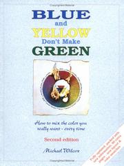
This is the essential bridge from theory to tube paint: Wilcox explains pigment bias and why traditional mixing rules fail, giving you a scientifically grounded method for clean, predictable mixes.
Advanced Control: Master Palettes & Artistic Vision
ExpertWork and think like a professional colorist — learn the limited and structured palettes used by master painters, understand color as a compositional and expressive tool, and develop a personal color voice.
▸ Study plan for this stage
Pace: 4–5 weeks, ~25–30 pages/day, with 2–3 dedicated painting/palette-building sessions per week
- Limited palettes as compositional strategy: how master painters restrict their color choices to achieve unity, harmony, and emotional impact
- Color dominance and temperature relationships: establishing a clear color hierarchy and using warm/cool shifts to guide the viewer's eye and create mood
- Alla prima technique and color mixing on the canvas: direct, decisive color application and how immediate mixing decisions shape the final work
- Personal color voice: developing your own signature palette and understanding how consistent color choices reflect artistic intention and style
- Color as narrative and expression: moving beyond decoration to use color as a primary means of storytelling and emotional communication
- Palette construction from observation: analyzing master paintings to reverse-engineer their color choices and understand the logic behind their selections
- Transparency, opacity, and layering in alla prima: how paint handling and color interaction create depth and visual interest within a limited palette
- How do limited palettes create compositional unity, and what are the advantages of restricting your color choices compared to using a full spectrum?
- What is color dominance, and how do you establish it in a painting using temperature relationships and value contrast?
- How does the alla prima technique influence color mixing decisions, and why does working directly on the canvas change the way you think about color harmony?
- What constitutes a 'personal color voice,' and how do you develop one through deliberate palette choices and repeated practice?
- How can you analyze a master painter's work to understand their underlying palette structure and the emotional or compositional purpose of their color choices?
- In what ways does color function as a narrative tool in painting, beyond creating visual harmony?
- Palette audit: Select 3 master paintings (from different periods/styles) and create a limited palette that matches each one—list the specific colors, note the dominant hue, and identify the temperature relationships
- Alla prima study series: Paint 5–6 small studies (8×10 or similar) using only 4–5 colors per study, working wet-on-wet and mixing directly on the canvas; focus on decisive color choices and resist overworking
- Personal palette development: Create 2–3 custom limited palettes (8–12 colors each) that reflect your artistic interests and emotional preferences; test each palette on a medium-sized painting (12×16 or larger)
- Color dominance exercise: Paint the same subject twice using different dominant colors (e.g., warm-dominant vs. cool-dominant); compare how the mood and composition shift with each choice
- Master painter analysis: Write a 1–2 page breakdown of how a single master colorist (e.g., Velázquez, Sargent, or a contemporary painter you admire) uses limited color and temperature to achieve their signature style
- Alla prima speed paintings: Complete 3–4 paintings in 1–2 hours each using only your chosen limited palette; prioritize color relationships and compositional impact over detail
Next up: This stage equips you with the technical and conceptual tools to paint with intention and restraint; the next stage will likely deepen your ability to apply these palettes and color principles to specific subjects, genres, or advanced compositional challenges.
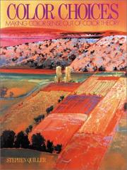
Quiller presents a comprehensive color wheel system mapped to real pigments and walks through harmony schemes in actual paintings, making this the ideal book for moving from exercises to finished artwork.

Schmid's masterwork shows how a world-class realist painter thinks about and controls color in the heat of direct painting — the perfect capstone that unifies perception, theory, and physical mixing into a living practice.
Discussion
Keep reading
Paths that share books, cover the same subject, or open a related topic.