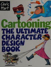
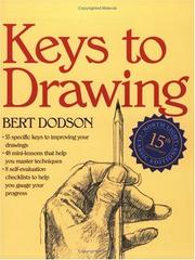
Draw digitally on an iPad
This curriculum takes a complete beginner from traditional drawing fundamentals through digital art theory and into hands-on Procreate and iPad-specific workflows. Each stage builds on the last — you must understand how to see and draw before you can translate those skills into a digital tool, and you must master that tool's basics before tackling advanced techniques like lighting, character design, and professional illustration.
Foundations: Learning to See and Draw
BeginnerBuild core observational drawing skills, understand line, shape, form, and composition — the universal language that underpins all digital illustration.
▸ Study plan for this stage
Pace: 6–8 weeks total. Weeks 1–4: "The New Drawing on the Right Side of the Brain" (~20–25 pages/day, including re-reading exercises). Weeks 5–8: "Fun With a Pencil" (~15–20 pages/day, with dedicated daily sketching sessions of 30–45 minutes alongside reading).
- L-mode vs. R-mode thinking (Edwards): learning to suppress the symbol-drawing, verbal-analytical left brain and activate the visual, perceptual right brain that sees things as they actually are
- The Five Basic Skills of Drawing (Edwards): the perception of edges, spaces, relationships, lights & shadows, and the gestalt (the whole) — every drawing problem reduces to one of these
- Contour and modified contour drawing (Edwards): training the eye to move slowly along edges and record exactly what it sees, building the hand-eye coordination that is the bedrock of all mark-making
- Negative space (Edwards): learning to draw the shapes AROUND an object rather than the object itself, breaking mental symbols and revealing true proportions
- Sighting and proportion (Edwards): using a pencil as a measuring tool to compare angles and relative sizes, transferring accurate relationships from life to paper
- Basic geometric construction of the head (Loomis): understanding that the human head is a sphere with a flat plane cut away, and how to place features using the center line and brow line as guides
- Simplification and appeal through cartooning (Loomis): reducing complex forms to their simplest readable shapes — a skill that directly maps to vector and character illustration workflows
- Line quality and expressive mark-making (Loomis): varying weight, confidence, and rhythm in a single line to convey form, depth, and personality
- According to Edwards, what is the difference between drawing in 'L-mode' and drawing in 'R-mode,' and what practical techniques does she give to shift between them?
- What are Edwards's Five Basic Skills of Drawing, and can you give a real example of how each one applies when drawing a household object from observation?
- How does Edwards use negative-space drawing to correct proportion errors, and why does focusing on negative space help bypass learned visual symbols?
- Using Loomis's sphere-and-plane method, how do you establish the center line and brow line on a head turned at a three-quarter angle, and where do the eyes, nose, and mouth fall relative to those guides?
- What does Loomis mean by 'appeal' in cartooning, and how does simplifying a form to its most essential shapes contribute to that appeal?
- How do the sighting and proportion techniques from Edwards translate into checking the accuracy of a Loomis head construction — where do the two authors' methods reinforce each other?
- Pure contour drawing (Edwards, Week 1): Without looking at your paper, spend 20 minutes drawing your non-dominant hand in extreme detail, moving your pencil only as fast as your eye moves along each edge. Repeat three times across the week and compare results.
- Negative-space still life (Edwards, Week 2): Arrange 3–5 objects on a table. Draw ONLY the negative spaces between and around them — never the objects themselves. Finish the drawing, then outline the objects and check your proportions against the real setup.
- Upside-down copy (Edwards, Week 3): Find a complex line drawing (a portrait, a hand, a figure). Flip it upside down and copy it upside down. Do not flip your copy right-side up until you are finished. Journal what felt different about the process.
- Sighting & proportion check (Edwards, Week 4): Set up a simple still life. Using a pencil held at arm's length, measure the height-to-width ratio of each object and the angles of every major edge. Lightly block these in before drawing any details. Photograph your setup and overlay your sketch to audit accuracy.
- Loomis head construction drill (Loomis, Weeks 5–6): Draw 10 heads per day using the sphere-and-plane method — vary the tilt (up, down, level) and the turn (front, three-quarter, profile). Do not add details until the construction lines satisfy you. Fill at least two sketchbook pages daily.
- Simplification-to-character exercise (Loomis, Weeks 7–8): Choose five real people from photos. Following Loomis's cartooning approach, reduce each face to its most essential shapes and exaggerate one defining feature. Then redraw each character digitally in your illustration software using only basic shape tools (ellipses, rectangles, lines) to bridge the pencil work to the screen.
Next up: Mastering observational accuracy (Edwards) and geometric form construction (Loomis) gives you a reliable mental model of how objects and figures are built in space — the essential prerequisite for the next stage, where those same forms will be rendered with value, color, and digital brushwork.
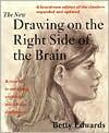
The single most trusted entry point for learning to truly see as an artist. Establishes perceptual skills that are tool-agnostic and essential before touching any software.
Loomis introduces simplified construction methods for drawing figures and faces. Read second to immediately apply your new observational skills to structured, constructive drawing.
Art Fundamentals: Color, Light, and Composition
BeginnerUnderstand the core visual principles — color theory, value, light, and compositional design — that determine whether a digital illustration succeeds or fails.
▸ Study plan for this stage
Pace: 8–10 weeks total. Weeks 1–6: "Color and Light" by James Gurney (~20–25 pages/day, 4–5 days/week) — read slowly and pause to sketch alongside every lighting and color example. Weeks 7–10: "The Animator's Survival Kit" by Richard Williams (~25–30 pages/day, 4–5 days/week) — focus on the timing charts,
- Color temperature and simultaneous contrast — how warm and cool light sources interact with surfaces and how adjacent colors shift each other's perceived hue (Gurney, Part I–II)
- Value structure — separating a scene into a simple light/shadow pattern before adding any color, and why value does more compositional work than hue (Gurney, throughout)
- Gamut mapping and limited palettes — choosing a restricted color gamut that creates harmony and mood rather than painting with every color available (Gurney, Part III)
- Form lighting vocabulary — understanding the seven elements of light on form (highlight, direct light, halftone, core shadow, reflected light, cast shadow, occlusion shadow) as described by Gurney
- Color of light vs. color of objects — distinguishing local color from the color imposed by the light source and environment (Gurney, Part II)
- Plein-air and observational thinking — Gurney's method of reading real-world light as a foundation for constructing convincing invented scenes
- Timing and spacing as visual rhythm — Williams' spacing diagrams showing how the intervals between positions create the feeling of weight, force, and life, principles that directly inform compositional 'eye flow' in still illustration
- Squash, stretch, and line of action — Williams' core principles of exaggeration and silhouette clarity, which translate into expressive, readable character and object design in digital illustration
- After reading Gurney, can you identify the light source color, shadow color, and reflected light color in a reference photo and explain why each appears the way it does?
- What is gamut mapping, and how would you choose a warm-light gamut versus a cool-light gamut for the same scene according to Gurney's method?
- How does value contrast direct the viewer's eye, and where should the highest value contrast be placed in a composition to establish a focal point?
- According to Williams, how does the spacing of an object's positions across frames communicate weight — and how does that same principle apply to the visual 'weight' and balance of elements in a static illustration?
- What is the difference between local color and the color of light, and how does ignoring this distinction produce flat, unconvincing digital artwork?
- How do Gurney's principles of observed light and Williams' principles of clear silhouette and line of action work together to make a character illustration feel both believable and dynamic?
- Value thumbnail drill (Gurney-based): Before opening any digital software, sketch 5–10 two-value (black and white only) thumbnails of a scene from imagination. Then paint the same scene digitally, locking in the value structure first and adding color only as a second pass — never letting color decisions override the value map.
- Gamut swatch card (Gurney-based): Pick three different lighting scenarios (golden-hour sunlight, overcast noon, interior candlelight). For each, mix a physical or digital swatch card of no more than 8 colors that represent the full gamut Gurney describes — light, halftone, shadow, reflected light, and cast shadow — staying strictly within that gamut for a small study painting.
- Seven-elements-of-light study (Gurney-based): Choose a simple 3-D object (a sphere, a mug, a hand). Paint it digitally three times under three different light sources, labeling all seven lighting elements on each version. Compare how the color and position of each element shifts with the light source.
- Silhouette-read test (Williams-based): Draw or paint 6 character or object poses in pure black silhouette with no interior detail. Show them to someone unfamiliar with your work and ask them to identify what each figure is doing. If they cannot read the action from silhouette alone, redesign the pose using Williams' line-of-action principle until they can.
- Color-temperature narrative piece: Create a small (roughly A5) digital illustration of any simple scene twice — once lit with a warm dominant light and cool shadows, once with the palette inverted. Write two sentences explaining the different emotional mood each version produces, grounding your explanation in Gurney's color-temperature theory.
- Spacing-to-composition translation (Williams-based): Take one of Williams' spacing diagrams (e.g., a bouncing ball arc) and use the same principle of clustered vs. spread intervals to design the placement of elements in a static illustration — dense clustering for rest, wide spacing for movement or tension. Annotate the final piece showing where you applied the principle.
Next up: Mastering color, value, light, and compositional clarity through Gurney and Williams gives the reader a language of visual decision-making — the essential grammar — that makes the next stage's focus on digital tools and software workflows immediately purposeful rather than purely technical.
The definitive modern guide to understanding how light and color behave in the real world. Directly translates to setting up lighting in Procreate and choosing palettes.
While rooted in animation, Williams's breakdown of timing, weight, and movement sharpens your understanding of dynamic composition and visual storytelling — critical for expressive digital illustration.
Intermediate Technique: Figure, Character, and Storytelling
IntermediateApply fundamentals and Procreate skills to more complex subjects — the human figure, character design, and narrative illustration — producing portfolio-quality work.
▸ Study plan for this stage
Pace: 10–13 weeks total. Week 1–4: "Figure Drawing for All It's Worth" (~20–25 pages/day, revisiting gesture and proportion chapters repeatedly). Week 5–8: "Framed Ink Drawing And Composition For Visual Storytellers" (~15–20 pages/day, pausing to sketch compositional studies after each chapter). Week 9–13
- Loomis's proportional systems — the 8-head ideal figure, the 7½-head fashion figure, and the simplified 'ball-and-socket' skeleton — as the structural backbone of all character work
- Gesture and rhythm: Loomis's emphasis on the line of action, weight distribution, and the 'feel' of movement before detail is added
- Light, shadow, and form on the figure: Loomis's planes-of-the-head and body-mass approach to rendering volume convincingly
- Mateu-Mestre's visual hierarchy and value composition — using light, dark, and mid-tone shapes to direct the viewer's eye and create mood
- Framing and camera language from 'Framed Ink': shot types (establishing, medium, close-up), camera angles, and their emotional/narrative impact on the reader
- Storytelling through staging: Mateu-Mestre's principles of silhouette clarity, negative space, and scene continuity across sequential panels
- Freddie Williams's digital inking workflow in Procreate/Photoshop — using custom brushes, layered line work, and pressure-sensitivity to replicate traditional comic inking
- Character construction for comics: Williams's method of building superhero anatomy, foreshortening, and dynamic poses on a digital canvas for print-ready output
- After studying Loomis, can you construct a standing figure from memory using the 8-head proportion system, correctly placing the major landmarks (chin, nipple line, navel, crotch, knees, ankles)?
- How does Loomis distinguish between 'action' and 'pose,' and why does he insist on establishing the line of action before drawing any anatomical detail?
- According to Mateu-Mestre in 'Framed Ink,' how do you use a limited value structure (3–4 tones) to ensure a composition reads clearly at a thumbnail size?
- What specific camera angles and shot distances does Mateu-Mestre recommend for building tension versus conveying exposition, and what visual logic underlies each choice?
- How does Freddie Williams approach the transition from rough pencil sketch to clean digital ink line in 'The DC Comics Guide,' and which layer/brush strategies does he use to maintain energy while tightening the drawing?
- How do the three books collectively define 'portfolio-quality' sequential art — what does a finished page need to demonstrate in terms of figure work, composition, and digital craft?
- **Loomis Figure Marathon (Weeks 1–4):** Complete 20 timed gesture drawings per day (2 min each) using online pose references, explicitly applying Loomis's line-of-action and ball-and-socket skeleton. At the end of each week, draw one fully rendered figure from imagination using his planes-of-the-body shading method — no reference allowed.
- **Proportion Deconstruction (Week 2):** Select 10 comic or illustration characters you admire and overlay Loomis's 8-head grid on each. Write a one-paragraph analysis of where each artist deviates from the ideal and what expressive purpose that deviation serves.
- **Mateu-Mestre Thumbnail Gauntlet (Weeks 5–6):** For each chapter of 'Framed Ink,' produce 5 original thumbnail compositions (3"×4" each) that apply the specific principle discussed — value structure, silhouette, camera angle, etc. Pin them up and evaluate which reads most clearly from 3 feet away.
- **Sequential Story Strip (Weeks 7–8):** Using Mateu-Mestre's shot-type and staging principles, script and thumbnail a 6-panel silent (wordless) story sequence. Vary shot distance and camera angle deliberately in every panel transition. Ink it loosely in Procreate and assess whether the story is legible without any text.
- **Williams Digital Inking Replica (Weeks 9–10):** Choose one finished page from 'The DC Comics Guide' and recreate it step-by-step in Procreate, mirroring Williams's layer structure, brush choices, and inking order. Then immediately apply the same workflow to one of your own rough figure sketches from the Loomis exercises.
- **Portfolio Page Integration (Weeks 11–13):** Produce one complete, print-ready comic page (or full-bleed character illustration) that synthesizes all three books: Loomis-grounded figure construction, a Mateu-Mestre-informed value composition, and Williams's digital inking finish. Write a 200-word artist statement explaining every major technical decision.
Next up: Mastering figure construction, compositional storytelling, and digital inking here gives the reader the technical and visual vocabulary needed to tackle advanced topics — such as color theory, complex environments, and full sequential production — with confidence and a growing portfolio to show for it.
Loomis's comprehensive figure-drawing system is the backbone of character illustration. Now that you can use Procreate, you can practice these exercises directly on the iPad.
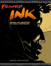
A masterclass in visual storytelling, staging, and cinematic composition. Elevates your illustrations from single images to scenes that communicate mood and narrative.
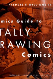
Focuses on professional digital illustration workflows — inking, coloring, and finishing — that map directly onto Procreate's layer and brush system at an intermediate level.
Advanced Practice: Style, Texture, and Professional Finish
ExpertDevelop a personal visual style, master advanced rendering and texture techniques in Procreate, and understand how professional illustrators bring work to a polished, publishable finish.
▸ Study plan for this stage
Pace: 8–10 weeks total. Weeks 1–5: "Imaginative Realism" by James Gurney (~20–25 pages/day, paired with active sketching sessions). Weeks 6–10: "Art of Game of Thrones" by Deborah Riley (~15–20 pages/day, used as a visual deep-dive and professional case study — read slowly and analytically, not just as a
- Imaginative Realism — the discipline of painting convincingly believable scenes that never existed, grounded in real-world observation, anatomy, light, and material logic
- Light logic and color temperature: how Gurney's principles of light sourcing, ambient occlusion, and subsurface scattering translate directly into Procreate brush and layer workflows
- Reference and invention: Gurney's method of combining photo reference, physical models, and imaginative extrapolation to build internally consistent worlds — applicable to any digital illustration pipeline
- Texture and surface rendering: understanding how different materials (skin, metal, stone, fabric, organic matter) behave under light, and how to replicate those behaviors with Procreate's texture brushes and blending modes
- Developing a personal visual style: using the Game of Thrones design bible to study how a large creative team maintains a unified aesthetic across thousands of assets — and distilling that into a personal, consistent visual language
- Professional finish and publishable polish: studying Deborah Riley's production design work to understand the gap between 'good illustration' and 'print/production-ready art' — including color grading, detail hierarchy, and compositional intentionality
- World-building through design detail: how every prop, costume, and environment in the Game of Thrones art book tells a story — applying this narrative-through-design thinking to your own Procreate illustrations
- Iterative refinement and the design process: how professional concept artists and illustrators use thumbnails, value studies, color comps, and final renders as distinct, non-skipped stages
- After reading Gurney, can you explain the difference between a 'light logic' error and a 'color harmony' error in a digital painting, and how would you fix each in Procreate?
- How does Gurney's concept of 'imaginative realism' differ from pure fantasy illustration or pure photo-realism, and why does that middle ground matter for professional digital illustrators?
- Looking at the Game of Thrones art book, how did the production design team establish visual consistency across wildly different locations (e.g., King's Landing vs. Winterfell vs. Essos) — and what specific design decisions created those distinct identities?
- How do the texture and material studies in Gurney's book inform the way you would set up layers, brushes, and blending modes in a Procreate illustration of an imaginary but believable environment?
- What does 'professional finish' mean in the context of the Game of Thrones design work — what separates the concept sketches shown in the book from the final production-ready assets?
- How would you define your own emerging visual style after studying both books — what specific choices (palette, texture, subject matter, rendering approach) would make your work recognizable?
- Gurney Light Study in Procreate: Choose any 3 illustrations from 'Imaginative Realism' and recreate their lighting setup digitally — build each from a flat grayscale value pass first, then add color temperature on separate layers. Label every light source and shadow type on a final annotation layer.
- Material Library Build: Using Gurney's material-rendering principles, create a personal Procreate 'swatch sheet' of at least 8 surfaces (aged leather, wet stone, hammered metal, rough linen, etc.) rendered under the same consistent light source. Save these as reusable reference canvases.
- Game of Thrones Location Deconstruction: Pick one location from the art book (e.g., Dragonstone, The Wall, Qarth). Write a one-page 'design bible entry' identifying its 5–7 defining visual rules (palette range, dominant textures, silhouette language, lighting mood). Then paint a new, original scene set in that location in Procreate, following your own rules.
- Personal Style Manifesto + Illustration: After finishing both books, write a 200-word personal style statement defining your visual identity. Then produce a single full Procreate illustration that deliberately embodies every point in that statement — treat it as a portfolio piece.
- Iterative Render Challenge: Take one of your existing Procreate sketches and push it through 4 distinct stages inspired by the professional workflows in both books — (1) thumbnail/value comp, (2) color rough, (3) texture and detail pass, (4) final polish with color grading. Save each stage separately and critique the jumps between them.
- Texture Brush Audit and Custom Brush Creation: Inspired by the surface variety in the Game of Thrones art book, audit your current Procreate brush library and identify gaps. Create or customize at least 3 brushes specifically designed to render textures central to your personal style (e.g., a worn-fabric brush, a cracked-earth brush, a glowing-ember brush), and document their settings.
Next up: Mastering personal style, advanced rendering, and professional finish here gives the reader a complete, portfolio-ready creative identity — the natural next stage is taking that work into the professional world through client workflows, licensing, publishing pipelines, or building a public-facing illustration practice.

Gurney's follow-up to Color and Light dives into how professional illustrators invent believable worlds. Pushes you to synthesize everything learned into original, fully realized digital paintings.

A professional art-direction and concept-illustration reference that exposes you to the standards, variety, and intentionality of high-end commercial digital illustration as an aspirational benchmark.
Discussion
Keep reading
Paths that share books, cover the same subject, or open a related topic.