Draw manga: characters, style & storytelling
This curriculum takes a complete beginner from the absolute basics of drawing through the specialized conventions of manga and anime, and finally into the craft of visual storytelling through sequential art. Each stage builds directly on the last — you must be able to draw convincing figures and faces before you can stylize them, and you must master the style before you can use it to tell compelling stories.
Foundations: Learning to See and Draw
BeginnerBuild core drawing skills — line control, proportion, basic forms, and observational drawing — so that manga-specific techniques have a solid foundation to rest on.
▸ Study plan for this stage
Pace: 6–8 weeks total: Spend weeks 1–4 on "The New Drawing on the Right Side of the Brain" (~20–25 pages/day, including time to complete Edwards's in-book exercises), then weeks 5–8 on "Fun With a Pencil" (~15–20 pages/day, slowing down to carefully copy every construction step Loomis demonstrates).
- L-mode vs. R-mode thinking (Edwards): learning to suppress the symbol-drawing habit of the verbal/analytical brain and switch into the visual, perceptual mode that actually sees what is in front of you
- The Five Basic Skills of Drawing (Edwards): the perception of edges, spaces, relationships, lights & shadows, and the gestalt (the whole) — all drawing ability flows from these five perceptual skills
- Contour and modified contour drawing (Edwards): training the hand-eye link by drawing edges slowly and faithfully without relying on memorized symbols
- Negative space as a drawing tool (Edwards): using the shapes around and between objects to check and correct proportion, rather than drawing the object in isolation
- Sighting and proportional relationships (Edwards): using a pencil as a measuring tool to compare angles, lengths, and ratios directly from observation, establishing accurate proportion from the very first mark
- The sphere as the universal starting form (Loomis): Loomis's core insight that every head — and by extension most organic forms — can be blocked in from a modified sphere with a front plane cut away, making construction predictable and repeatable
- Construction over copying (Loomis): building forms from the inside out using geometric underdrawing (sphere, cylinder, box) rather than tracing outlines, so drawings remain correct from any angle
- Cartooning as simplified construction (Loomis): 'Fun With a Pencil' shows that even exaggerated, humorous characters obey the same proportional and constructive rules as realistic figures — simplification is controlled, not arbitrary
- According to Edwards, what is the practical difference between drawing in 'L-mode' and drawing in 'R-mode,' and what specific warm-up strategies does she recommend to trigger the perceptual shift?
- What are Edwards's Five Basic Skills of Drawing, and why does she argue that learning to perceive negative space is just as important as learning to draw the positive subject?
- How does Edwards's sighting method work, and how would you use it to verify that the angle of a jaw line or the width-to-height ratio of a head is correct before committing to a finished line?
- In 'Fun With a Pencil,' how does Loomis use the sphere-plus-front-plane construction to place the eyes, nose, and mouth consistently, regardless of whether the head is tilted or turned?
- What does Loomis mean when he says cartooning is 'drawing simplified'? How do his cartoon heads still obey the same proportional landmarks as his more realistic constructions?
- How do the observational skills trained by Edwards (seeing edges, spaces, and relationships) directly support the constructive approach taught by Loomis (building from geometric forms)?
- Complete every in-book exercise Edwards assigns in sequence — especially the pre-instruction and post-instruction self-portrait, the vase/faces negative-space drawing, and the upside-down copying exercise — and keep all results in a dated sketchbook so you can see measurable progress
- Spend 15 minutes daily on pure contour drawing (no peeking at your paper): choose a non-symmetrical object (a crumpled hand, a shoe, a plant) and trace its edges with your eyes while your pencil moves in sync — this directly trains the R-mode perceptual shift Edwards describes
- Sighting drill: set up a simple still life of 2–3 objects and, before drawing a single outline, use a pencil held at arm's length to measure and record at least five proportional relationships (e.g., 'the bottle is 2× the height of the cup') and three angles — then construct the drawing from those measurements alone
- Loomis sphere-head construction drill: fill one sketchbook page per day with Loomis's ball-and-plane head in at least six different orientations (front, 3/4, profile, tilted up, tilted down, 3/4 down) using only his step-by-step construction method, until placement of the eye line, nose line, and chin feels automatic
- Cartoon character copy-then-construct: choose five of Loomis's finished cartoon characters from 'Fun With a Pencil,' first copy the finished drawing, then — on a fresh page — reconstruct the same character from scratch using only the underlying sphere/geometric forms, without looking at the final version
- Integration drawing: once both books are finished, draw a page of six original cartoon heads of your own invention using Loomis's construction method, but apply Edwards's negative-space check (flip the page, look at the shapes between features) to catch proportion errors before finalizing lines
Next up: By the end of this stage the reader can construct a believable head from any angle using geometric forms and verify its proportions through direct observation — exactly the spatial and constructive literacy needed to absorb manga-specific stylization (elongated eyes, simplified noses, expressive proportions) without losing structural integrity in the next stage.
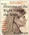
The single best-known book for training a beginner to truly see before they draw. It rewires how you observe the world, which is essential before learning any stylized art form like manga.
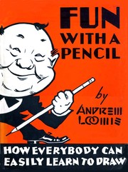
Loomis introduces simplified, cartoon-friendly head and figure construction using basic shapes — a direct bridge between general drawing and the simplified forms manga uses. Read this second to start thinking in constructive geometry.
The Manga Style: Faces, Figures & Conventions
BeginnerUnderstand and apply the core visual language of manga — stylized heads, expressive eyes, chibi proportions, body types, and the genre's iconic conventions.
▸ Study plan for this stage
Pace: 8–10 weeks total. Week 1–2: Read "Manga! Manga!" cover to cover (~20–25 pages/day) to absorb historical and cultural context. Week 3–6: Work through "How To Draw Manga Volume 1" slowly (~10–15 pages/day), pausing to sketch every technique demonstrated. Week 7–10: Complete "The Manga Artist's Workboo
- The historical and cultural roots of manga as established in 'Manga! Manga!' — understanding how the art form evolved shapes why its visual conventions exist
- Manga's stylized head construction: the use of simplified geometric shapes (oval/egg forms) as the foundation for faces, as taught in 'How To Draw Manga Volume 1'
- The iconic manga eye: large irises, multi-layered highlights, heavy upper lash lines, and how eye style communicates character gender, age, and personality
- Facial feature hierarchy and placement: the deliberate minimization of noses and mouths relative to eyes, and the use of the cross-guideline method for consistent feature placement
- Expressive manga conventions: sweat drops, speed lines, blush marks, vein pops, and other visual shorthand symbols that carry emotional meaning
- Body proportions and figure types: the standard 7–8 head tall 'realistic' manga figure vs. the 2–3 head tall chibi figure, as contrasted across 'How To Draw Manga Volume 1' and 'The Manga Artist's Workbook: Chibis'
- Chibi-specific design rules from 'The Manga Artist's Workbook: Chibis': oversized heads, stubby limbs, simplified hands and feet, and how to adapt full-sized characters into chibi form
- Genre and demographic conventions: how shonen, shojo, and other manga categories use distinct visual styles, a distinction grounded in the genre overview in 'Manga! Manga!'
- After reading 'Manga! Manga!', can you explain at least three historical or cultural reasons why manga developed its distinctive visual style — such as the influence of Osamu Tezuka or post-war publishing culture?
- Using the methods in 'How To Draw Manga Volume 1', can you construct a manga face from scratch using the oval-and-guideline method, placing eyes, nose, and mouth in correct manga proportions?
- How does eye design differ between a typical shonen male character and a shojo female character, and what specific linework choices (lash thickness, highlight count, iris size) create that difference?
- What are at least five manga visual shorthand symbols (e.g., sweat drop, blush lines), what emotion or situation does each represent, and where would you place them on or around a face?
- Using 'The Manga Artist's Workbook: Chibis', can you describe the step-by-step process for converting a standard manga character into its chibi version — what changes in the head-to-body ratio, limb shape, and facial feature size?
- What distinguishes the body proportions, linework, and facial style of a shonen action character from a chibi comedy character, drawing on examples from both 'How To Draw Manga Volume 1' and 'The Manga Artist's Workbook: Chibis'?
- FACE CONSTRUCTION DRILL (Week 3–4): Using the oval-and-cross-guideline method from 'How To Draw Manga Volume 1', draw 10 blank manga head templates in different angles (front, 3/4, profile). Then populate each with eyes, nose, and mouth without referencing the book — check your results against the book's examples afterward.
- EYE STYLE MATRIX (Week 4–5): Create a reference sheet of 12 manga eyes: 3 for a young female character, 3 for a young male, 3 for an older/villain character, and 3 chibi eyes from 'The Manga Artist's Workbook: Chibis'. Label each choice (highlight shape, lash style, iris detail) and note which book/page inspired it.
- EMOTION SYMBOL LIBRARY (Week 5): Draw a single neutral manga face 8 times. On each copy, add a different visual shorthand symbol from 'How To Draw Manga Volume 1' (sweat drop, anger vein, blush marks, etc.) and write one sentence describing the scene that would use it.
- PROPORTION COMPARISON CHART (Week 6–7): Draw the same original character three times side by side — once as a standard manga figure (~7 heads tall, per 'How To Draw Manga Volume 1'), once as a semi-chibi (~4 heads), and once as a full chibi (~2–3 heads, per 'The Manga Artist's Workbook: Chibis'). Annotate what changes at each stage.
- CHIBI ADAPTATION EXERCISE (Week 8–9): Choose a character design from 'How To Draw Manga Volume 1'. Follow the step-by-step chibi conversion process in 'The Manga Artist's Workbook: Chibis' to redraw that character in full chibi style. Focus on head enlargement, limb simplification, and facial feature rescaling.
- CULTURAL REFLECTION JOURNAL (Ongoing, Week 1–2): While reading 'Manga! Manga!', keep a one-page journal. Each session, write 2–3 sentences connecting a historical fact or genre convention you just read to a specific visual technique you have already practiced or will practice — building a bridge between cultural context and drawing craft.
Next up: Mastering manga's foundational face and figure conventions — the stylized proportions, expressive eyes, and chibi forms practiced in this stage — gives you the stable visual vocabulary needed to tackle the next stage's focus on dynamic poses, action composition, and storytelling panels, where those same characters must move, interact, and carry a narrative.
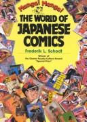
Before drawing in a style, understand its culture and history. This classic gives essential context for what manga is, where it came from, and why it looks the way it does — shaping every artistic decision you'll make.
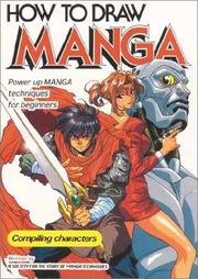
A foundational, widely-used instructional volume covering the construction of manga faces, heads, and character types step by step. Read it here to get systematic instruction on the style's core building blocks.

Hart's approachable, exercise-driven format lets beginners practice manga heads, expressions, and body proportions with guided drills — reinforcing the techniques from the previous book through active repetition.
Anatomy & Figure Drawing for Manga
IntermediateDevelop a strong understanding of the human figure — anatomy, gesture, and movement — and learn to translate that knowledge into convincing manga-style characters in any pose.
▸ Study plan for this stage
Pace: 10–13 weeks total. Week 1–4: "Figure Drawing for All It's Worth" by Loomis (~20–25 pages/day, revisiting plates and redrawing exercises daily). Week 5–8: "Anatomy For Sculptors" by Zarins (~15–20 pages/day, slow and observational — treat it like a reference atlas, not a novel). Week 9–13: "Manga in
- The Loomis Method: constructing the figure from simplified 3D volumes (the 'bean' torso, sphere head, and cylindrical limbs) to establish proportion and foreshortening before adding detail
- Gesture and rhythm: capturing the line of action, weight distribution, and the 'feel' of movement in a pose before committing to anatomy — Loomis's core argument that gesture always precedes structure
- Canonical human proportions: the 7.5-head figure as a realistic baseline (Loomis), and how manga deliberately distorts this — elongating limbs, enlarging eyes, shrinking noses — for expressive effect
- Anatomical landmark reading (Zarins): identifying surface landmarks (clavicles, iliac crests, greater trochanter, scapulae) that remain visible through skin and clothing and anchor believable figure construction
- Muscle group logic (Zarins): understanding muscles not as isolated shapes but as layered groups — how the deltoid, pectorals, and trapezius interact, and how that interaction changes with arm position
- Form and light on the figure: how 3D volumes catch light predictably, enabling manga artists to choose where to simplify or stylize shading without losing structural believability
- Araki's 'Manga-ka philosophy': the concept that manga characters must communicate personality, emotion, and story role through pose, silhouette, and exaggerated anatomy — not just accurate drawing
- Translating realism into manga style: the deliberate pipeline of (1) understand real anatomy, (2) simplify to essential forms, (3) exaggerate for drama and expression — the synthesis of all three books
- Using Loomis's volume-based method, how would you block out a figure in a running pose from a three-quarter view — what shapes do you place first, and in what order?
- Identify five surface anatomical landmarks described in Zarins that are visible on a lean figure, and explain how each one shifts when the figure bends laterally at the waist.
- How does Loomis define 'line of action,' and why does he insist it must be established before any anatomical detail is drawn?
- According to Araki in 'Manga in Theory and Practice,' what role does a character's pose and physique play in communicating their personality and story function — and how does this differ from purely realistic figure drawing?
- How do the muscle interactions described in Zarins (e.g., the relationship between the sternocleidomastoid, trapezius, and deltoid) inform how a manga artist can stylize the neck and shoulder region without making it look anatomically broken?
- What is the difference between drawing a figure that is anatomically correct and one that reads as visually dynamic in a manga context, and which specific techniques from all three books help bridge that gap?
- Loomis Volume Dailies (Weeks 1–4): Every day, draw 10 quick figure sketches (2–5 min each) using only Loomis's simplified volumes — sphere, bean, cylinders. No detail. Focus purely on proportion and line of action. At the end of each week, pick your best sketch and render it fully.
- Landmark Mapping from Life (Weeks 5–8): Using Zarins as your atlas, photograph yourself or use reference photos and annotate them digitally or on printouts — label every major surface landmark (clavicles, sternum, iliac crest, scapula spine, etc.). Then redraw the figure from memory using only those landmarks as anchors.
- Muscle-State Studies (Weeks 5–8): Choose 5 muscle groups from Zarins (e.g., deltoid, biceps, quadriceps, trapezius, gluteus medius). For each, draw the muscle in two states — relaxed and contracted — and write one sentence explaining what pose or action caused the change.
- Araki Pose Deconstruction (Weeks 9–13): Select 6 panels from any JoJo's Bizarre Adventure volume (or any Araki work). For each panel, (1) trace the line of action, (2) identify what emotion or personality trait the pose communicates, and (3) redraw the figure replacing the manga style with a realistic Loomis-method block-in to test whether the underlying anatomy holds up.
- Style Translation Pipeline (Final 2 weeks): Take 3 original poses you drew during the Loomis Volume Dailies. Run each through a three-step pipeline: Step 1 — refine with Zarins anatomical landmarks; Step 2 — simplify back down to essential forms; Step 3 — push the exaggeration and expressiveness using Araki's principles. Compare all three versions side by side.
- Pose-from-Imagination Challenge (Ongoing from Week 3): Once per week, draw a full figure in a pose entirely from imagination — no reference. After finishing, audit it against Loomis's proportion checklist and Zarins's landmark guide. Write down every error you find. Repeat the pose corrected. Track improvement across the stage.
Next up: Mastering the underlying human figure — through Loomis's construction logic, Zarins's anatomical depth, and Araki's expressive philosophy — gives the reader a structural foundation from which the next stage can safely explore character design, clothing, and stylization without the work collapsing into anatomical guesswork.
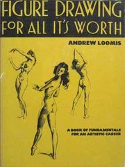
Loomis's definitive guide to the full human figure gives you the anatomical and proportional knowledge that separates stiff, flat characters from dynamic, believable ones. This is the backbone of all figure work in manga.

A visually rich, photo-and-diagram-based anatomy reference that makes muscle groups and body masses immediately clear. Use it alongside figure drawing practice to understand what is under the skin before you stylize it.

Written by the creator of JoJo's Bizarre Adventure, this is a rare insider account of how a professional manga artist thinks about poses, expressions, and character design. It bridges anatomy knowledge directly into manga application.
Sequential Art & Storytelling
IntermediateLearn to arrange panels, control pacing, guide the reader's eye, and use manga's unique visual grammar to tell stories — moving from single images to complete sequential narratives.
▸ Study plan for this stage
Pace: 10–13 weeks total. Week 1–4: "Understanding Comics" (~20–25 pages/day, reading slowly and analytically — treat every page as both text and visual argument). Week 5–8: "Making Comics" (~20–25 pages/day, pausing to sketch alongside McCloud's demonstrations). Week 9–13: "Framed Ink" (~15–20 pages/day,
- The 'invisible art' principle from Understanding Comics — how closure between panels creates meaning in the reader's mind, not on the page
- McCloud's six panel-transition types (moment-to-moment, action-to-action, subject-to-subject, scene-to-scene, aspect-to-aspect, non-sequitur) and how manga favors aspect-to-aspect for mood and atmosphere
- The vocabulary of time in comics: how panel size, shape, gutters, and bleed control perceived duration and pacing
- Visual iconography and the picture plane spectrum (realistic to abstract/symbolic) from Understanding Comics — and why manga characters are often simplified while backgrounds stay detailed
- The five choices every comics artist must make per page (as defined in Making Comics): moment, frame, image, word, and flow — and how each decision affects reader experience
- Guiding the reader's eye: using line of action, character gaze, pointing elements, panel borders, and word balloon placement to create an unambiguous reading path (Making Comics)
- Framed Ink's core principle: every frame is a directed emotional argument — value contrast, camera angle, and compositional weight must all serve the story's mood at that exact moment
- Tonal hierarchy and the use of light/shadow masses (notan) from Framed Ink to create depth, focus attention, and establish atmosphere without relying on line alone
- According to Understanding Comics, what is 'closure' and why is it the engine that makes sequential art work? Give an example of how two unrelated panels can produce a third idea that exists only in the reader's mind.
- Identify and distinguish all six panel-transition types from Understanding Comics. Which transitions dominate mainstream Western superhero comics vs. Japanese manga, and what emotional effect does that difference produce?
- In Making Comics, McCloud outlines five choices a comics artist makes for every scene. What are they, and how does a poor decision in one (e.g., a badly chosen 'moment') cascade into problems with the others?
- How does panel size and shape function as a pacing tool? Using principles from both Understanding Comics and Making Comics, explain how you would slow a scene down vs. accelerate it using layout alone.
- From Framed Ink, what is the role of value (light and dark masses) in directing the viewer's eye and communicating mood? How does Mateu-Mestre's approach differ from simply adding shading for realism?
- How do camera angle and compositional 'weight' work together in Framed Ink to create an emotional subtext — for example, making a character feel powerful vs. vulnerable — without any dialogue?
- TRANSITION AUDIT (Understanding Comics): Take 5 pages from any manga volume you own. Label every panel transition using McCloud's six types. Tally the results, then rewrite one page's transitions on paper — swapping action-to-action cuts for aspect-to-aspect — and note how the pacing and mood change.
- SILENT 8-PAGE STORY (Making Comics): Write a simple 3-beat story (setup → conflict → resolution) with zero dialogue or captions. Apply McCloud's five choices deliberately for every panel. The constraint forces you to communicate entirely through moment selection, framing, and visual flow.
- CLOSURE EXPERIMENT (Understanding Comics): Draw two completely unrelated panels and show them to someone unfamiliar with comics. Ask them what happened 'between' the panels. Repeat with five different pairs. Document how strongly closure operates even with minimal visual cues.
- THUMBNAIL PACING STUDY (Making Comics + Understanding Comics): Take a single dramatic scene (a chase, a revelation, an argument) and lay it out three different ways in thumbnail form: (a) fast and kinetic, (b) slow and tense, (c) lyrical/atmospheric. Use only panel count, size, and shape — no finished art. Compare how each version feels.
- NOTAN COMPOSITION STUDIES (Framed Ink): Choose 6 panels from a manga you admire. Redraw each as a pure two-value (black/white) silhouette study, then a three-value study. Identify where the artist placed the lightest light against the darkest dark, and ask: does it land on the story's focal point?
- FULL PAGE INTEGRATION DRILL (all three books): Script a single manga page (5–7 panels). First, plan it using McCloud's five choices. Then thumbnail it applying Framed Ink's compositional and tonal principles. Finally, produce a clean penciled or inked version. Annotate the final page: label each transition type, the intended eye path, and the dominant value mass.
Next up: Mastering sequential grammar and compositional storytelling here gives you the structural foundation to tackle the next stage — where you'll apply these narrative frameworks to the specific visual language of manga character design, genre conventions, and full chapter construction.

The definitive theoretical text on how sequential art communicates. McCloud explains panel transitions, the gutter, time, and reader perception in a way that applies directly to manga — essential reading before tackling page composition.

McCloud's practical follow-up translates his theory into craft: how to choose moments, design pages, write with pictures, and create flow. Read it immediately after Understanding Comics to put theory into practice.
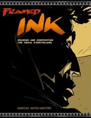
A masterclass in visual composition and cinematic framing for sequential artists. It teaches how to use light, shadow, and camera angle to create mood and direct attention — skills that elevate manga pages from competent to cinematic.
Advanced Craft & Professional Practice
ExpertSynthesize everything into a professional-level understanding of manga creation — inking, toning, page design, and the workflow of producing a complete manga story.
▸ Study plan for this stage
Pace: 8–10 weeks total: Weeks 1–5 cover "Perspective! For Comic Book Artists" (~20–25 pages/day, including time to pause and sketch); Weeks 6–10 cover "The DC Comics Guide to Inking Comics" (~15–20 pages/day, with dedicated inking practice sessions after each chapter).
- One-, two-, and three-point perspective systems and how David Chelsea applies them specifically to comic panel construction and dynamic storytelling angles
- Curvilinear and fisheye perspective as tools for expressive, manga-style distortion and dramatic effect
- How perspective governs the placement of figures, architecture, and objects within a panel to create believable 3D space on a 2D page
- Worm's-eye and bird's-eye views as narrative devices for conveying power dynamics and emotional tone — critical in manga storytelling
- Klaus Janson's philosophy of inking as interpretation, not mere tracing — understanding how line weight, texture, and mark-making carry meaning
- The technical toolkit of inking: quill pens, brushes, technical pens, and how each tool produces distinct expressive qualities suited to different manga aesthetics
- Using blacks, feathering, hatching, and cross-hatching to model form, establish light sources, and create tonal depth without screentones
- Integrating perspective-accurate environments (from Chelsea) with Janson's inking language to produce cohesive, professional-quality manga pages
- Given a panel concept, how do you select the correct perspective system (1-, 2-, or 3-point) to best serve the emotional and narrative intent of that moment?
- How does Chelsea distinguish between mechanical perspective accuracy and the deliberate distortions artists use for dramatic effect — and when is each appropriate in manga?
- According to Janson, what is the difference between an inker who 'finishes' art and one who 'interprets' it, and how does that distinction affect your approach to inking your own manga pages?
- How do line weight variation and the strategic placement of solid blacks (as taught by Janson) guide the reader's eye across a manga page?
- How can you combine Chelsea's perspective grids with Janson's inking techniques to render a complex architectural background that feels both spatially accurate and visually dynamic?
- What workflow does a professional comics/manga artist use to move from a rough perspective-blocked layout to a fully inked, print-ready page, drawing on the methods in both books?
- Perspective Grid Library: After each perspective chapter in Chelsea, draw one original manga panel using only that chapter's system (1-point for a corridor, 2-point for a cityscape, 3-point for a skyscraper shot). Compile these into a personal reference grid library.
- Environment-to-Ink Pipeline: Choose three of your perspective panels and fully ink them using Janson's techniques — vary your tool (brush for one, quill for one, technical pen for one) and compare how each tool changes the mood of the same scene.
- Line Weight Hierarchy Drill: Take a single pencilled manga page (your own or a rough sketch) and ink it three times: once with uniform line weight, once applying Janson's thick-to-thin hierarchy, and once with heavy blacks. Write a one-paragraph reflection on how each version reads differently.
- Dramatic Angle Sequence: Script a 4-panel manga sequence showing a confrontation between two characters. Deliberately use a worm's-eye view, a bird's-eye view, a fisheye panel, and a neutral eye-level close-up — applying Chelsea's perspective rules to each — then ink the full sequence using Janson's mark-making vocabulary.
- Texture & Tone Inventory: Following Janson's chapters on texture, fill an A4 page with at least 12 distinct ink textures (wood grain, fabric, skin, metal, stone, foliage, etc.) using hatching, feathering, stippling, and brushwork. Label each and note which manga contexts each texture suits.
- Complete Manga Page Production: Produce one fully finished manga page (5–7 panels) from thumbnail to final ink. The page must include at least one complex perspective environment (Chelsea), deliberate line weight storytelling, and at least two distinct Janson inking techniques. This serves as the capstone artifact for the entire stage.
Next up: Mastering perspective-accurate environments and professional inking gives the reader a complete visual production toolkit, making them ready to tackle the next stage's focus on narrative structure, page pacing, and the full end-to-end workflow of writing, thumbnailing, and publishing a complete manga story.
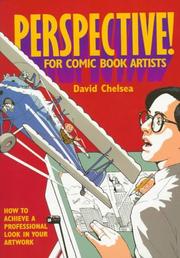
Perspective is the final major technical hurdle for manga artists building complex environments and dynamic action scenes. Chelsea's comic-format instruction makes even complex perspective systems approachable and directly applicable.
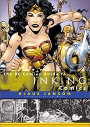
Inking is the defining visual finish of manga pages. Janson's guide — by a legendary inker — covers line weight, texture, shadow, and brush technique in a way that translates directly to manga's bold, clean ink aesthetic.
Discussion
Keep reading
Paths that share books, cover the same subject, or open a related topic.