Beautiful writing: calligraphy by hand
This curriculum takes a complete beginner from zero calligraphy knowledge to confident practice across broad-edge, pointed-pen, and modern lettering styles. Each stage builds on the last — starting with hand and tool fundamentals, moving through the two classical pen traditions, and finishing with the creative freedom of modern lettering and personal style development.
Foundations: Tools, Strokes & the Lettering Mindset
BeginnerUnderstand how lettering tools work, develop muscle memory for basic strokes, and learn the shared vocabulary (baseline, x-height, ascenders, weight, spacing) that underpins every style ahead.
▸ Study plan for this stage
Pace: 6–8 weeks total. Week 1–3: Read "Calligraphy" by Maryanne Grebenstein at ~20–25 pages/day, pausing after each chapter to practice at the desk. Week 4–8: Read "The Calligrapher's Bible" by David Harris at ~15–20 pages/day — this book is denser with historical scripts, so slow down and treat each scri
- Tool anatomy & ink behavior: understanding how broad-edged nibs, brush pens, and pointed nibs each create thick/thin contrast through angle and pressure
- The lettering anatomy vocabulary: baseline, cap height, x-height, ascenders, descenders, and how these invisible guidelines structure every letterform
- Nib angle consistency: holding the pen at a fixed angle relative to the baseline (e.g., 45° for Italic, 30° for Uncial) as demonstrated in Grebenstein's foundational exercises
- Basic stroke families: the push stroke, pull stroke, oval, and compound curve — the building blocks from which all letters in Harris's script survey are assembled
- Weight and proportion: understanding pen-width-to-letter-height ratios (nib widths stacked to set x-height) as introduced by both Grebenstein and Harris
- Spacing as white space management: the optical principle that the space inside letters should visually match the space between them
- The lettering mindset: slow, deliberate repetition over speed; treating practice sheets as diagnostic tools rather than finished art
- Historical context as a learning scaffold: Harris's Bible shows how each script (Uncial, Carolingian, Gothic, Italic) evolved from the same stroke logic, reinforcing that foundations are universal
- After working through Grebenstein's tool introduction, can you explain in your own words why nib angle — not pressure — is the primary driver of thick/thin contrast in broad-edged calligraphy?
- Using the vocabulary from both books, how would you describe the proportional relationship between x-height, ascender height, and descender depth in a well-balanced hand?
- Harris's Calligrapher's Bible surveys multiple historical scripts — what single stroke principle do Uncial, Carolingian, and Italic share, and how does recognizing it change how you approach a new script?
- What does 'nib-width laddering' mean, and how do you use it (as shown in either book) to set up your guidelines before writing a single letter?
- How does Grebenstein recommend diagnosing uneven spacing on a practice sheet, and what optical correction do you apply?
- Why do both authors emphasize practicing individual strokes before assembling full letters, and what specific risk does skipping that step create for a beginner?
- Stroke warm-up drill (daily, 10 min): Using Grebenstein's basic stroke charts as your model, fill one full page with each stroke family — push strokes, pull strokes, ovals, and compound curves — before touching a single letter. Date every sheet and keep them to track muscle-memory progress.
- Nib-width ladder setup (every new session): Before writing, stack nib-width squares in pencil to rule your baseline, x-height, and cap-height lines as both books instruct. Do this by hand — never use a pre-printed sheet until the ratio feels automatic.
- Single-letter isolation (Grebenstein, weeks 1–3): Pick five letters from Grebenstein's exemplars (start with o, n, i, l, a — they encode the most stroke families). Write each letter 30 times in a row, then circle your three best and annotate what made them work.
- Script comparison chart (Harris, weeks 4–8): After reading each script chapter in The Calligrapher's Bible, draw a side-by-side comparison of the letter 'a' in that script versus the previous one. Note the nib angle, x-height ratio, and dominant stroke direction. By the end you'll have a visual map of how scripts relate.
- Spacing diagnostic exercise: Write a short word (e.g., 'minimum' or 'noon') in your current hand, then cut the letters apart with scissors and physically redistribute them until the internal and external white spaces look optically equal. Glue the corrected version beside the original as a reference.
- Timed slow-writing meditation (weekly): Set a timer for 15 minutes and write a single pangram ('The quick brown fox…') as slowly as you possibly can, focusing only on consistent nib angle. The goal is zero speed — this trains the deliberate mindset both Grebenstein and Harris describe as essential for beginners.
Next up: Mastering the stroke vocabulary, guideline construction, and tool control in this stage gives you the precise physical and conceptual language needed to tackle specific historical and decorative script styles in the next stage — you'll recognize every new letterform as a variation on strokes you've already drilled, rather than starting from scratch.
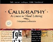
A gentle, structured primer that introduces pen angles, stroke families, and basic letterforms without overwhelming a beginner — perfect as the very first book.
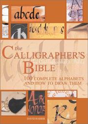
Provides a panoramic view of historical scripts and tools, giving the learner essential context and vocabulary before committing to a single style.
Broad-Edge Pen: Italic & Classic Scripts
BeginnerHold and control a broad-edge nib confidently, master Foundational Hand and Italic letterforms, and understand how pen angle and letter construction create consistent, rhythmic writing.
▸ Study plan for this stage
Pace: 6–8 weeks total. Week 1–3: Reynolds' "Italic Calligraphy and Handwriting" (~15–20 pages/day, including re-reading and tracing key exemplar pages). Week 4–8: Eager's "The Italic Way to Beautiful Handwriting" (~10–15 pages/day, slower pace to allow daily practice drills alongside each chapter).
- Broad-edge nib mechanics: how the flat edge of the pen, held at a consistent pen angle (typically 45° for Italic), creates thick and thin strokes automatically through direction of movement rather than pressure
- Foundational Hand letterforms: the archetypal Roman-derived minuscule alphabet Reynolds presents as the structural basis for all Italic work, emphasizing the branching arch and oval 'o' as the key pattern letters
- The five families of letterforms: Reynolds' analytical grouping of letters by their shared skeletal structure (e.g., n/m/h/u, o/c/e/d/g/q), which makes learning and correcting the alphabet systematic rather than letter-by-letter
- Pen angle consistency and the 'writing plane': maintaining a fixed nib angle relative to the writing line so that stroke weights are predictable and the script has visual unity
- Rhythm and spacing in Italic: Eager's emphasis that the white space inside and between letters (the 'counter') must be optically equal, creating the characteristic forward-leaning, evenly spaced texture of Italic script
- Letter slope and compression: the characteristic 5–12° forward slant of Italic and the slightly compressed oval (not circular) that distinguishes it from Foundational Hand, as demonstrated in Eager's progressive drills
- Serifs and entry/exit strokes: how Reynolds and Eager each treat the small horizontal entry strokes and exit flicks that give Italic its crisp, calligraphic finish and connect naturally into cursive forms
- The transition from calligraphic Italic to everyday handwriting: Eager's core argument that the same pen-angle discipline and letterform logic can be applied with any writing tool to permanently improve personal handwriting
- After studying Reynolds, can you name the five structural families of lowercase Italic letters and give two example letters from each family?
- What pen angle does Reynolds prescribe for Italic, and what physical effect does changing that angle by 15° have on the thick-to-thin contrast of your strokes?
- How does Eager define the relationship between the internal counter space of a letter and the space between letters, and why does getting this ratio right produce 'rhythm'?
- What is the difference between Foundational Hand and Italic as Reynolds presents them — in terms of letter slope, oval shape, and arch construction?
- According to Eager's progression, what are the three stages through which a student moves from formal calligraphic Italic to a fluent, beautiful everyday handwriting?
- How do both authors treat capital (majuscule) letters differently from minuscules in terms of height ratio and complexity, and what practical rule does this suggest for a beginner?
- 'Skeleton alphabet' tracing drill (Reynolds): Before touching a broad-edge pen, draw each of Reynolds' five letter families in pencil as single-stroke skeletons to internalize the underlying shapes, spending one full session per family.
- Pen-angle ladder exercise: Rule a series of horizontal lines and draw short strokes at 30°, 45°, and 60° nib angles back-to-back, then compare the thick/thin ratio. Repeat daily for the first two weeks until 45° feels automatic.
- Counter-space study (Eager): Write a line of the letter 'n' repeated 10 times, then cut the paper and rearrange the letters to visually compare internal and external white spaces — adjust your spacing until counters and inter-letter gaps look equal.
- Five-families copywork (Reynolds): Dedicate one practice page per letter family, writing each letter 3 lines in isolation, then 2 lines in simple words that feature that family (e.g., 'minimum' for the n/m/h family), checking arch branching point each time.
- Slope-and-compression grid (Eager): Draw a grid of slanted guidelines at your chosen Italic slope (7–10°) and practice filling entire pages with the compressed oval 'o' until its width-to-height ratio is consistent across a full line.
- Sentence-to-handwriting transfer (Eager): In the final two weeks, copy one paragraph of ordinary prose daily — first with a broad-edge pen following Eager's calligraphic model, then immediately re-write the same paragraph with a ballpoint pen, consciously applying the same letterform logic to test the transfer to everyday handwriting.
Next up: Mastering the broad-edge pen's angle discipline and Italic letterform logic in this stage gives the reader a precise understanding of how tool geometry drives stroke contrast — the exact foundation needed to tackle pointed-pen scripts (Copperplate, Spencerian), where pressure rather than angle controls thick and thin, demanding a completely different but equally systematic approach.

The canonical text for Italic hand — Reynolds teaches the logic of the broad-edge pen from first principles, making letterform construction feel intuitive rather than imitative.

A practical, drill-focused companion that reinforces Reynolds's principles with abundant exercises, cementing the muscle memory needed before moving to more complex scripts.
Pointed Pen: Copperplate & Spencerian
IntermediateTransition to the flexible pointed nib, master the pressure-and-release technique that creates thick downstrokes and hairline upstrokes, and produce legible Copperplate and Spencerian letterforms.
▸ Study plan for this stage
Pace: 10–12 weeks total. Weeks 1–7: "Mastering Copperplate Calligraphy" by Eleanor Winters (~15–20 pages/day, including slow practice sessions with each chapter's letterforms before moving on). Weeks 8–12: "Spencerian Penmanship (Theory Book)" by Platt Rogers Spencer (shorter text, so read 8–10 pages/day
- Pressure-and-release mechanics: applying deliberate downstroke pressure to splay the tines and releasing fully on upstrokes to produce hairline strokes
- Nib and ink selection: understanding how flexible pointed nibs (e.g., Nikko G, Leonardt Principal) differ from broad-edge nibs, and how ink viscosity affects flow
- Copperplate oval construction: the slanted, compressed oval as the foundational shape from which Winters derives all lowercase letterforms
- Consistent slant angle: maintaining a uniform 52–55° slant (as taught by Winters) across every letter and connecting stroke
- Shade placement: knowing exactly where on each letterform the thick shade falls versus where the hairline lives, per Winters's stroke-by-stroke analysis
- The seven Spencerian principles: the straight line, the right curve, the left curve, the direct oval, the reverse oval, the extended loop, and the compound curve as Spencer's building blocks for every letter
- Spencerian shade and shade position: Spencer's lighter, more oval-based shading philosophy versus the heavier Copperplate shade, and how muscle memory must be recalibrated between the two scripts
- Rhythm and movement: developing a flowing, arm-driven rhythm rather than finger-driven strokes, as emphasized in both Winters and Spencer
- According to Winters, what is the correct paper angle and body posture for Copperplate, and why does slant originate from paper rotation rather than wrist tilt?
- How does Winters break down the lowercase alphabet into oval-based and arch-based families, and which letters belong to each group?
- What are Spencer's seven principles of penmanship, and how does each one map to a specific recurring stroke shape found in Spencerian letterforms?
- How does the shading philosophy in Spencerian (as described by Spencer) differ from Copperplate shading as taught by Winters — in terms of pressure weight, placement, and visual effect?
- What common faults does Winters identify for letters like 'o', 'a', and 'n', and what physical adjustments correct each fault?
- After working through both books, how would you describe the key differences in rhythm, oval shape, and shade weight between Copperplate and Spencerian scripts?
- Winters warm-up drill (daily, 10 min): Fill one full page with oval drills and push-pull strokes at the correct 52–55° slant before touching any letters — use Winters's introductory drill pages as your template.
- Letter-family isolation (Weeks 1–6): Work through Winters's oval family (a, c, d, e, g, o, q) for one full week before moving to the arch family (n, m, h, u, etc.), producing at least three pages of each letter in isolation before combining into words.
- Shade mapping exercise: Photocopy or trace a Winters exemplar page, then use a highlighter to mark every thick shade. Reproduce the same page freehand, consciously cueing your pressure at each marked point.
- Spencerian principle drills (Weeks 8–12): For each of Spencer's seven principles, dedicate one full practice session (30–45 min) to writing only that stroke shape across the page in rhythmic repetition before applying it to letters.
- Side-by-side comparison study: Write the same pangram (e.g., 'The quick brown fox jumps over the lazy dog') in Copperplate (Winters style) and then in Spencerian (Spencer style) on facing pages. Annotate the differences in oval angle, shade weight, and letter spacing.
- Self-critique log: After each practice session, photograph your work and write 2–3 sentences identifying one thing that matched the Winters or Spencer exemplar and one specific stroke to correct next session — review the log weekly to track progress.
Next up: Mastering the pressure-and-release discipline and the structural logic of both Copperplate and Spencerian scripts gives the reader a deep understanding of how letterform proportion, rhythm, and contrast are intentionally designed — the exact analytical lens needed to explore historical scripts, personal style development, or advanced flourishing in subsequent stages.
The historic source text for Spencerian and business penmanship — reading it first grounds the learner in the authentic tradition and reveals the underlying oval system of pointed-pen scripts.
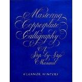
The most accessible modern guide to Copperplate: clear diagrams, progressive drills, and troubleshooting advice that bridge the gap between the historical tradition and contemporary practice.
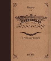
The original five-copybook set teaches Spencerian ovals and shades in sequence — working through it after Copperplate reveals how the two pointed-pen traditions differ in rhythm and form.
Modern Hand Lettering & Brush Scripts
IntermediateApply calligraphic principles to brush pens and modern lettering, develop a flexible personal style, and learn to design multi-word compositions with intentional hierarchy and flow.
▸ Study plan for this stage
Pace: 6–8 weeks total: Weeks 1–3 cover "Hand-Lettering for Everyone" (~20–25 pages/day, including practice time); Weeks 4–6 cover "The Complete Book of Chalk Lettering" (~15–20 pages/day with heavier hands-on work); Weeks 7–8 are dedicated to integration projects combining both books' techniques.
- Brush pen pressure dynamics — understanding how thick downstrokes and thin upstrokes are produced by varying pressure, as taught through Vanko's foundational drills
- Bounce lettering and informal script — deliberately offsetting baseline heights to create rhythm and personality, a signature technique in Vanko's modern style
- Style flexibility — Vanko's approach to developing multiple lettering voices (casual, bold, whimsical) rather than locking into one rigid hand
- Multi-word composition and hierarchy — arranging words of varying sizes, weights, and styles so the eye moves intentionally through a layout
- Flourishing and connective strokes — adding entry/exit strokes and decorative loops that unify letterforms without cluttering the composition
- Chalk as a medium — McKeehan's techniques for working on chalkboard surfaces, including layering, blending, and achieving clean edges with chalk markers and pastels
- Lettering on non-paper surfaces — adapting letterform pressure, scale, and spacing for vertical or textured surfaces as explored in McKeehan's projects
- Thumbnail sketching and layout planning — roughing out word arrangements, testing hierarchy, and committing to a composition before final execution
- How does brush pen pressure translate directly into stroke contrast, and what drills from 'Hand-Lettering for Everyone' best train consistent thick-thin transitions?
- What is bounce lettering, and how does Vanko recommend controlling it so it reads as intentional rhythm rather than inconsistent spacing?
- How do you establish visual hierarchy in a multi-word phrase — what variables (size, weight, style, placement) does Vanko use to make one word dominant?
- What surface preparation and tool choices does McKeehan recommend before beginning a chalk lettering piece, and why do they matter for the final result?
- How does working on a chalkboard surface change your approach to letterform scale, stroke order, and error correction compared to paper?
- How can the compositional layout principles from McKeehan's chalk projects be transferred back to brush-pen work on paper?
- Daily 15-minute pressure drills: fill a page with parallel downstrokes (heavy) and upstrokes (light) using a brush pen, then connect them into oval and oval-derived letterforms — repeat for two weeks following Vanko's warm-up model
- Bounce lettering word studies: choose 10 common short words and letter each three times — once on a strict baseline, once with moderate bounce, once with exaggerated bounce — then annotate which version feels most readable and why
- Style-switching drill: letter the same five-word phrase in three distinct moods drawn from Vanko's style chapters (e.g., casual/rounded, tall/elegant, chunky/bold) to build a personal style vocabulary
- Composition thumbnail practice: before any final piece, sketch at least 4 thumbnail layouts for a 3–5 word quote, experimenting with word size hierarchy, line breaks, and filler elements — select the strongest and execute it at full scale
- Chalk surface project: following McKeehan's project structure, complete one full chalkboard piece (minimum 4 words) from sketch to finished surface, documenting each stage with a photo to review stroke consistency and layout balance
- Cross-medium translation: take a finished chalk composition from McKeehan's book (or your own chalk piece) and re-letter it with brush pens on paper, adapting scale and pressure — write a short reflection on what changed and what stayed the same
Next up: Mastering brush script rhythm, multi-word hierarchy, and surface adaptability here builds the compositional confidence and stylistic range needed to tackle more advanced topics such as pointed-pen calligraphy, type design principles, or large-scale lettering for professional applications.

Bridges classical calligraphy and contemporary lettering culture, showing how to adapt pen-based skills to brush markers and casual styles without losing structural discipline.

Expands the learner's toolkit into large-format and textured surfaces, reinforcing composition and layout thinking that is essential for real-world lettering projects.
Advanced Practice: Design, Composition & Personal Voice
ExpertSynthesize all previous skills into polished, designed pieces — understanding layout, flourishing, color, and how to develop a signature lettering style for professional or artistic work.
▸ Study plan for this stage
Pace: 3–4 weeks, ~20–25 pages/day; read reflectively rather than quickly — pause at each historical example or stylistic discussion to sketch responses in your lettering journal
- The cultural and historical arc of handwriting and script as a designed, expressive art form — understanding how aesthetic standards evolved and why they matter to a modern lettering artist
- The distinction Florey draws between 'script' (intentional, trained mark-making) and 'scribble' (degraded or unconscious writing) — and how advanced practitioners consciously occupy the space between them to develop voice
- How personal handwriting style is shaped by tools, training, habit, and intention — and how to audit your own hand against these forces
- The role of penmanship traditions (Spencerian, Copperplate, italic, etc.) as design vocabularies you can borrow from, remix, or react against rather than merely imitate
- Composition as a deliberate act: how the arrangement of letterforms on a page creates hierarchy, rhythm, and visual tension
- Flourishing as a compositional device — when ornament serves the piece versus when it overwhelms it
- Developing a 'signature style': synthesizing historical awareness, tool mastery, and personal aesthetic into work that is recognizably yours
- The relationship between legibility and expressiveness — understanding where on that spectrum your work intentionally sits for a given project or audience
- According to Florey's historical survey, what social and technological forces caused the decline of careful penmanship, and how does that context inform what it means to practice calligraphy intentionally today?
- How does Florey define the difference between script and scribble, and how can an advanced practitioner use that tension creatively rather than simply avoiding 'scribble'?
- Which historical script traditions does Florey highlight, and how would you describe the core design DNA (letterform structure, slant, weight, spacing) of at least two of them in your own words?
- What does Florey's book suggest — directly or implicitly — about the relationship between tool choice and the character of a lettering style?
- After reading, how would you articulate your own current lettering style in one paragraph — its influences, its intentional departures, and the mood or voice it projects?
- How can the historical and cultural lens Florey provides be applied when making compositional decisions, such as choosing a script tradition for a specific client brief or artistic project?
- **Style Audit Journal Entry:** Write two full pages of your most natural, unguarded handwriting, then write the same content in your most deliberate calligraphic hand. Annotate both samples: identify every choice (conscious or unconscious) about letterform, slant, spacing, and weight. Use Florey's script-vs-scribble framework to locate each sample on the spectrum.
- **Historical Homage & Departure Piece:** Choose one script tradition Florey discusses (e.g., Spencerian, italic, Copperplate). Produce a finished, composed piece — a quote, short poem, or original phrase — faithfully in that tradition. Then produce a second version of the same text where you deliberately break three rules of that tradition in service of your own voice. Write a short artist's note
- **Flourish Audit:** Take a previous piece from your portfolio (or create a new short one) and add flourishing. Photograph it at three stages — minimal, moderate, and maximal flourish. Evaluate each version against Florey's implicit standard: does the ornament serve the composition or compete with it? Write one paragraph of self-critique per version.
- **Compositional Layout Studies:** Using a single short text (5–10 words), produce five entirely different layout compositions varying hierarchy, scale contrast, axis (horizontal vs. diagonal vs. centered), and white space. Label the design intention of each. This exercise translates Florey's historical awareness of how scripts were *used* into active compositional decision-making.
- **Personal Style Manifesto:** Draft a one-page written manifesto for your lettering practice — your influences (you may cite traditions Florey discusses), your intentional aesthetic choices, what you want your work to feel like, and what you are consciously rejecting. Then design the manifesto itself as a finished lettering piece, so that the *form* embodies the *content*.
- **Color & Tool Expansion Study:** Florey's text grounds you in the history of ink and tool. Now experiment: execute the same short composition in three different media (e.g., pointed pen + iron gall ink, brush pen + watercolor, broad-edge nib + gouache). Write a comparative note on how the tool and color palette shift the 'voice' of the piece — connecting back to Florey's argument that tools are i
Next up: By grounding advanced technical skill in historical awareness and conscious personal voice — as Florey's book demands — the reader is now equipped to move beyond exercises into sustained, self-directed creative projects, professional client work, or teaching, where an articulated aesthetic identity and design literacy are essential.
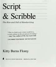
A thoughtful, cultural meditation on handwriting and lettering that encourages the advanced learner to reflect on personal voice, style history, and the meaning of mark-making — the ideal capstone read.
Discussion
Keep reading
Paths that share books, cover the same subject, or open a related topic.