Learn Tableau: the best books to read in order
This curriculum takes a beginner from zero Tableau experience to confident dashboard designer and BI storyteller across four progressive stages. Each stage builds on the last — first mastering the interface and core chart types, then advancing into calculated fields and data modeling, then tackling dashboard design and storytelling, and finally reaching expert-level performance and enterprise BI practices.
Foundations: Getting Started with Tableau
BeginnerUnderstand the Tableau interface, connect to data sources, and build fundamental chart types (bar, line, scatter, maps) with confidence.
▸ Study plan for this stage
Pace: 4–5 weeks, ~40–50 pages/day (mix of reading and hands-on practice)
- Tableau's core interface: workbooks, worksheets, dashboards, and stories—how they relate and when to use each
- Connecting to diverse data sources (Excel, CSV, databases) and understanding data types, dimensions vs. measures
- Building foundational visualizations: bar charts, line charts, scatter plots, and geographic maps with proper encoding
- Using Marks Card and Shelves (Rows, Columns, Color, Size, Detail) to construct and refine charts
- Filtering, sorting, and aggregating data to answer business questions visually
- Best practices for visual design: choosing appropriate chart types, color, and layout for clarity and impact
- Publishing and sharing Tableau workbooks for business stakeholder consumption
- What is the difference between a dimension and a measure, and how does Tableau treat them differently in visualizations?
- Walk through the steps to connect a new data source (e.g., Excel file) to Tableau and verify the data has loaded correctly.
- When would you use a bar chart vs. a line chart vs. a scatter plot, and what business questions does each answer best?
- Explain how the Marks Card and Shelves (Rows, Columns, Color, Size) work together to build a visualization.
- How do you filter data in Tableau, and what is the difference between a quick filter and a context filter?
- Describe the structure of a Tableau workbook: what are worksheets, dashboards, and stories, and how do they differ?
- Load a sample dataset (e.g., superstore sales data) into Tableau and explore the data source panel; identify and classify fields as dimensions or measures.
- Build a bar chart showing sales by product category; then convert it to a line chart and a scatter plot; compare which visualization tells the story most clearly.
- Create a geographic map visualization using latitude/longitude or built-in geographic fields (e.g., state, country) to show regional performance.
- Construct a multi-dimensional chart using the Marks Card: create a scatter plot with dimensions on Rows/Columns, a measure on Size, and another measure on Color.
- Apply multiple filters to a single worksheet (e.g., by date range, region, and product type) and observe how the visualization updates in real time.
- Build a simple dashboard combining 2–3 related worksheets (e.g., sales overview, regional breakdown, trend line) and add interactivity with filters.
Next up: This foundation in Tableau's core interface, data connection, and basic chart types equips you to move into intermediate techniques—calculated fields, parameters, and advanced filtering—that enable more sophisticated business intelligence and storytelling.

The most widely recommended beginner book for Tableau — it walks through the core interface, data connections, and essential chart types step by step, giving newcomers a solid vocabulary before anything else.

A hands-on, project-based introduction that reinforces the fundamentals from the first book with practical exercises, helping beginners solidify their workflow before moving to more complex topics.
Core Skills: Calculations, Data, and Chart Mastery
IntermediateWrite calculated fields and table calculations, model data relationships, and build a full range of chart types including LOD expressions.
▸ Study plan for this stage
Pace: 6–8 weeks, ~40–50 pages/day, with 2–3 days per week dedicated to hands-on practice
- Calculated fields: creating custom dimensions and measures using Tableau's formula syntax
- Table calculations: running totals, year-over-year comparisons, and rank/percentile functions
- Data relationships and joins: connecting multiple tables and managing granularity
- Level of Detail (LOD) expressions: FIXED, INCLUDE, and EXCLUDE for precise aggregation control
- Chart type mastery: building scatter plots, box plots, histograms, dual-axis charts, and combination charts
- Performance optimization: understanding data density and when to use different aggregation strategies
- Practical business intelligence workflows: translating business questions into calculated fields and visualizations
- What is the difference between a calculated field and a table calculation, and when would you use each in a business context?
- How do FIXED, INCLUDE, and EXCLUDE LOD expressions differ, and what business problems does each solve?
- How do you set up and troubleshoot data relationships and joins in Tableau, and what are the implications for your calculations?
- What are the key steps for building a dual-axis or combination chart, and how do you ensure axes are properly aligned?
- How do you create a year-over-year comparison using table calculations, and what pitfalls should you avoid?
- When should you use a scatter plot versus a box plot, and how do you layer multiple measures effectively in a single visualization?
- Create 5 calculated fields from a sample dataset (e.g., profit margin, customer lifetime value, discount impact) and validate results against expected business logic
- Build a table calculation that shows running totals and month-over-month growth rates; compare results with a calculated field approach to understand the difference
- Set up a multi-table data source with joins; create LOD expressions using FIXED to isolate customer-level metrics while showing transaction-level detail
- Construct a dual-axis chart combining a bar chart (sales by region) with a line chart (profit margin trend); ensure both axes are properly scaled and labeled
- Create a scatter plot with at least 3 dimensions encoded (position, size, color) and add a reference line or trend line; interpret the resulting patterns
- Build a year-over-year comparison dashboard using table calculations (PREVIOUS_VALUE, INDEX, or RANK functions); test with multiple years of data
- Design a box plot or histogram to explore data distribution; add a calculated field to segment the data and compare distributions across segments
- Replicate a business intelligence workflow from one of the book examples: identify a business question, model the data, write the necessary calculations, and build the final visualization
Next up: Mastering these core skills—calculations, data modeling, and chart types—provides the foundation to tackle advanced topics like dashboard interactivity, performance tuning, and production-ready Tableau implementations in the next stage.

A comprehensive, well-structured guide that systematically covers calculated fields, LOD expressions, and data blending — the essential analytical engine behind any serious Tableau workbook.

Organized as 100 focused tips, this book deepens chart-building skills and introduces clever techniques for common BI scenarios, making it ideal to read after the fundamentals are in place.
Dashboard Design & Data Storytelling
IntermediateDesign clear, audience-focused dashboards and craft compelling data narratives that drive business decisions.
▸ Study plan for this stage
Pace: 8–10 weeks, ~40–50 pages/day (mix of reading and active dashboard design work)
- Audience-centric design: identifying stakeholder needs, decision-making context, and tailoring visualizations to specific business questions
- Data storytelling framework: structuring narratives with context, conflict, and resolution to make data insights memorable and actionable
- Visual encoding best practices: choosing appropriate chart types, color palettes, and layouts to reduce cognitive load and highlight key insights
- Dashboard architecture and layout: organizing multiple visualizations into cohesive, scannable dashboards that support different user workflows
- Interactivity and filtering strategies: designing filters, parameters, and drill-down mechanisms that empower users without overwhelming them
- Advanced Tableau techniques: leveraging calculated fields, table calculations, and design patterns to create sophisticated, polished dashboards
- Iterative design and feedback loops: testing dashboards with real users, gathering feedback, and refining designs for clarity and impact
- How do you identify your audience's decision-making context, and why does this shape every design choice in a dashboard?
- What are the key components of a data story (context, conflict, resolution), and how do you structure a dashboard narrative around them?
- When should you use a bar chart versus a line chart versus a scatter plot, and what visual principles guide these choices?
- How do you balance interactivity in a dashboard—when should you add filters, parameters, or drill-down actions, and when should you keep it simple?
- What are three common dashboard design mistakes, and how do you avoid them?
- How do you test a dashboard with users and incorporate feedback to improve its effectiveness?
- Read 'Storytelling with Data' and identify three data stories in your own organization; sketch out the context, conflict, and resolution for each before building any visualizations
- Redesign an existing dashboard or report from your organization using the principles from Knaflic's book—focus on removing clutter, choosing one key message, and simplifying the visual hierarchy
- Work through case studies in 'The Big Book of Dashboards'; for each, document the design decisions (layout, chart types, interactivity) and explain why they work for that audience
- Build a multi-page dashboard in Tableau using Wexler's architectural patterns (e.g., overview + detail, comparison, time-series); include at least two different user workflows
- Study Sleeper's advanced techniques in 'Innovative Tableau' and implement three new design patterns (e.g., custom shapes, advanced calculations, or parameter-driven layouts) in a practice dashboard
- Conduct a user testing session with a real stakeholder or colleague; present a draft dashboard, gather feedback on clarity and usability, and iterate on the design
Next up: This stage equips you with the storytelling, design, and Tableau technical skills to create dashboards that drive decisions; the next stage will likely focus on scaling these practices across organizations, managing dashboard governance, and optimizing performance for enterprise environments.
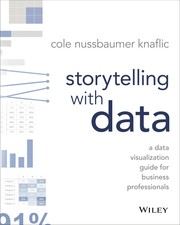
The canonical book on data visualization communication — teaches the principles of choosing the right chart, eliminating clutter, and guiding an audience's attention, which directly informs how you design Tableau dashboards.

Co-authored by leading Tableau practitioners, this book presents real-world dashboard case studies across industries, showing how design principles translate into actual BI products built in Tableau.

Builds directly on Sleeper's earlier work with 100 more advanced tips focused on dashboard interactivity, design polish, and user experience — the perfect capstone for this storytelling stage.
Advanced & Enterprise BI Mastery
ExpertAchieve expert-level Tableau skills including advanced analytics, performance optimization, and deploying scalable BI solutions in an enterprise context.
▸ Study plan for this stage
Pace: 4–5 weeks, ~25–30 pages/day, with 2–3 days per week dedicated to hands-on Prep projects
- Tableau Prep architecture and workflow design for enterprise data pipelines
- Data cleaning, transformation, and validation techniques at scale
- Aggregation, pivoting, and reshaping data for complex analytical requirements
- Performance optimization and handling large datasets in Prep
- Integration of Prep flows with Tableau Server/Cloud for automated, scheduled data refresh
- Best practices for building reusable, maintainable data preparation logic
- Error handling and data quality assurance in production BI environments
- How do you design a Tableau Prep workflow to handle incremental data loads and minimize processing time in an enterprise environment?
- What are the key differences between data cleaning in Tableau Prep versus in Tableau Desktop, and when should you use each?
- How do you validate data quality and implement error-handling logic within a Prep flow to ensure reliable downstream analytics?
- What performance optimization techniques can you apply when working with multi-million-row datasets in Tableau Prep?
- How do you schedule and automate Tableau Prep flows on Tableau Server or Cloud, and what monitoring/logging capabilities exist?
- Describe a real-world scenario where pivoting or aggregating data in Prep before visualization improves both performance and user experience.
- Build a multi-step Prep flow that ingests raw CSV/database data, applies 5+ cleaning rules (null handling, outlier detection, standardization), and outputs a clean dataset
- Create a Prep flow that pivots messy transactional data into a dimensional structure suitable for Tableau analysis; document the transformation logic
- Optimize a slow Prep flow processing 5+ million rows by profiling bottlenecks, applying aggregation strategies, and measuring performance improvements
- Design a Prep flow that integrates data from 3+ disparate sources (CSV, database, API), performs joins/unions, and validates referential integrity
- Publish a Prep flow to Tableau Server/Cloud, schedule it for automated daily refresh, and set up alerts for failed runs
- Audit an existing Prep flow for best practices: reusability, error handling, documentation, and performance; refactor it to production standards
Next up: This stage equips you with enterprise-grade data preparation skills that form the foundation for advanced analytics and performance optimization; mastering Prep workflows ensures clean, reliable data pipelines that enable sophisticated Tableau visualizations and server-scale deployments in the next stage.

Mastering Tableau Prep is essential for enterprise BI — this book teaches how to clean, shape, and pipeline data before it reaches Tableau Desktop, closing the full BI workflow loop.
Discussion
Keep reading
Paths that share books, cover the same subject, or open a related topic.