Typography is the most pervasive design discipline and the least noticed — you are reading its output right now. Good typography is invisible; bad typography quietly makes everything harder to read and trust. It is also deceptively deep: what looks like "just picking a font" is a craft with centuries of accumulated principles about spacing, rhythm, hierarchy, and the anatomy of letters. Reading the right books in order is how you start seeing what your eye has always felt but never named.
Learn typography: a reading path for designing with type
July 12, 2026 · 2 min read
Why order matters here
The canonical typography texts run from friendly and practical to scholarly and demanding. Open with the most revered reference and you will meet rules whose reasoning you cannot yet appreciate. This path starts with working fundamentals you can apply today, deepens into how type is judged and chosen, and ends with the theory of how letterforms themselves are made.
A staged reading path
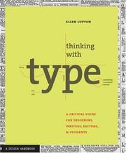
Start where working designers start: Thinking with Type by Ellen Lupton is the clearest practical primer there is, covering letter, text, and grid with examples you can use immediately. Pair it with Stop Stealing Sheep & Find Out How Type Works by Erik Spiekermann, a witty, approachable book that trains your eye for why type feels the way it does. Together they make you dangerous in a week.
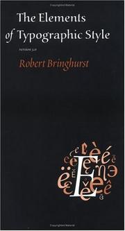
Then reach for the reference the whole field cites: The Elements of Typographic Style by Robert Bringhurst is widely regarded as the definitive book on setting type well — part manual, part philosophy. It rewards a slow read once the fundamentals have landed.
Next, learn to actually see letters. The Anatomy of Type by Stephen Coles teaches you to recognize and distinguish typefaces by their forms, and Detail in Typography by Jost Hochuli zooms in on the micro-level craft — spacing, punctuation, the fine points that separate careful work from sloppy. This stage turns "I like this font" into "I can say why."
Then broaden and go deep. Just My Type by Simon Garfield is a fun cultural history that makes you care about fonts as characters, and Typography by Paul Luna is a concise scholarly overview. When you are ready to understand how type is truly constructed, The Stroke: Theory of Writing by Gerrit Noordzij reveals the handwriting logic beneath every letterform, and Fonts & Encodings by Yannis Haralambous is the deep technical reference for how type works in software.
How to actually learn this
Typography is a seeing skill, and seeing is trained by making and comparing. Set the same paragraph in several typefaces and adjust size, leading, and measure until it reads better — then figure out why. Study type in the wild: signs, books, packaging, and ask what is working. If you want to design letters, remember that reading about it complements but cannot replace drawing and spacing thousands of glyphs. The books sharpen your judgment; a lot of careful practice builds your hand.
Start seeing the type everywhere. Follow the full reading path, visit the typography subject hub, or explore more design and making paths.
FAQ
- What is the best typography book for beginners?
- Thinking with Type by Ellen Lupton is the clearest practical starting point. Read The Elements of Typographic Style afterward as your lasting reference.
- Is typography the same as type design?
- No. Typography is arranging existing type well; type design is drawing new letterforms. This path covers both, ending with The Stroke and Fonts & Encodings for the design side.
Get the books
- 1The Elements of Typographic StyleAmazon ↗Robert Bringhurst
- 2Thinking with TypeAmazon ↗Ellen Lupton
- 3The anatomy of typeAmazon ↗Stephen Coles
- 4Stop stealing sheep & find out how type worksAmazon ↗Erik Spiekermann
- 5Detail in typographyAmazon ↗Jost Hochuli
- 6Just my typeAmazon ↗Simon Garfield
As an Amazon Associate we earn from qualifying purchases. Some book links are affiliate links; you pay the same price and we may earn a small commission.
Follow the full reading path

Learn typography: designing with type
Beginner9books68 hrs4 stages
@craftsherpa♥ 0
Ready to learn something deeply?
Build a reading path — free