Most people quit calligraphy in week two, and it's usually because they started with the wrong script. Copperplate flourishes look magnificent on Instagram, so beginners buy an oblique pen holder, produce three pages of wobbly ovals, and conclude they lack the gene. There is no gene. Calligraphy is drilled, not channeled — and the drills work far better in a deliberate order: a forgiving broad-edge script first, pointed pen later, style last.
Calligraphy and hand lettering: from shaky strokes to confident scripts
July 9, 2026 · 2 min read
The path, stage by stage
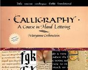
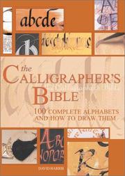
The path opens with two orientation texts: Maryanne Grebenstein's Calligraphy for the tools, terms, and first strokes, and David Harris' The Calligrapher's Bible — a hundred alphabets in one volume, less a tutorial than a map of everywhere this craft can go. Then it settles into the smartest starting script: italic. Lloyd J. Reynolds' Italic Calligraphy and Handwriting is the classic course, and Fred Eager's The Italic Way to Beautiful Handwriting extends it to your actual everyday handwriting — meaning you practice every time you write a note.
With a disciplined hand established, the pointed pen becomes learnable instead of demoralizing. Eleanor Winters' Mastering Copperplate Calligraphy is the standard course for the script everyone secretly wants, and Platt Rogers Spencer's Spencerian Penmanship theory book teaches the flowing American hand from the source. The path closes with the modern, looser end of the craft — Cristina Vanko's Hand-Lettering for Everyone and Valerie McKeehan's The Complete Book of Chalk Lettering — plus Kitty Burns Florey's Script and Scribble, a history of handwriting that explains why any of this survives the keyboard.
The sequencing matters more here than in most crafts. Italic first isn't traditionalism — it's ergonomics. The broad-edge pen gives immediate, legible feedback and builds the rhythm and letter-spacing instincts that pointed-pen scripts assume you already have. Learners who start with copperplate are fighting nib pressure, ink flow, and letterforms simultaneously; learners who arrive at Winters after a season of Reynolds are fighting only the nib, and it shows in about a month.
The habit: ten minutes of drills before any project
The single practice that separates people who progress from people who plateau: warm-up drills before every session, every time. Two minutes of ovals and parallel lines, then one letterform repeated across a full line, then — only then — actual words. Ten minutes daily beats two hours on Sunday, because calligraphy is a motor skill and motor skills are built by frequency. Date every practice sheet and keep them; the month-old pages are the motivation the craft doesn't otherwise hand you.
Expect around 90 hours of reading, most of it with a pen in your other hand. Follow the path or start at the calligraphy hub. The eye you're training transfers directly to drawing — same lines, fewer rules.
FAQ
- Should I start with brush pens or a dip pen?
- Neither, strictly speaking — a broad-edge marker or fountain pen and the italic hand is the classic on-ramp, because it builds letterform discipline without nib management. Dip pens and copperplate come much easier afterward.
- How long before my calligraphy looks good?
- With short daily practice, most people produce genuinely giftable envelope-and-quote work in two to three months. Mastering a formal script like copperplate takes longer, but the improvement curve is steep and visible week to week.
Get the books
- 1CalligraphyAmazon ↗Maryanne Grebenstein
- 2The Calligrapher's BibleAmazon ↗David Harris
- 3Italic calligraphy and handwritingAmazon ↗Lloyd J. Reynolds
- 4Amazon ↗
- 5The Zanerian Manual of Alphabets and Engrossing; an Instructor in Round Hand, Lettering, Engrossing, Designing, Pen and Brush Art, EtcAmazon ↗C P (Charles Paxton) Zaner
- 6Mastering copperplate calligraphyAmazon ↗Eleanor Winters
As an Amazon Associate we earn from qualifying purchases. Some book links are affiliate links; you pay the same price and we may earn a small commission.
Follow the full reading path

Beautiful writing: calligraphy by hand
Beginner10books39 hrs5 stages
@craftsherpa♥ 0
Ready to learn something deeply?
Build a reading path — free