Learn HTML and CSS: The Best Books in Order
This curriculum takes a complete beginner from zero knowledge of web markup to confident, modern CSS layout techniques. Each stage builds directly on the last — first establishing solid HTML and CSS fundamentals, then layering on professional styling practices, and finally mastering the modern layout systems (Flexbox and Grid) that power responsive design today.
Foundations: HTML & CSS Basics
BeginnerUnderstand how the web works, write well-structured semantic HTML, and apply basic CSS rules for color, typography, and the box model.
▸ Study plan for this stage
Pace: 4–5 weeks, ~40–50 pages/day (Duckett first, then Robbins)
- How the web works: clients, servers, HTTP requests, and how browsers render HTML/CSS
- Semantic HTML structure: proper use of headings, lists, forms, and meaningful elements over generic divs
- CSS selectors and the cascade: understanding specificity, inheritance, and how rules are applied
- The box model: margins, borders, padding, and content area, and how they affect layout
- Typography fundamentals: font families, sizing, line-height, and text styling for readability
- Color theory and application: hex/RGB values, contrast, and using color effectively in design
- Document structure and accessibility: writing valid, well-organized HTML that works for all users
- Explain the journey of a web request from browser to server and back. What role do HTML and CSS play in this process?
- What is semantic HTML and why is it important? Give examples of semantic elements and when to use them instead of generic divs.
- How do CSS selectors work, and what is specificity? Why does the cascade matter when multiple rules apply to the same element?
- Describe the CSS box model. How do margin, border, padding, and content interact, and how does box-sizing affect layout calculations?
- What are the key principles of typography on the web? How do font-family, font-size, and line-height work together to improve readability?
- How do you choose and apply colors effectively in web design? What is contrast, and why does it matter for accessibility?
- Build a multi-page personal website (3–5 pages) using semantic HTML: home, about, portfolio/projects, contact. Include proper heading hierarchy, navigation, and forms.
- Create a CSS stylesheet from scratch that styles a provided HTML file. Practice using different selector types (element, class, ID) and demonstrate understanding of specificity by intentionally overriding rules.
- Recreate a simple real-world website layout (e.g., a blog post or product page) using only HTML and CSS—no frameworks. Focus on semantic structure and proper box model usage.
- Experiment with typography: take a block of text and create 3 different CSS versions with different font families, sizes, line-heights, and letter-spacing. Evaluate which is most readable.
- Build a color palette for a fictional brand and apply it to a simple website. Document your color choices (hex values) and explain contrast ratios for accessibility.
- Debug a broken HTML/CSS file: given poorly structured HTML and conflicting CSS rules, identify and fix semantic issues, selector conflicts, and box model problems.
Next up: This foundation in semantic HTML structure, CSS fundamentals, and the box model equips you to move into responsive design and layout techniques (flexbox, grid), where you'll apply these core concepts to create flexible, multi-device-friendly interfaces.
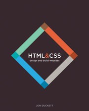
The single most beginner-friendly entry point into HTML and CSS — its visual, magazine-style layout makes abstract concepts immediately concrete. Read this first to build a complete mental model of how markup and styles work together.

A thorough, methodical companion that reinforces Duckett's visual intro with deeper explanations of semantic HTML5 elements and the cascade. Read second to solidify vocabulary and fill any gaps before moving on.
Styling & the Cascade
BeginnerMaster CSS selectors, specificity, the cascade, inheritance, and core visual styling — the rules that govern how every style decision is resolved by the browser.
▸ Study plan for this stage
Pace: 2–3 weeks, ~20–25 pages/day (The CSS Pocket Guide is concise; read actively with a code editor open)
- CSS selectors (element, class, ID, attribute, pseudo-class, pseudo-element, combinators) and how to target specific elements
- Specificity calculation and how it determines which rule wins when multiple selectors target the same element
- The cascade: how source order, importance, and origin resolve competing styles
- Inheritance: which properties inherit from parent to child elements and how to control it with inherit, initial, and unset
- Box model (margin, border, padding, content) and how it affects layout and spacing
- Common visual properties: color, background, fonts, text styling, and how they apply across the cascade
- How the browser resolves style conflicts using specificity, cascade, and inheritance rules together
- How do you calculate specificity for a selector, and why does a selector with higher specificity override one with lower specificity?
- What is the difference between the cascade and inheritance, and when does each one apply?
- Which CSS properties are inherited by default, and how can you force inheritance or prevent it?
- What are the main CSS selector types (element, class, ID, attribute, pseudo-class, pseudo-element), and when should you use each?
- How does the box model work, and what is the difference between margin, padding, and border?
- If two selectors have the same specificity and target the same element, which rule wins and why?
- Build a simple HTML page (header, nav, main content, footer) and write CSS selectors to target each section using element, class, and ID selectors; experiment with combining them
- Create a specificity test: write three competing selectors with different specificity levels targeting the same element, predict which wins, then verify in the browser
- Write CSS that relies on inheritance (e.g., set font-family on body, color on a parent div) and test which properties inherit; then override inherited values on child elements
- Build a multi-level nested HTML structure and use combinators (descendant, child, adjacent sibling, general sibling) to target specific elements; verify each selector works as expected
- Style a component (e.g., a button or card) using the box model: set margin, padding, and border; adjust each and observe how it affects layout and spacing
- Refactor a stylesheet with conflicting rules: identify which rules win due to specificity and cascade, then simplify by removing unnecessary overrides
Next up: Understanding how selectors, specificity, and the cascade work is the foundation for writing maintainable CSS and avoiding style conflicts—skills you'll apply immediately when learning layout techniques like Flexbox and Grid in the next stage.
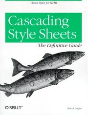
The canonical deep-dive into how CSS actually works under the hood — selectors, the cascade, specificity, and the visual formatting model. Reading this after the basics turns intuition into reliable, predictable knowledge.

A concise, focused reference that reinforces the most-used CSS properties and patterns. Use it alongside Meyer's book to quickly look up and practice individual concepts as you learn them.
Modern Layouts: Flexbox & Grid
IntermediateBuild fully responsive, real-world page layouts using CSS Flexbox and CSS Grid — the two layout systems that have replaced older float-based techniques.
▸ Study plan for this stage
Pace: 4–5 weeks, ~20–25 pages/day, with 2–3 days per week dedicated to hands-on layout projects
- CSS Grid fundamentals: grid containers, grid items, grid lines, tracks, and the fr unit for flexible sizing
- Grid placement: explicit grid definition with grid-template-columns/rows, and implicit grid behavior
- Named grid lines and grid areas for semantic, maintainable layout code
- Responsive grid design: auto-fit, auto-fill, minmax(), and media queries for adaptive layouts
- Alignment and justification: align-items, justify-items, align-content, justify-content, and gap for spacing
- Combining Flexbox and Grid: when to use each system and how they complement each other
- Real-world layout patterns: card grids, sidebar layouts, hero sections, and multi-column designs using Grid
- What is the difference between explicit and implicit grids, and how does auto-placement work?
- How do you create a responsive grid layout without media queries using auto-fit, auto-fill, and minmax()?
- What are named grid areas, and why are they preferable to numeric grid placement for maintainability?
- When should you use CSS Grid versus Flexbox, and can you combine them in a single layout?
- How do gap, align-items, and justify-items work together to control spacing and alignment in a grid?
- How would you build a real-world layout (e.g., a blog homepage with header, sidebar, and card grid) using Grid?
- Build a responsive product card grid that reflows from 1 column on mobile to 3 columns on desktop using auto-fit and minmax(), without media queries
- Create a semantic layout using named grid areas (header, sidebar, main, footer) and reposition them for mobile using grid-template-areas
- Implement a two-column blog layout with a fixed sidebar and fluid main content area using Grid
- Build a masonry-style gallery or dashboard grid and practice alignment techniques (align-items, justify-items, gap)
- Refactor a float-based or Flexbox-only layout into a Grid-based layout and document the improvements in code clarity
- Create a complex multi-section page layout (hero, feature grid, testimonials, footer) combining Grid for major sections and Flexbox for component-level alignment
Next up: Mastering Grid and Flexbox as complementary layout tools prepares you to tackle advanced responsive design patterns, CSS custom properties for dynamic layouts, and modern frameworks that build on these foundational layout systems.

Written by one of the foremost CSS Grid experts, this book explains the Grid specification clearly and practically. It pairs perfectly with the Flexbox book, completing your two-dimensional layout toolkit.
Responsive Design & Professional Workflow
IntermediateDesign and build websites that look great on any screen size, using responsive design principles, media queries, and a professional CSS architecture mindset.
▸ Study plan for this stage
Pace: 6–8 weeks, ~25–30 pages/day, with 2–3 days per week dedicated to hands-on projects
- Fluid grids and proportional layouts as the foundation of responsive design
- Flexible images and media that scale intelligently across breakpoints
- Media queries: syntax, breakpoints, and mobile-first vs. desktop-first strategies
- CSS3 selectors, pseudo-classes, and pseudo-elements for precise styling control
- CSS3 transforms, transitions, and animations for smooth, modern interactions
- Box model refinements, flexbox basics, and layout techniques in CSS3
- Professional CSS architecture: organization, naming conventions, and maintainability
- Testing and debugging responsive designs across devices and browsers
- What is a fluid grid, and how do you calculate proportional widths using the formula (target ÷ context = result)?
- How do media queries work, and what are the differences between mobile-first and desktop-first approaches?
- What CSS3 techniques can you use to make images and embedded media responsive without distortion?
- How do CSS3 transforms and transitions differ, and when would you use each in a real project?
- What is a professional CSS architecture, and why are naming conventions and modular organization important?
- How do you test a responsive design across multiple devices and screen sizes, and what tools are available?
- Build a three-column layout using fluid grids (no frameworks); calculate proportional widths and test at multiple breakpoints
- Create a responsive image gallery that scales fluidly and uses media queries to adjust grid columns at tablet and mobile sizes
- Write a set of media queries for a website, implementing a mobile-first strategy with breakpoints at 768px and 1024px
- Design and code a responsive navigation menu that collapses into a hamburger menu on mobile using CSS3 and media queries
- Practice CSS3 transforms and transitions: animate a card on hover with scale, rotate, and shadow effects
- Refactor an existing CSS file using a professional naming convention (BEM or SMACSS) and organize it into logical sections
- Build a fully responsive landing page from scratch (desktop, tablet, mobile) using fluid grids, flexible images, and media queries
- Test your responsive site using Chrome DevTools device emulation and a real mobile device; document and fix any issues
Next up: This stage equips you with the responsive design principles and CSS3 techniques needed to build flexible, modern websites; the next stage will deepen your skills with advanced layout systems (like CSS Grid and Flexbox), preprocessors, and build tools that automate and scale professional workflows.
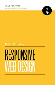
The book that coined the term 'responsive web design' — Marcotte's foundational text explains fluid grids, flexible images, and media queries as a unified philosophy. Essential reading before writing production-level responsive CSS.

Ties together everything learned so far — semantic HTML, the cascade, Flexbox, Grid, and responsive techniques — into practical, project-based walkthroughs that mirror real professional workflows.
Discussion
Keep reading
Paths that share books, cover the same subject, or open a related topic.