Watercolor, from washes to finished paintings
This curriculum takes a beginner watercolorist from first brushstrokes to confident, expressive painting across four progressive stages. Each stage builds on the last — first mastering the medium's unique behaviors, then developing color intelligence, then tackling composition, and finally synthesizing everything into a personal, expressive practice.
Foundations: Understanding the Medium
BeginnerUnderstand how water and pigment behave on paper, learn basic wet-on-wet and wet-on-dry techniques, and build confidence handling a brush without fear of the medium.
▸ Study plan for this stage
Pace: 4–5 weeks, ~15–20 pages/day (the book is richly illustrated, so budget extra time to study the visual examples alongside the text)
- Water-to-pigment ratio: how the amount of water on your brush and paper controls bloom, flow, and edge quality
- Wet-on-wet technique: applying wet paint onto a pre-wetted surface to create soft, diffused edges and organic blends
- Wet-on-dry technique: applying wet paint onto dry paper or dry paint layers to create crisp, controlled edges
- Paper behavior: how different paper weights (90 lb vs. 140 lb vs. 300 lb) and surfaces (hot press, cold press, rough) absorb and resist water differently
- Pigment properties: transparency vs. opacity, staining vs. non-staining pigments, and how granulating pigments settle into paper texture
- Brush loading and pressure: how the amount of paint held in the belly of the brush, tip pressure, and stroke speed affect mark-making
- Drying stages: recognizing the 'shine' on wet paper and understanding when to add paint for soft edges vs. waiting for dry for hard edges
- Fearless experimentation: MacKenzie's emphasis on treating mistakes as discoveries and building an intuitive, playful relationship with the medium
- What physically happens when you drop wet pigment onto a wet surface, and how does the water-to-pigment ratio change the result?
- How does cold press paper behave differently from hot press paper when you apply a wet wash, and which is more forgiving for a beginner?
- What visual cue on the paper surface tells you the right moment to add a second color wet-on-wet without losing soft edges?
- Why do staining pigments require different planning than non-staining pigments, and how does this affect how you approach corrections?
- What distinguishes a wet-on-dry glaze from a flat wash, and when would you choose one over the other?
- How does MacKenzie suggest a beginner overcome the fear of 'ruining' a painting, and what practice mindset does he recommend?
- Water ratio ladder: On a single sheet of cold press paper, paint a row of swatches of the same pigment — starting with near-pure pigment and progressively adding more water. Label each swatch and observe how value, transparency, and flow change across the gradient.
- Wet-on-wet sky study: Thoroughly wet a half-sheet of 140 lb cold press with clean water, then drop in two or three colors (e.g., cerulean blue, yellow ochre, and a touch of burnt sienna) at different moments as the paper dries. Note the edge quality at each timing stage.
- Wet-on-dry stripe exercise: Once the wet-on-wet study is fully dry, paint controlled horizontal stripes of a single color across it using a flat brush and wet-on-dry technique. Compare the crisp edges to the soft edges underneath.
- Paper surface comparison: Paint the same simple subject (a single leaf or a flat graded wash) on three different paper surfaces — hot press, cold press, and rough — using identical paint mixtures. Write one sentence of observation about each result.
- Pigment personality chart: Choose one transparent pigment (e.g., quinacridone rose), one opaque pigment (e.g., cadmium yellow), and one granulating pigment (e.g., ultramarine blue). Paint a swatch of each over a dried wash of another color and observe how they layer, granulate, or obscure what is beneath.
- Daily 10-minute 'fearless page': Following MacKenzie's experimental spirit, fill one page of a cheap sketchbook each day with no goal other than to try one thing you haven't done before — a new brush angle, an unusual color mix, letting paint run off the edge. Date each page and review them at the end of the stage to track growing comfort with the medium.
Next up: Mastering how water and pigment behave on paper gives the reader the physical intuition they need to move confidently into color theory and mixing — the logical next challenge — where those same wet-on-wet and wet-on-dry skills become the delivery mechanism for intentional, harmonious color relationships.

A visually rich reference that demystifies washes, edges, and basic color mixing through hundreds of small experiments. Reading it second reinforces Hoffmann's concepts with hands-on visual proof.
Water Control & Color Mixing
BeginnerDevelop reliable control over water-to-pigment ratios, understand how colors mix and granulate on wet paper, and begin mixing clean, luminous hues without mud.
▸ Study plan for this stage
Pace: 6–8 weeks total: Weeks 1–4 cover "Watercolor Wisdom" by Jo Taylor (~20–25 pages/day, focusing on her water-control and mixing chapters); Weeks 5–8 cover "Color and Light" by James Gurney (~15–20 pages/day, with slower reading for theory-heavy sections on light and color interaction).
- Water-to-pigment ratio: understanding how the amount of water on the brush and on the paper surface independently affect bloom, flow, and value (from Taylor's wet-on-wet and wet-on-dry demonstrations)
- The three wetness states of paper (wet, damp, dry) and how each produces different edges — soft, bloomed, or hard — as taught through Taylor's practical exercises
- Pigment transparency vs. opacity: Taylor's distinction between transparent, semi-transparent, and opaque pigments and why layering transparent colors preserves luminosity
- Granulation and blooms: recognizing which pigments granulate naturally and how to use or avoid backruns intentionally
- Color temperature and simultaneous contrast: Gurney's explanation of how warm and cool light sources create complementary shadows, and why this matters for mixing lifelike hues
- The color wheel in practice: mixing primaries to secondaries and understanding why certain pigment combinations produce clean mixes while others turn muddy (pigment bias, as reinforced by both authors)
- Avoiding mud: Taylor's rule of limiting mixes to two or three pigments and Gurney's principle that mud arises from mixing across too many color temperatures or complementary pairs without intention
- Luminosity through glazing: building color in transparent layers rather than mixing everything on the palette, a technique Taylor demonstrates and Gurney supports with his light-transmission theory
- After reading Taylor, can you explain what happens to a wet-on-wet wash if you add a second color when the paper is 'just damp' versus 'fully wet,' and why the results differ?
- What is pigment bias, and how does knowing whether a yellow leans warm or cool help you mix a clean, non-muddy green or orange?
- According to Gurney's color and light theory, why do shadows often contain the complementary color of the dominant light source, and how would you mix that shadow on a watercolor palette?
- How does granulation occur at the pigment level, and can you name at least two pigments Taylor identifies as heavy granulators versus two that stay smooth?
- What is the difference between mixing colors on the palette versus letting them mix on wet paper, and when does each approach serve luminosity better?
- How do you test and adjust your water-to-pigment ratio before committing a wash to paper, using the approach Taylor recommends?
- Water ratio ladder: Paint a 10-step value strip of a single pigment (e.g., ultramarine blue) by adjusting only the water level — no white added. Label each step with your estimated ratio. Repeat with a warm pigment (e.g., burnt sienna) to compare how different pigments behave at the same dilution.
- Wetness-state sampler: Divide a sheet into three columns labeled Wet, Damp, and Dry. Drop the same two-color mix (e.g., quinacridone rose + phthalo blue) into each column at the matching paper wetness. Observe and annotate the edge quality, bloom, and spread after drying.
- Clean-mix matrix (Taylor-inspired): Create a 5×5 grid mixing your five core pigments against each other. Mark each resulting swatch as 'clean,' 'slightly muddy,' or 'muddy,' and note which pigment bias combinations cause problems.
- Granulation study: Paint side-by-side swatches of at least four pigments wet-on-wet on rough paper. Once dry, use a magnifier to observe granulation. Write a short note on which you'd use for texture (rocks, clouds) vs. smooth skies.
- Gurney shadow-mixing drill: Choose three simple objects lit by warm light (lamp or sunlight). Mix a shadow color for each by starting with the object's local color and adding its complement plus a cool blue, following Gurney's warm-light/cool-shadow principle. Compare your mixed shadows to the observed shadows.
- Luminous glaze study: Paint the same simple subject (e.g., a lemon) twice — once by mixing all color on the palette in a single layer, and once by glazing 2–3 transparent layers. Compare the luminosity of both results and write a reflection on what Taylor's and Gurney's principles explain about the difference.
Next up: Mastering water control and clean color mixing gives the reader a reliable technical foundation, so the next stage can focus on applying these skills purposefully — building compositions, handling light and shadow across larger scenes, and developing a personal palette — without being derailed by muddy color or unpredictable washes.
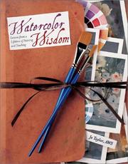
Taylor breaks down water control and value relationships in plain language, making it the ideal bridge between conceptual understanding and repeatable technical skill.

Though medium-agnostic, Gurney's deep exploration of how light creates color is essential before advancing color mixing. It trains the eye to see color temperature and value — critical for watercolor's transparency.
Composition & Design
IntermediateLearn to design a painting before touching the paper — controlling value structure, edges, focal points, and the flow of the viewer's eye across the picture plane.
▸ Study plan for this stage
Pace: 4–5 weeks, ~20–25 pages/day; Graham's text is dense with visual analysis, so budget extra time to study each diagram and plate before moving on — treat every illustration as a reading assignment in itself.
- Value structure as the skeleton of a composition — Graham's insistence that a painting must read as a clear pattern of lights and darks before color or detail are considered
- The picture plane as an active field — understanding how shapes, lines, and masses create tension, balance, and movement across the flat surface
- Dominance and subordination — establishing a clear hierarchy so one element (the focal point) commands attention while all others support it
- Directional thrust and eye movement — how diagonal lines, value gradients, and edge quality guide the viewer's gaze through and around the composition
- Edge control as a compositional tool — the difference between hard, soft, and lost edges and how each controls emphasis and depth
- Notan (dark-light design) — reducing a scene to its simplest two-value pattern to test whether the abstract design is strong enough to carry the painting
- The concept of 'passage' — linking shapes of similar value or color so the eye travels continuously rather than jumping between isolated islands
- Thumbnail and value-sketch practice — Graham's method of working out all major compositional decisions in small, rapid studies before committing to full-scale work
- Can you reduce any reference scene to a two-value notan and explain why the resulting abstract pattern does or does not work as a composition?
- According to Graham, what is the relationship between the picture plane and the illusion of depth — and how do you maintain control of both simultaneously?
- How does dominance function at multiple scales in a composition (overall value, shape size, color temperature, edge quality), and what happens when no single element dominates?
- What specific techniques does Graham describe for directing the viewer's eye toward the focal point and preventing it from escaping the picture frame?
- How does edge quality (hard vs. soft vs. lost) affect the perceived importance of a shape, and how would you use this deliberately in a watercolor?
- What is Graham's argument for designing in thumbnail before working large, and what information must a thumbnail capture to be a useful planning tool?
- Notan thumbnails: Choose 10 different reference photos or outdoor scenes. Reduce each to a pure black-and-white two-value sketch (1–2 inches). Evaluate each for balance, dominance, and a clear path for the eye — redesign any that feel static or chaotic before moving on.
- Value-scale mapping: Pick one completed or in-progress watercolor. Photograph it, desaturate it, and map every area onto a 5-step value scale (0 = white, 4 = black). Identify where the focal point sits on the scale and whether the surrounding values properly subordinate to it.
- Directional-line overlay: Trace the major lines and edges of three master paintings (or strong reference photos) onto tracing paper. Draw arrows showing the direction each line points. Identify which lines lead toward the focal point and which create a 'return path' to keep the eye inside the frame.
- Passage practice: Paint three small (quarter-sheet) watercolor studies in which you deliberately connect background, midground, and foreground shapes by 'losing' edges where two areas share a similar value — practice letting shapes merge and re-emerge.
- Thumbnail series for one subject: Take a single landscape or still-life subject and produce at least 6 thumbnail compositions (each no larger than 3×4 inches), varying the placement of the horizon, the position of the focal point, and the overall value pattern. Select the strongest and execute it as a half-sheet painting.
- Focal-point isolation drill: Paint the same simple subject (e.g., a tree, a boat, a figure) three times on small sheets. In version 1, use hard edges and high contrast at the focal point; in version 2, shift the contrast elsewhere and observe how the focal point weakens; in version 3, deliberately use lost edges everywhere and note the effect on mood and legibility.
Next up: Mastering Graham's pre-painting design process — especially value structure and eye-flow — gives the reader a compositional framework they can immediately apply when the next stage introduces color temperature, pigment behavior, and wet-into-wet technique, ensuring those expressive tools serve a planned design rather than driving it by accident.

A foundational text on visual design principles — shape, value, rhythm, and balance — that applies directly to planning watercolor compositions before any paint is mixed.
Discussion
Keep reading
Paths that share books, cover the same subject, or open a related topic.